Search Header Logo
Intro to presenting data

Intro to presenting data

Assessment

Presentation

Mathematics

2nd Grade

Practice Problem

Medium

CCSS
6.SP.B.4, 2.MD.D.9, 6.SP.A.1

+9

Standards-aligned

Created by

Amy Mahony

Used 5+ times

FREE Resource

8 Slides • 15 Questions

1

Intro to presenting data

Recap and line plot and bar charts

Slide image

2

Slide image

3

Slide image

4

Multiple Choice

This chart presents categorical data with rectangular bars, heights or lengths.

1

horizontal graph

2

bar graph

3

line graph

4

pictograph

5

Multiple Choice

STEM AND LEAF PLOT

1

is a graph that uses flowers

2

it is a graph that measures how much plants grow

3

it is a device for presenting quantitative data in a graphical format

4

it is a horizontal graph that uses two rectangles to represent two forms of data

6

Multiple Choice

Question image

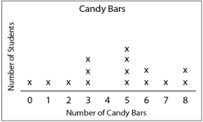
What is the difference between the shortest and the longest distance of the baseball thrown?

1

1,005 feet

2

85 feet

3

82 feet

4

80 feet

7

Multiple Choice

Question image

How many baseballs were thrown 50 or more feet?

1

5

2

4

3

13

4

8

8

Multiple Choice

Question image
What is the highest score in the class?
1
88%
2
100%
3
13
4
98%

9

Multiple Choice

Question image
How many students had more than 6 candy bars?
1
5
2
2
3
3
4
1

10

Multiple Choice

Question image
Which type of graph is this?
1
Box Plot
2
Bar Graph
3
Dot Plot
4
Stem Plot

11

Multiple Choice

Question image
How many more people like purple than red?
1
3
2
5
3
7
4
9

12

Multiple Choice

Question image
What type of graph is this?
1
Bar graph
2
Histogram
3
Pie Chart
4
Stem Chart

13

Multiple Choice

Question image

This is the test scores for two different classes. Which class has a greater mode?

1

2009 class

2

2010 class

3

neither

4

Same

14

Multiple Choice

Question image

This is the test scores for two different classes. Which class has the greater mean?

1

2009 class

2

2010 class

3

neither

4

Same

15

Multiple Choice

Question image
A florist records the amount of money he spent on gasoline each week to deliver orders. The list shows the data for 16 weeks.
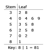
 32, 38, 40, 44, 44, 46, 49, 53, 55, 58, 62, 65, 68, 70, 72, 81
 He put the data in a stem-and-leaf plot. What number did he leave out of the stem-and-leaf plot?
   

1
32
2
44
3
65
4
81

16

Multiple Choice

Question image

What is the range?

1

97.2

2

4

3

3.3

4

3.2

17

Multiple Choice

Question image

What is the Mode?

1

97.4

2

97.2

3

97

4

96.8

18

Multiple Choice

Question image
Which type of graph is this?
1
Histogram
2
Bar Graph
3
Stem Plot
4
Box Plot

19

Slide image

20

Slide image

21

Slide image

22

Slide image

23

Slide image

Intro to presenting data

Recap and line plot and bar charts

Slide image

Show answer

Auto Play

Slide 1 / 23

SLIDE