Search Header Logo
Data practice

Data practice

Assessment

Presentation

Mathematics

7th Grade

Medium

CCSS
6.SP.B.4, 3.OA.D.8, 2.MD.D.9

+6

Standards-aligned

Created by

Heather Ruiz

Used 86+ times

FREE Resource

5 Slides • 13 Questions

1

Data practice

Box plots

Dot plots

Bar graphs

Circle graphs

Slide image

2

Multiple Choice

Question image

What was the most number of books read?

1

1

2

6

3

9

4

12

3

Multiple Choice

Question image
What is the highest score in the class?
1
88%
2
100%
3
13
4
98%

4

Take a moment and look at these graphs.

Write down the:

Mode

Median

Range

Mean

Slide image

5

Multiple Choice

Question image

Which statement is support by the data shown?

1

The mode of the data for Store 2 is greater than the mode of the data for Store 1.

2

The range of the data for Store 1 is greater than the range of the data for Store 2.

3

The mean of the data for Store 1 is greater than the mean of the data for Store 2.

4

The median of the data for Store 2 is greater than the median of the data for Store 1.

6

Multiple Choice

Question image

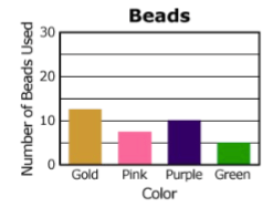
The graph shows the number of colored beads used to make a necklace. How many purple and green beads were used in all?

1

23

2

20

3

18

4

15

7

Multiple Choice

Question image

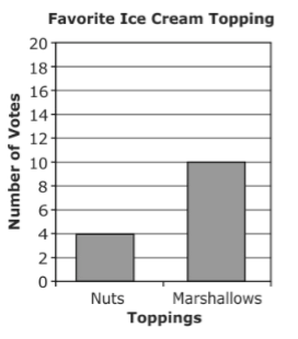
Students voted for their favorite ice cream topping. How many more students chose marshmallows than chose nuts?

1

4

2

6

3

10

8

Read the bar graph.

Write down the total number surveyed and how many chose each fruit.

Slide image

9

Multiple Choice

Question image

Which statement is true about the graph shown?

1

Pears were chosen half as much as oranges.

2

50% of students chose apples

3

Oranges and strawberries combined are equal to apples and bananas combined.

4

Grapes were chosen twice as often as strawberries.

10

Multiple Choice

Question image

According to this graph, what is the most popular flavor of Jolly Rancher?

1

Cherry

2

Grape

3

Blue Rasberry

4

Watermelon

11

Multiple Choice

What percentage does a whole circle graph represent?

1

360%

2

90%

3

50%

4

100%

12

Find the number of students who voted for each type of sport.

Set up a proportion to solve each.


%           x
100     250


Slide image

13

Fill in the Blank

Question image

How many students chose chess as their favorite?

14

Multiple Choice

Question image

Which best represents the Interquartile Range

1

15

2

93

3

85

4

78

15

Multiple Choice

Question image

What is the median?

1

62

2

58

3

66

4

60

16

Read the box plots.

Write down the:

Median

Range

IQR (interquartile range)

Slide image

17

Multiple Choice

Question image

Which statement is correct?

1

The range of the data for men 20-40 years old is less than the range of the data for men 50-70 years old.

2

The median of the data for men 20-40 years old is less than the median of the data for men 50-70 years old.

3

The minimum target heart rate for men 20-40 years old is less than the minimum target heart rate for men 50-70 years old.

4

The interquartile range of the data for men 20-40 years old is greater than the interquartile range of the data for men 50-70 years old.

18

Multiple Choice

Question image

Name this character

1

Superman

2

Batman

3

Darna

4

Barney

Data practice

Box plots

Dot plots

Bar graphs

Circle graphs

Slide image

Show answer

Auto Play

Slide 1 / 18

SLIDE