Search Header Logo
Data

Data

Assessment

Presentation

Mathematics

6th Grade

Easy

Created by

Brendan Frost

Used 6+ times

FREE Resource

1 Slide • 21 Questions

1

Introduction to Data

Slide image

2

Multiple Choice

Question image
In which year did exactly 60 students have scholarships?
1
2010
2
2011
3
2012
4
2013

3

Multiple Choice

Question image
How many total people took the survey?
1
50
2
150
3
100
4
200

4

Multiple Choice

Question image

How many pictures did Robin draw?

1

2

2

4

3

6

4

8

5

Multiple Choice

Question image

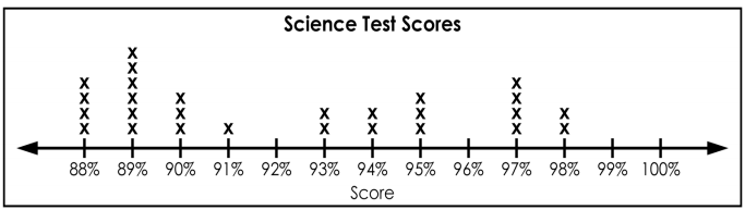
What day had the MOST rain?

1

Monday

2

Tuesday

3

Wednesday

4

Thursday

6

Multiple Choice

Question image

What team scored the MOST slam dunks?

1

Rockets

2

Celtics

3

Bulls

4

Pistons

7

Multiple Choice

Question image

What day was the MOST popcorn sold?

1

Monday

2

Tuesday

3

Wednesday

4

Thursday

8

Multiple Choice

Question image

What does this graph show?

1

Dogs on a leash

2

Students

3

Popcorn sold

4

Teachers

9

Multiple Choice

Question image
How many students take the bus to school?
1
35
2
20
3
10
4
15

10

Multiple Choice

Question image
How many total students are in the science class?
1
13
2
6
3
27
4
25

11

Multiple Choice

Question image
How many students received a score in the 80's?
1
2
2
10
3
14
4
27

12

Multiple Choice

Question image

What percantage people choose zucchini?

1

15%

2

25%

3

30%

4

10%

13

Multiple Choice

Question image

Which superhero is the most popular among fans?

1

Hulk

2

Batgirl

3

Storm

4

Thor

14

Multiple Choice

Question image

What percentage of fans chose

Robin or Batgirl?

1

13% & 11%

2

12% & 15%

3

14% & 15%

4

15% & 15%

15

Multiple Choice

Question image

What percentage does the entire circle graph represent?

1

100%

2

50%

3

25%

4

15%

16

Multiple Choice

Question image

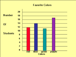
How many more people have purple for a favourite colour than red?

1

3

2

5

3

7

4

9

17

Multiple Choice

Question image

How many students have blue for a favorite colour?

1

11

2

12

3

14

4

17

18

Multiple Choice

Question image
What type of graph is this?
1
Bar Graph
2
Line Plot
3
Pictograph
4
Tally Chart

19

Multiple Choice

Question image

According to this graph, what is the most popular flavor of Jolly Rancher?

1

Cherry

2

Grape

3

Blue Rasberry

4

Watermelon

20

Multiple Choice

Question image

Which month had the greatest number of books read?

1

November

2

December

3

January

4

February

21

Multiple Choice

Question image

The bar graph shows data about the pets owned by math students in four classes. One bar is missing from the graph. If the students have a total of 32 dogs, which bar shows the number of dogs Ms. Davalos's class has?

1
2
3
4

22

Multiple Choice

Question image
Which appliance is used twice as many hours on the weekends as it is on weekdays?
1
Lights
2
Computer
3
Refrigerator
4
Television

Introduction to Data

Slide image

Show answer

Auto Play

Slide 1 / 22

SLIDE