
Math Q4 Week 5
Presentation
•
Mathematics
•
5th Grade
•
Easy

Chatleen Til-adan
Used 2+ times
FREE Resource
14 Slides • 32 Questions
1
Math Q4 Week 5
Organizing, Presenting and Interpreting Data in a Line Graph

2

Study the bar graph below and answer the questions that follow.
3
Multiple Choice

What is the title of the bar graph?
4
Multiple Choice
On what day did the greatest number of learners use the library?
5
Multiple Choice
On what day did the least number of learners use the library?
6
Multiple Choice
On what days did the same number of learners use the library?
7
Multiple Choice
How many learners use the library on Tuesday?
8

9

10

11

12

13

14
Open Ended

15

16

17
Open Ended

What is the title of the graph?
18
Open Ended
What does the scale in the y-axis represents?
19
Open Ended
In which month/s were Kevin’s plant greater than John?
20
Open Ended
In which month/s were Kevin’s plant greater than John?
21
Open Ended

In which month/s were Kevin’s plants less than John?
22
Open Ended

In which month/s were Kevin’s plants less than John
23
Open Ended
Who has fewer plants between the two pupils?
24

25

26
27

28
Multiple Select

Use the tally chart.
Which statement is true?
29
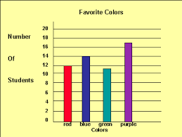
Multiple Select

Use the bar graph.
Which of the following describes how the number of hours changed from Week 1 to Week 4?
30
Multiple Select

Use the tally chart.
Which animal did the most children choose?
31
Multiple Select

Use the bar graph.
Which fruit did the most children choose?
32
Multiple Select

Use the bar graph.
How many balls are in the store?
33
Multiple Select

Use the bar graph.
How many more dolls than blocks are in the store?
34
Multiple Select

Use the bar graph.
Which is the best label for the rows in the bar graph?
35
Multiple Select
36
Multiple Choice

How many people watch basketball and golf?
37
Multiple Choice

What is the total number of girls in class 5 and class 9?
38
Multiple Choice
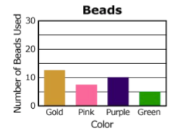
The graph shows the number of colored beads used to make a necklace. How many purple and green beads were used in all?
39
Multiple Choice
40
Multiple Choice

41
Multiple Choice
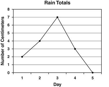
Annie recorded the amount of rain that fell each day. The results are shown in the line graph below. How many centimeters of rain fell on the third day?
42
Multiple Choice

Which month had the biggest difference between the high and low temperatures?
43
Multiple Choice

At what rate did the temperature decrease between the 20th and 25th minutes of the experiment?
44
Multiple Choice

45
Multiple Choice

46
Multiple Choice

How many votes did reading receive?
Math Q4 Week 5
Organizing, Presenting and Interpreting Data in a Line Graph
Show answer
Auto Play
Slide 1 / 46
SLIDE
