Search Header Logo
EOC Data

EOC Data

Assessment

Presentation

Mathematics

8th - 10th Grade

Medium

CCSS
6.SP.B.4, 8.SP.A.4, 2.MD.D.9

+5

Standards-aligned

Created by

Darryl Padgett

Used 5+ times

FREE Resource

11 Slides • 20 Questions

1

EOC Data

by Darryl Padgett

2

What does a Box and Whisker Plot includes?

Other Names:

Lower Extreme = Least Value = Minimum

Lower Quartile = First Quartile = Q1

Median = Q2

Upper Quartile = Third Quartile = Q3

Upper Extreme = Greatest Value = Maximum

media

3

media

4

Box and Whisker Plots

media

5

Five Number Summary

A box and whisker is created from five numbers called the Five Number Summary. This includes the Median, the lower quartile (Q1) , the upper quartile (Q3), the minimum (lowest number), and maximum (highest number).

media

6

Multiple Choice

Question image

Given the following box plot, what are the median, lower, and upper quartiles? 

1

11.5, 14, and 16 

2

12, 16, and 18 

3

12, 12.7, and 15 

4

11, 14, and 20 

7

Multiple Choice

Question image

Mrs. Johnson created this histogram of her 3rd period students’ test scores.  Which figure best describes the data?

1
2
3
4

8

Multiple Choice

Question image
How many cities have temperatures between 70 degrees and 99 degrees?
1
44
2
34
3
26
4
62

9

Multiple Choice

Question image

Members of the cross-country teams ran an obstacle course. The table shows the times, in minutes and seconds. Which Histogram represents the times from Team R on the obstacle course? 

1
2
3
4

10

Multiple Choice

Question image

The distributions of two classes’ final exam scores are shown.  Which statement about the box-and-whisker plots is true? 

1

50% of the scores for Mr. Smith’s class are between 65 and 80. 

2

50% of the scores for Mrs. Jones’ class are between 80 and 100. 

3

The median scores for the two classes are the same. 

4

The interquartile range of scores for Mr. Smith’s class is greater than the interquartile range of the scores for Mrs. Jones’ class. 

11

media

12

Dotplot

Quantitative data in a single variable is often collected in order to understand how a characteristic of a group differs amongst the group members or between groups.

media

13

Multiple Choice

Which of the following is the dot plot for the data: 8, 7, 6, 10, 5, 6, 6, 6, 8, 8. 

1
2
3
4

14

Multiple Choice

Question image
How many students spent 7 hours doing homework that week?
1
1
2
3
3
5
4
6

15

Multiple Choice

Question image
How many people have two or less books in their desk?
1
4
2
5
3
6
4
7

16

Multiple Select

Question image

A random sample of 200 teenagers participated in a taste test. Each teenager sampled four choices of fruit drink (labeled “A”, “B”, “C”, and “D”), and then were asked to pick a favorite. The table shows the results of this taste test. Based on the information given, which of the given statements are true? Select ALL that apply. 

1

40% of the participants were girls 

2

70% of the participants preferred “A” 

3

20120\frac{20}{120}  of the boys preferred “D” 

4

1035\frac{10}{35}  of the participants who preferred “B” were girls 

5

The proportion of boys who preferred “C” is equal to the proportion of girls who preferred “C” 

17

Multiple Choice

Question image

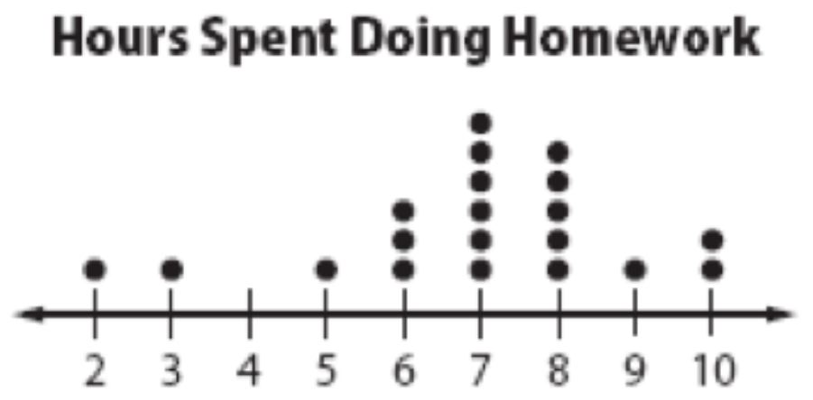
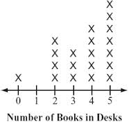
What type of Data Display is this?

1

Stem & Leaf Plot

2

Histogram

3

Line Plot

4

Bar Graph

18

Multiple Choice

Question image

This is an example of a

1

histogram

2

dot plot

3

frequency table

4

relative frequency table

19

Multiple Choice

Question image

How many total people were surveyed?

1

224

2

448

3

131

4

146

20

Multiple Choice

Question image

What percentage of SUV's are driven by women?

1

56.25%

2

75%

3

83.25%

4

86.5%

21

Multiple Choice

Question image

A radio station did a survey to determine what kind of music to play by taking a sample of middle school, high school, and college students. They were asked which of three different types of music they prefer on the radio: hip-hop, alternative, or classic rock.  What percentage of college students prefer classic rock? 

1

14%

2

28%

3

33%

4

58%

22

Multiple Choice

Question image

What type of function would be better to model the data?

1

Exponential

2

Linear

3

Quadratic

23

Fill in the Blank

Type answer...

24

Multiple Choice

Question image

The scatterplot below represents the forearm lengths and foot lengths of 10 people. Based on a linear model of the data, which is the best prediction for the length of a person’s foot if his/her forearm length is 21 centimeters? 

1

19 cm

2

20 cm

3

22 cm

4

24 cm

25

media

26

media

27

Multiple Choice

Question image

The line of best fit for the scatterplot is y = 1.4x +2.9.

What is the residual for the point (4, 10)? 

1

-1.5

2

1.5

3

8.5

4

10

28

media

29

media

30

Multiple Choice

Question image

The correlation coefficient between two variables is 0.9.

How would you describe this value? 

1

Strong and positive 

2

Strong and negative 

3

Weak and positive 

4

Weak and negative 

31

Multiple Choice

Question image

The following figure displays a graph showing GPA and SAT score. Based on the scatter plot, which of the following is the best assumption about the correlation between the variables? 

1

Positive linear correlation 

2

No correlation 

3

Negative linear correlation 

4

Exponential correlation 

EOC Data

by Darryl Padgett

Show answer

Auto Play

Slide 1 / 31

SLIDE