
6.12A Data Displays
Presentation
•
Mathematics
•
6th Grade
•
Medium
+3
Standards-aligned

Angie Kemp
Used 22+ times
FREE Resource
6 Slides • 24 Questions
1
2

3
Multiple Choice

Which of the following stem-and-leaf plots best represents the table?
4
Multiple Choice

Which stem-and-leaf plot accurately displays the data values 3, 28, 25, 28, 36, 4, 22, and 31?
5
Multiple Choice
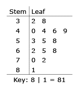
32, 38, 40, 44, 44, 46, 49, 53, 55, 58, 62, 65, 68, 70, 72, 81
He put the data in a stem-and-leaf plot. What number did he leave out of the stem-and-leaf plot?
6
Multiple Choice

Which stem-and-leaf represents this data?
7

8
Multiple Choice

What is the difference between the medians for the two data sets?
9
Multiple Choice

Which stem and leaf plot best represents the data in the line plot?
10
Multiple Choice

11
Multiple Choice

The frequency table shows the hours students were doing their math homework. Which dot plot best represents the data on the table?
12
Multiple Choice

Which display allows you to tell the MODE of the data?
13

14
Multiple Choice

15
Multiple Choice

The frequency table shows the times (in seconds) that it takes for several students to run 40 yards.
Which histogram correctly displays the data?
16
Multiple Choice

The amount of items that each student sold for the class fundraiser was recorded.Which stem-and-leaf plot represents the same data represented in the histogram?
17
Multiple Choice

The histogram shows the ages of the customers in a grocery store.
Which frequency chart could be best represented by the histogram?
18
Multiple Choice

Which histogram best represents the data in the table?
19
Multiple Choice

Which histogram displays all the data in the table correctly?
20

21
Multiple Choice

Which of the displays allows you to easily find the MEDIAN of the data?
22
Multiple Choice

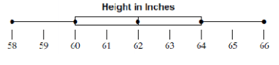
Is the box-and-whisker plot of the data values 63, 65, 79, 60, 69, 73, 78, 67, and 74 correct?
23
Multiple Choice
24
Multiple Choice
25
Multiple Choice

Which box and whisker plot best represents the data set?
26
Multiple Choice

The list shows the points earned by 12 students during a review game. Which box plot best displays this data?
27

28
Multiple Choice

Which table could be represented by the percentage bar graph
29
Multiple Choice

The table shows the results of a survey, used to create a bar graph. Which percentage bar graph best represents the data?
30
Multiple Choice

Which percentage bar graph best represents the data?
Show answer
Auto Play
Slide 1 / 30
SLIDE
