Search Header Logo
Unit 9 Review

Unit 9 Review

Assessment

Presentation

Mathematics

9th - 12th Grade

Medium

Created by

Christine Richmond

Used 12+ times

FREE Resource

10 Slides • 33 Questions

1

​Unit 9 Review

2

3

Multiple Choice

Find the mean of the numbers below:


12, 8, 14, 5, 1, 3, 0, 8, 10, 11

1

7.2

2

8

3

9

4

7.4

4

Multiple Choice

What is the standard deviation for the data given:

5, 10, 7, 12, 0, 20, 15, 22, 8, 2

1

6.89

2

10.1

3

7.26

4

9

5

​Understanding Standard Deviation

6

Definition

media

7

Multiple Choice

Four data sets are shown below.
Set 1: {10, 19, 38, 50, 51}
Set 2: {5, 21, 26, 39, 51}
Set 3: {9, 38, 50, 50, 51}
Set 4: {5, 28, 28, 28, 51}
Which data set has the largest standard deviation?
1

Set 1

2

Set 2

3

Set 3

4

Set 4

8

Multiple Choice

All of the below sets have the same mean.
Set 1-Standard Deviation=3.1
Set 2-Standard Deviation=4.9
Set 3-Standard Deviation=1.7
Set 4-Standard Deviation=3.2
Which set of data probably has the points closest to the mean?
1

1

2

2

3

3

4

4

9

Multiple Choice

Question image

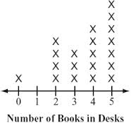
Which measure of central tendency would best represent this data?

1

Mean

2

Median

3

Mode

4

Range

10

Multiple Choice

Four data sets are shown below.
Set 1: {10, 19, 38, 50, 51}
Set 2: {5, 21, 26, 39, 51}
Set 3: {9, 38, 50, 50, 51}
Set 4: {5, 28, 28, 28, 51}
Which data set has the largest standard deviation?
1

Set 1

2

Set 2

3

Set 3

4

Set 4

11

Multiple Choice

Question image
The dot plots compare the number of raffle tickets sold by boys and girls during a school fund-raiser. Which plot has an outlier? 
1

Girls

2

Boys

3

Both Plots

4

Neither

12

​Compare and Analyze Data

13

Multiple Choice

Question image
What is the difference between the medians for the two data sets? 
1

0 tickets

2

2 tickets

3

4 tickets

4

6 tickets

14

Multiple Choice

Question image
What is the range in gas mileage for cars?
1

2

2

3

3

4

4

6

15

Multiple Choice

Question image
Is the Cars dot plot skewed left or right?
1

left

2

right

16

Multiple Choice

Question image

The double dot plots show the average wait times in minutes for two popular rides at an amusement park. Compare the measures of center and variation, which ride typically has a longer wait time?

1

No inference can be made from the graph.

2

Topsy Turvy

3

The wait times are the same for both rides.

4

Rocket Blast

17

Multiple Choice

Question image

What is the IQR of the Cruisers?

1

4

2

6

3

13

4

9

18

Multiple Choice

Question image

Mary is recording her plant's growth in a journal. How many inches has the plant grown from week 1 to 7?

1

22

2

18

3

14

19

Multiple Choice

Question image
How many people have two or less books in their desk?
1

4

2

5

3

6

4

7

20

Multiple Choice

Question image

Which statement best describes this graph?

1

There is a peak at 47.

2

There is a cluster around 38-40.

3

The mode is 40.

4

There is a gap in the data between 39-40.

21

Multiple Choice

Question image

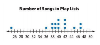
What type of shape does the following graph have?

1

Skewed Right

2

Symmetric

3

Skewed Left

4

Uniform

22

media

Appropriate Measures of Center and

Variation

The shape of the distribution determines which measure of center
and variability are best.

Use the mean and standard deviation for distributions that are
unimodal and roughly symmetric.

Use the median and IQR for distributions with skewness or outliers.

The median and IQR are resistant to (unaffected by) outliers.

23

Drag and Drop

Question image
This distribution is ​
so we should use the ​
as a measure of center.
Drag these tiles and drop them in the correct blank above
right skewed
median
fairly symmetric
left skewed
mean
standard deviation
range
mode

24

Drag and Drop

Question image
This distribution is ​
so we should use the ​
as a measure of center and the ​
as a measure of variability.
Drag these tiles and drop them in the correct blank above
fairly symmetric
mean
standard deviation
left skewed
range
mode
median
IQR
right skewed

25

​Line that Best Fits

26

27

Multiple Choice

Question image
Based on the scatterplot, what is the best prediction of the average amount of money spent on groceries for a household of 7 people?
1

$240

2

$190

3

$210

4

$300

28

Multiple Choice

Question image
Which of the following lines represents the line of best fit for the scatter plot?
1

A

2

B

3

C

4

D

29

Multiple Choice

Question image
As the age of the car increases, its value decreases. Which scatter plot represents this relationship?
1

A

2

B

3

C

4

D

30

Open Ended

Question image

 A) What is the line of best fit?

31

Multiple Choice

Question image

 B) What is the correlation coefficient, r? (Round to the nearest hundreth.)

1

r=0.5r=0.5  

2

r=0.67r=-0.67  

3

r=0.32r=-0.32  

32

Open Ended

Question image

 A) What is the line of best fit?

33

Multiple Choice

Question image
the slope is -5/7, what does that mean?
1

gain 5 hour of sleep for 7 cups of coffee

2

lose 5 hours of sleep for 7 cups of coffee

3

lose 7 cups of coffee for 5 hours of sleep

4

lose 5 cups of coffee for 7 hours of sleep

34

Multiple Choice

Question image

What is the correlation coefficient of the data characteristics shown?

1

-.928

2

.928

3

.861

4

-.861

35

Match

Match the following

Non-linear Correlation

No Correlation

Positive, Linear Correlation

Negative, Linear Correlation

36

Reorder

Order the scatterplots from STRONGEST to WEAKEST correlation coefficients

1
2
3
4

37

​Correlation & Causation

38

Multiple Choice

This implies that one variable has a direct affect on the other variable.
1

Correlation

2

Causation

39

Multiple Choice

A correlation shows that two things

1

Are Related

2

Cause Each Other to Happen

3

Are Unrelated

40

Multiple Choice

Correlation or Causation?

When it rains several inches, the water level of a lake increases

1

Correlation

2

Causation

41

Multiple Choice

Which example shows CAUSATION?

1

Taller people have larger shoe sizes and shorter people have smaller shoe sizes.

2

If you exercise, the calories burned per minute increases.

42

Multiple Choice

Which example shows a CORRELATION?
1

It rained and the ground is wet.

2

Ice cream sales increase as temperature increases.

43

​Unit 9 Review

Show answer

Auto Play

Slide 1 / 43

SLIDE