
QUIZ ////2-27-25
Presentation
•
Mathematics
•
6th Grade
•
Hard
Standards-aligned

Vanessa Trevino
FREE Resource
8 Slides • 35 Questions
1
Match
2
Multiple Choice

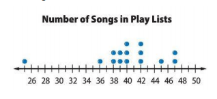
Which stem and leaf plot best represents the data in the line plot?
3
Multiple Choice

4
Multiple Choice

5
Multiple Choice

6
Multiple Choice

7
Multiple Choice

8
Multiple Choice

9
Multiple Choice

10
Multiple Choice

11
Multiple Choice
12
Multiple Choice

13
Multiple Choice

14
Multiple Choice

15
Multiple Choice

16
Multiple Choice
17
Multiple Choice

18
Multiple Choice

Which interval shows the greatest number of pets?
19
Multiple Choice

True or False? Over 50% of the students watch between 5 and 14 hours of television on the weekend?
20
Multiple Choice

The data display above is misleading. What do you think is the best data display for replacing the bar graph above?
21
Multiple Select

Group A and Group B were randomly sampled from the same population. Which statements below are true? Select all that apply.
22
Multiple Choice

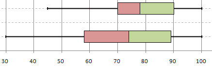
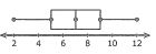
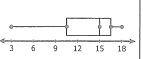
Mykel surveyed 15 7th graders and 15 8th graders at his school to see how many hours they spend per day listening to music. He made two box plots to compare the data sets. What inference can he draw from the data sets?
23
Multiple Choice
24

25

26
27


28


29
Multiple Choice
What is the shape of the data?
30
Multiple Choice
What is the shape of the data?
31
Multiple Select

What is shape of the data?
32
Multiple Choice

What is the shape of the data?
33
Multiple Choice
What is the shape of the distribution?
34
Multiple Choice
35
Multiple Choice
36


37
38


39
Multiple Choice
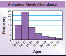
Which statement best describes this graph?
40
Multiple Choice

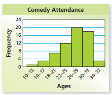
Which statement best describes this graph?
41
Multiple Choice

Which statement best describes the graph?
42
Multiple Choice

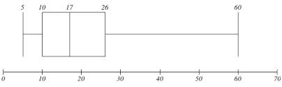
What is the spread of the data?
43
Multiple Choice

Where is the gap in the data?
Show answer
Auto Play
Slide 1 / 43
MATCH
