
Data Analysis Quest
Presentation
•
Mathematics
•
6th - 8th Grade
•
Medium
+23
Standards-aligned

Zachary Prince
Used 1+ times
FREE Resource
27 Slides • 54 Questions
1
2


3
4
Multiple Choice

Which of the following is a statistical question?
5
Multiple Select
Which of the following are statistical questions? Select all that apply.
6

7

8

9

10
Match

Match each type of data display with its name:
11


12

13


14
Multiple Choice

15
Multiple Choice

16
Multiple Choice

17
Multiple Choice

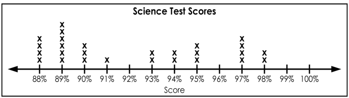
Describe the shape of the distribution.
18
Multiple Choice

Describe the shape of the distribution.
19

20
21

22

23

24

25
Fill in the Blanks

Type answer...
26
Fill in the Blanks

Type answer...
27
Fill in the Blanks
Type answer...
28
Fill in the Blanks
Type answer...
29
Fill in the Blanks

Type answer...
30
Multiple Choice
Which best describes the distribution of the data?
31
Fill in the Blanks
Type answer...
32
Fill in the Blanks
Type answer...
33
Fill in the Blanks
Type answer...
34
Multiple Choice
Which best describes the distribution of this data?
35
Multiple Choice
How many students took the quiz? (count the dots)
36
Fill in the Blanks
Type answer...
37
Fill in the Blanks

Type answer...
38
Multiple Choice
What is the outlier of the data set?
39
Fill in the Blanks

Type answer...
40
Multiple Choice
What is the mode?
41
Multiple Select
Which two of the following are gaps in the data distribution?
42
Fill in the Blanks
Type answer...
43
Multiple Choice

44
Multiple Choice

45
Multiple Choice

What is the highest score in the class?
46
Multiple Choice
47
Multiple Choice
48
Multiple Choice

The frequency table shows the times (in seconds) that it takes for several students to run 40 yards.
Which histogram correctly displays the data?
49
Multiple Choice

The histogram shows the ages of the customers in a grocery store.
Which frequency chart could be best represented by the histogram?
50
Multiple Choice
51
Multiple Choice

Which box and whisker plot best represents the data set?
52
53

54

55
Multiple Choice

What day were the least amount of cars sold?
56
Multiple Choice

The dot plot show the distances, in miles cyclists completed on Saturday. How many cyclists went at least 11 miles?
57

58
59
60
Fill in the Blanks

Type answer...
61
Fill in the Blanks
Type answer...
62
Multiple Choice

Which interval contains exactly 4 students?
63
Multiple Choice
Describe the shape of the data distribution:
64
Multiple Choice

Which histogram matches the data set? (Hint: the greatest number 49.)
65

66
67

68
69
Multiple Choice

What is the median of the data represented by the box plot?
70
Multiple Choice
71
Fill in the Blanks

Type answer...
72
Fill in the Blanks
Type answer...
73
Fill in the Blanks
Type answer...
74
Fill in the Blanks
Type answer...
75
Multiple Choice
What percentage of the data is contained between Q1 and Q3?
76
Fill in the Blanks

Type answer...
77
Match

Match the following using the box plot example:
78
Match

Based on the box plot example, match the following:
79
Fill in the Blanks
Type answer...
80
Fill in the Blanks
Type answer...
81
Show answer
Auto Play
Slide 1 / 81
SLIDE
