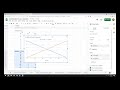
Creating a Supply and Demand Graph in Google Sheets
Interactive Video
•
Computers, Business, Economics, Instructional Technology
•
7th - 12th Grade
•
Practice Problem
•
Medium

Sophia Harris
Used 5+ times
FREE Resource
Read more
10 questions
Show all answers
1.
MULTIPLE CHOICE QUESTION
30 sec • 1 pt
What is the main focus of the video tutorial?
Designing a presentation in Google Slides
Learning advanced Excel functions
Making a supply and demand graph in Google Sheets
Creating a budget in Google Sheets
2.
MULTIPLE CHOICE QUESTION
30 sec • 1 pt
What are the two main variables used in the supply and demand graph?
Profit and Loss
Supply and Demand
Cost and Revenue
Price and Quantity
3.
MULTIPLE CHOICE QUESTION
30 sec • 1 pt
What should you do after setting up the data for quantity demanded and supplied?
Print the sheet
Share the document
Save the file
Insert a chart
4.
MULTIPLE CHOICE QUESTION
30 sec • 1 pt
What is the first step in customizing the chart in Google Sheets?
Changing the chart type
Adding a title
Adjusting the axis labels
Inserting data points
5.
MULTIPLE CHOICE QUESTION
30 sec • 1 pt
How can you modify the demand curve in the graph?
By adding more data points
By changing the axis labels
By adjusting the prices
By changing the chart type
6.
MULTIPLE CHOICE QUESTION
30 sec • 1 pt
What happens when you change the quantities in the data?
The chart type changes
The graph remains the same
The supply curve adjusts
The demand curve adjusts
7.
MULTIPLE CHOICE QUESTION
30 sec • 1 pt
What is the significance of the point where the supply and demand curves cross?
It represents the total revenue
It shows the equilibrium price
It marks the lowest quantity
It indicates the highest price
Access all questions and much more by creating a free account
Create resources
Host any resource
Get auto-graded reports
Continue with Google

Continue with Email
Continue with Classlink
Continue with Clever
or continue with
Microsoft
%20(1).png)
Apple
Others
Already have an account?
Popular Resources on Wayground

15 questions
Fractions on a Number Line
Quiz
•
3rd Grade
20 questions
Equivalent Fractions
Quiz
•
3rd Grade
25 questions
Multiplication Facts
Quiz
•
5th Grade
29 questions
Alg. 1 Section 5.1 Coordinate Plane
Quiz
•
9th Grade
22 questions
fractions
Quiz
•
3rd Grade
11 questions
FOREST Effective communication
Lesson
•
KG
20 questions
Main Idea and Details
Quiz
•
5th Grade
20 questions
Context Clues
Quiz
•
6th Grade