Graphing Concepts and Data Interpretation
Interactive Video
•
Mathematics
•
5th Grade
•
Practice Problem
•
Hard

Thomas White
FREE Resource
Read more
15 questions
Show all answers
1.
MULTIPLE CHOICE QUESTION
30 sec • 1 pt
What is the primary purpose of a line graph?
To display data in a circular format
To show how data changes over time
To list data in a table
To compare data using bars
2.
MULTIPLE CHOICE QUESTION
30 sec • 1 pt
What does a line graph use to show data changes?
Dots
Line segments
Pie slices
Bars
3.
MULTIPLE CHOICE QUESTION
30 sec • 1 pt
What is a scale in the context of graphs?
A tool to measure weight
A series of numbers at even distances
A method to calculate averages
A type of graph
4.
MULTIPLE CHOICE QUESTION
30 sec • 1 pt
Why should intervals on a graph's scale be equal?
To make the graph look symmetrical
To highlight specific data points
To ensure accurate representation of data changes
To simplify the graph
5.
MULTIPLE CHOICE QUESTION
30 sec • 1 pt
What is the role of intervals in a graph?
To separate different data sets
To indicate the time of day
To show equal differences between values
To show the total data
6.
MULTIPLE CHOICE QUESTION
30 sec • 1 pt
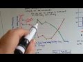
In what year were American Bison and lions both at 100% population?
1850
1900
1800
1950
7.
MULTIPLE CHOICE QUESTION
30 sec • 1 pt
By 1950, what was the status of the lion population compared to American Bison?
Lions were extinct
Lions had increased in number
Lions were more numerous than Bison
Lions were at the same level as Bison
Access all questions and much more by creating a free account
Create resources
Host any resource
Get auto-graded reports
Continue with Google

Continue with Email
Continue with Classlink
Continue with Clever
or continue with
Microsoft
%20(1).png)
Apple
Others
Already have an account?
Similar Resources on Wayground
Popular Resources on Wayground

15 questions
Fractions on a Number Line
Quiz
•
3rd Grade
20 questions
Equivalent Fractions
Quiz
•
3rd Grade
25 questions
Multiplication Facts
Quiz
•
5th Grade
54 questions
Analyzing Line Graphs & Tables
Quiz
•
4th Grade
22 questions
fractions
Quiz
•
3rd Grade
20 questions
Main Idea and Details
Quiz
•
5th Grade
20 questions
Context Clues
Quiz
•
6th Grade
15 questions
Equivalent Fractions
Quiz
•
4th Grade
Discover more resources for Mathematics
25 questions
Multiplication Facts
Quiz
•
5th Grade
10 questions
Multiplying Fractions
Quiz
•
5th Grade
15 questions
Rounding Decimals
Quiz
•
5th Grade
16 questions
Volume of Rectangular Prisms and Cubes
Quiz
•
5th Grade
15 questions
Converting Mixed Numbers and Improper Fractions
Quiz
•
4th - 5th Grade
15 questions
Adding and Subtracting Fractions - Unlike denominators
Quiz
•
5th Grade
10 questions
Multiplying Fractions
Quiz
•
5th Grade
20 questions
One Step equations addition and subtraction
Quiz
•
5th - 8th Grade