Exploring Dot Plots and Frequency Tables
Interactive Video
•
Mathematics
•
6th - 10th Grade
•
Practice Problem
•
Medium
+3
Standards-aligned

Mia Campbell
Used 4+ times
FREE Resource
Standards-aligned
Read more
10 questions
Show all answers
1.
MULTIPLE CHOICE QUESTION
30 sec • 1 pt
What is a dot plot?
A bar graph representation
A table showing data distribution
A graph of quantitative data using dots above a number line
A type of pie chart
Tags
CCSS.6.SP.B.4
CCSS.HSS.ID.A.1
2.
MULTIPLE CHOICE QUESTION
30 sec • 1 pt
What does a frequency table display?
Correlations between two variables
Predictions based on past data
The distribution of quantitative data using groups and tallies
The mean, median, and mode of data
Tags
CCSS.6.SP.B.5A
3.
MULTIPLE CHOICE QUESTION
30 sec • 1 pt
How should data be organized before creating a dot plot?
Randomly
From greatest to least
From least to greatest
Alphabetically
Tags
CCSS.2.MD.D.9
4.
MULTIPLE CHOICE QUESTION
30 sec • 1 pt
How many values should you have after ordering the data from least to greatest?
16
15
14
The same number as the original data set
Tags
CCSS.6.SP.B.5A
5.
MULTIPLE CHOICE QUESTION
30 sec • 1 pt
What is the first step in creating a dot plot?
Calculating the mean of the data
Placing dots directly over the corresponding numbers on a number line
Labeling the x-axis with data categories
Drawing a bar for each data point
Tags
CCSS.6.SP.B.4
CCSS.HSS.ID.A.1
6.
MULTIPLE CHOICE QUESTION
30 sec • 1 pt
How many dots should be placed over the number 13 if it appears four times in the data set?
Three
Four
Five
Two
Tags
CCSS.2.MD.D.9
7.
MULTIPLE CHOICE QUESTION
30 sec • 1 pt
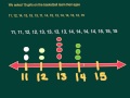
Why don't we start the number line at 0 when creating a dot plot for the given data?
To save space
Because the lowest value in the data is 11
To make the plot look more complex
It's a common mistake
Tags
CCSS.3.MD.B.4
Access all questions and much more by creating a free account
Create resources
Host any resource
Get auto-graded reports
Continue with Google

Continue with Email
Continue with Classlink
Continue with Clever
or continue with
Microsoft
%20(1).png)
Apple
Others
Already have an account?
Popular Resources on Wayground

15 questions
Fractions on a Number Line
Quiz
•
3rd Grade
20 questions
Equivalent Fractions
Quiz
•
3rd Grade
25 questions
Multiplication Facts
Quiz
•
5th Grade
29 questions
Alg. 1 Section 5.1 Coordinate Plane
Quiz
•
9th Grade
22 questions
fractions
Quiz
•
3rd Grade
11 questions
FOREST Effective communication
Lesson
•
KG
20 questions
Main Idea and Details
Quiz
•
5th Grade
20 questions
Context Clues
Quiz
•
6th Grade
Discover more resources for Mathematics
29 questions
Alg. 1 Section 5.1 Coordinate Plane
Quiz
•
9th Grade
36 questions
6th Grade Math STAAR Review
Quiz
•
6th Grade
14 questions
Volume of rectangular prisms
Quiz
•
7th Grade
14 questions
finding slope from a graph
Quiz
•
8th Grade
20 questions
Graphing Inequalities on a Number Line
Quiz
•
6th - 9th Grade
23 questions
Solve and Graph Inequalities
Quiz
•
6th Grade
15 questions
Distributive Property & Review
Quiz
•
6th Grade
10 questions
Mean, Median, Mode, and Range
Quiz
•
7th Grade