Understanding Box Plots and Salary Comparisons
Interactive Video
•
Mathematics, Education
•
6th - 10th Grade
•
Practice Problem
•
Hard
+2
Standards-aligned

Lucas Foster
FREE Resource
Standards-aligned
Read more
7 questions
Show all answers
1.
MULTIPLE CHOICE QUESTION
30 sec • 1 pt
What is the purpose of a box plot in data analysis?
To show the average of a dataset
To compare two datasets directly
To calculate the standard deviation
To display the distribution of data based on a five-number summary
Tags
CCSS.6.SP.B.5A
2.
MULTIPLE CHOICE QUESTION
30 sec • 1 pt
Which of the following is NOT part of the five-number summary?
Minimum
Mean
Median
Maximum
Tags
CCSS.6.SP.B.4
CCSS.HSS.ID.A.1
3.
MULTIPLE CHOICE QUESTION
30 sec • 1 pt
How is the data divided in a box plot?
Into three equal parts
Into four quartiles
Into five sections
Into two halves
4.
MULTIPLE CHOICE QUESTION
30 sec • 1 pt
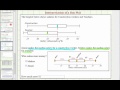
What is Jenny's annual salary as a construction worker?
$45,000
$40,000
$35,000
$30,000
5.
MULTIPLE CHOICE QUESTION
30 sec • 1 pt
What is Marco's annual salary as a teacher?
$45,000
$30,000
$35,000
$40,000
Tags
CCSS.8.SP.A.1
6.
MULTIPLE CHOICE QUESTION
30 sec • 1 pt
Who earns more between Jenny and Marco?
Cannot be determined
Both earn the same
Marco
Jenny
Tags
CCSS.4.OA.A.3
7.
MULTIPLE CHOICE QUESTION
30 sec • 1 pt
How much more does Jenny earn compared to Marco?
$6,000
$5,000
$4,000
$3,000
Tags
CCSS.4.OA.A.3
Access all questions and much more by creating a free account
Create resources
Host any resource
Get auto-graded reports
Continue with Google

Continue with Email
Continue with Classlink
Continue with Clever
or continue with
Microsoft
%20(1).png)
Apple
Others
Already have an account?
