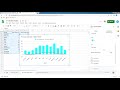
Creating and Analyzing Climate Graphs
Interactive Video
•
Computers, Science, Geography
•
9th - 10th Grade
•
Practice Problem
•
Hard

Patricia Brown
FREE Resource
Read more
10 questions
Show all answers
1.
MULTIPLE CHOICE QUESTION
30 sec • 1 pt
What is the first step in creating a climate graph in Google Sheets?
Insert a chart
Set the axis titles
Enter data into the spreadsheet
Customize the chart style
2.
MULTIPLE CHOICE QUESTION
30 sec • 1 pt
Which button do you click to insert a chart in Google Sheets?
View
Insert
Edit
File
3.
MULTIPLE CHOICE QUESTION
30 sec • 1 pt
What should the x-axis represent in a climate graph?
Precipitation
Temperature
Year
Month
4.
MULTIPLE CHOICE QUESTION
30 sec • 1 pt
How should temperature data be displayed in the climate graph?
As a pie chart
As a scatter plot
As a line
As columns
5.
MULTIPLE CHOICE QUESTION
30 sec • 1 pt
What color is recommended for displaying temperature in the graph?
Blue
Green
Red
Yellow
6.
MULTIPLE CHOICE QUESTION
30 sec • 1 pt
Where should precipitation data be graphed in terms of axis?
Right axis
Left axis
Top axis
Bottom axis
7.
MULTIPLE CHOICE QUESTION
30 sec • 1 pt
What is the recommended maximum value for the vertical axis representing precipitation?
110
100
120
130
Access all questions and much more by creating a free account
Create resources
Host any resource
Get auto-graded reports
Continue with Google

Continue with Email
Continue with Classlink
Continue with Clever
or continue with
Microsoft
%20(1).png)
Apple
Others
Already have an account?
