Understanding Histograms and Frequency Tables
Interactive Video
•
Mathematics
•
6th - 7th Grade
•
Practice Problem
•
Hard

Patricia Brown
FREE Resource
Read more
10 questions
Show all answers
1.
MULTIPLE CHOICE QUESTION
30 sec • 1 pt
What is the frequency of an event?
The number of times it is predicted to occur
The number of times it should occur
The number of times it actually occurs
The number of times it is expected to occur
2.
MULTIPLE CHOICE QUESTION
30 sec • 1 pt
How are intervals determined in a frequency table?
By using the smallest and largest data points
By dividing the range by the desired number of intervals
By choosing random numbers
By dividing the range by the number of data points
3.
MULTIPLE CHOICE QUESTION
30 sec • 1 pt
How do you determine the number of intervals in a frequency table?
By using the average of the data points
By selecting the largest data point
By dividing the range by a chosen number of intervals
By dividing the total number of data points by the range
4.
MULTIPLE CHOICE QUESTION
30 sec • 1 pt
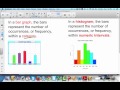
What is a key difference between a bar graph and a histogram?
Bar graphs represent intervals, histograms represent categories
Histograms have touching bars, bar graphs do not
Bar graphs have touching bars, histograms do not
Histograms are always taller than bar graphs
5.
MULTIPLE CHOICE QUESTION
30 sec • 1 pt
Why do histograms have no gaps between bars?
To save space on the graph
To make them look more appealing
To show that they represent continuous data
To confuse the viewer
6.
MULTIPLE CHOICE QUESTION
30 sec • 1 pt
What does the height of a bar in a histogram represent?
The total number of data points
The frequency of data within that interval
The range of the data
The average value of the data
7.
MULTIPLE CHOICE QUESTION
30 sec • 1 pt
What is the purpose of a jagged line in a histogram?
To indicate a break in the data
To show the highest frequency
To separate different categories
To make the graph more compact
Access all questions and much more by creating a free account
Create resources
Host any resource
Get auto-graded reports
Continue with Google

Continue with Email
Continue with Classlink
Continue with Clever
or continue with
Microsoft
%20(1).png)
Apple
Others
Already have an account?
