Scatter Plot and Trendline Techniques
Interactive Video
•
Mathematics, Computers, Instructional Technology
•
9th - 10th Grade
•
Practice Problem
•
Hard

Patricia Brown
FREE Resource
Read more
10 questions
Show all answers
1.
MULTIPLE CHOICE QUESTION
30 sec • 1 pt
What is the main purpose of this tutorial?
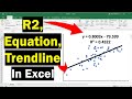
To understand how to add a trendline, equation, and R-squared value to a scatter plot
To explore different types of graphs in Excel
To learn how to use Excel for data entry
To learn how to create a pie chart in Excel
2.
MULTIPLE CHOICE QUESTION
30 sec • 1 pt
What data is used in the example to create a scatter plot?
Time and distance data
Height and weight measures from 49 participants
Temperature and humidity data
Sales and revenue data
3.
MULTIPLE CHOICE QUESTION
30 sec • 1 pt
Which tab in Excel is used to insert a scatter plot?
Data
Insert
View
Home
4.
MULTIPLE CHOICE QUESTION
30 sec • 1 pt
What is one method to add a trendline to a scatter plot?
Using the Home tab
Inserting a new chart
Right-clicking on the data points and selecting 'Add Trendline'
Using the Data tab
5.
MULTIPLE CHOICE QUESTION
30 sec • 1 pt
How can you customize the appearance of a trendline?
By changing the data source
By adding more data points
By adjusting the chart type
By selecting the line and using the Format tab to change color, style, and thickness
6.
MULTIPLE CHOICE QUESTION
30 sec • 1 pt
How do you add the equation of the line to the scatter plot?
By selecting 'Add Equation' from the Insert tab
By right-clicking the trendline and selecting 'Format Trendline', then choosing 'Display Equation on Chart'
By typing it manually into a text box
By using the Data Analysis tool
7.
MULTIPLE CHOICE QUESTION
30 sec • 1 pt
What can you do to change the appearance of the equation on the chart?
Add more data points
Use the Insert tab to add a new equation
Change the chart type
Use the Home tab to make it bold and increase the font size
Access all questions and much more by creating a free account
Create resources
Host any resource
Get auto-graded reports
Continue with Google

Continue with Email
Continue with Classlink
Continue with Clever
or continue with
Microsoft
%20(1).png)
Apple
Others
Already have an account?
