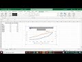
Plotting Data with Dual Axes
Interactive Video
•
Computers, Science, Mathematics
•
9th - 10th Grade
•
Practice Problem
•
Hard

Patricia Brown
FREE Resource
Read more
10 questions
Show all answers
1.
MULTIPLE CHOICE QUESTION
30 sec • 1 pt
What is the primary focus of the tutorial video?
Formatting cells in Excel
Using Excel for data entry
Plotting a line graph with two vertical y-axes
Creating a pie chart in Excel
2.
MULTIPLE CHOICE QUESTION
30 sec • 1 pt
Why is it not ideal to plot lactate and heart rate data on a single axis?
The heart rate data is too small compared to lactate
It is difficult to add markers
The lactate data appears as a steady line due to its small values
It makes the graph too colorful
3.
MULTIPLE CHOICE QUESTION
30 sec • 1 pt
What type of chart is recommended for plotting lactate and heart rate data?
Scatter plot
Bar chart
Pie chart
Line chart
4.
MULTIPLE CHOICE QUESTION
30 sec • 1 pt
How do you highlight the data in Excel before plotting?
Right-click and select 'Highlight'
Double-click the data
Use the 'Highlight' button in the toolbar
Click and drag the mouse over the data
5.
MULTIPLE CHOICE QUESTION
30 sec • 1 pt
What is the first step to format the heart rate data to use a secondary axis?
Click on the lactate line
Click on the heart rate line
Select 'Insert' from the menu
Change the chart type
6.
MULTIPLE CHOICE QUESTION
30 sec • 1 pt
What option should you select to move the heart rate data to a secondary axis?
Primary Axis
No Axis
Secondary Axis
Tertiary Axis
7.
MULTIPLE CHOICE QUESTION
30 sec • 1 pt
What is a good practice when finalizing a graph in Excel?
Avoiding any titles
Using only one color for all lines
Adding titles to both axes
Using a pie chart for clarity
Access all questions and much more by creating a free account
Create resources
Host any resource
Get auto-graded reports
Continue with Google

Continue with Email
Continue with Classlink
Continue with Clever
or continue with
Microsoft
%20(1).png)
Apple
Others
Already have an account?
Similar Resources on Wayground

11 questions
Graphing Complex Numbers and Concepts
Interactive video
•
9th - 10th Grade
8 questions
CLEAN : Sade exhibit showcases writers fascination with human body
Interactive video
•
9th - 10th Grade
11 questions
Understanding Maps and Cartography Concepts
Interactive video
•
9th - 10th Grade
11 questions
Tucker Carlson's Rhetoric and Immigration
Interactive video
•
9th - 10th Grade
6 questions
Using Graphs to Persuade: Measures of Center and Variability
Interactive video
•
9th - 10th Grade
11 questions
Sample Proportions and Expected Values
Interactive video
•
9th - 10th Grade
11 questions
Sampling Methods and Data Types
Interactive video
•
9th - 10th Grade
11 questions
Understanding Functions and Their Properties
Interactive video
•
9th - 10th Grade
Popular Resources on Wayground
15 questions
Fractions on a Number Line
Quiz
•
3rd Grade
20 questions
Equivalent Fractions
Quiz
•
3rd Grade
25 questions
Multiplication Facts
Quiz
•
5th Grade
54 questions
Analyzing Line Graphs & Tables
Quiz
•
4th Grade
22 questions
fractions
Quiz
•
3rd Grade
20 questions
Main Idea and Details
Quiz
•
5th Grade
20 questions
Context Clues
Quiz
•
6th Grade
15 questions
Equivalent Fractions
Quiz
•
4th Grade