Data Displays and Histograms
Interactive Video
•
Mathematics
•
6th - 7th Grade
•
Practice Problem
•
Hard

Thomas White
FREE Resource
Read more
10 questions
Show all answers
1.
MULTIPLE CHOICE QUESTION
30 sec • 1 pt
What is the primary purpose of a histogram?
To display the frequency of data values in intervals
To compare different categories of data
To show changes over time
To show the relationship between two variables
2.
MULTIPLE CHOICE QUESTION
30 sec • 1 pt
When creating a histogram, what should the x-axis represent?
The average of data values
The total number of data points
The intervals of data values
The frequency of data values
3.
MULTIPLE CHOICE QUESTION
30 sec • 1 pt
Why is it important for the bars in a histogram to touch?
To separate different categories
To make the graph look more appealing
To show the total number of data points
To indicate that the data is continuous
4.
MULTIPLE CHOICE QUESTION
30 sec • 1 pt
In a histogram, which interval contains the most data values?
The interval with the least frequency
The interval with the shortest bar
The interval with the tallest bar
The interval with the most labels
5.
MULTIPLE CHOICE QUESTION
30 sec • 1 pt
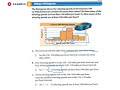
How many winning speeds are less than 140 miles per hour?
Five
Three
Seven
Nine
6.
MULTIPLE CHOICE QUESTION
30 sec • 1 pt
Which data display is more effective for showing the number of students in each interval?
Circle graph
Line graph
Histogram
Bar chart
7.
MULTIPLE CHOICE QUESTION
30 sec • 1 pt
Why can't a circle graph be used to find the total number of students in each interval?
It is too complex to interpret
It only shows percentages
It is not a numerical data display
It does not show the number of students in each interval
Access all questions and much more by creating a free account
Create resources
Host any resource
Get auto-graded reports
Continue with Google

Continue with Email
Continue with Classlink
Continue with Clever
or continue with
Microsoft
%20(1).png)
Apple
Others
Already have an account?
Similar Resources on Wayground
Popular Resources on Wayground

7 questions
History of Valentine's Day
Interactive video
•
4th Grade
15 questions
Fractions on a Number Line
Quiz
•
3rd Grade
20 questions
Equivalent Fractions
Quiz
•
3rd Grade
25 questions
Multiplication Facts
Quiz
•
5th Grade
22 questions
fractions
Quiz
•
3rd Grade
15 questions
Valentine's Day Trivia
Quiz
•
3rd Grade
20 questions
Main Idea and Details
Quiz
•
5th Grade
20 questions
Context Clues
Quiz
•
6th Grade
Discover more resources for Mathematics
20 questions
Writing Algebraic Expressions
Quiz
•
6th Grade
20 questions
Ratios/Rates and Unit Rates
Quiz
•
6th Grade
14 questions
Volume of rectangular prisms
Quiz
•
7th Grade
20 questions
Graphing Inequalities on a Number Line
Quiz
•
6th - 9th Grade
20 questions
One Step Equations
Quiz
•
6th Grade
10 questions
Solving One Step Inequalities
Quiz
•
6th Grade
15 questions
Equivalent Ratios
Quiz
•
6th Grade
16 questions
2022 Winter Olympics Medal Table
Passage
•
6th - 8th Grade