Climate Graph Interpretation and Analysis
Interactive Video
•
Geography
•
6th - 7th Grade
•
Practice Problem
•
Hard

Patricia Brown
FREE Resource
Read more
10 questions
Show all answers
1.
MULTIPLE CHOICE QUESTION
30 sec • 1 pt
What does a climate graph typically display?
Weather patterns over a year
Only rainfall data
Only temperature data
Daily weather forecasts
2.
MULTIPLE CHOICE QUESTION
30 sec • 1 pt
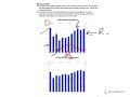
How is rainfall represented in a climate graph?
With a blue line
With dots
With bars
With a green line
3.
MULTIPLE CHOICE QUESTION
30 sec • 1 pt
In the climate graph for Crieff, which month is the wettest?
July
October
April
January
4.
MULTIPLE CHOICE QUESTION
30 sec • 1 pt
How is temperature data shown in a climate graph?
With a green line
With bars
With a red line
With a blue line
5.
MULTIPLE CHOICE QUESTION
30 sec • 1 pt
What is the approximate average temperature in Crieff during January?
15-16 degrees
10-11 degrees
2-3 degrees
5-6 degrees
6.
MULTIPLE CHOICE QUESTION
30 sec • 1 pt
Which month marks the peak temperature in Crieff?
October
July
January
April
7.
MULTIPLE CHOICE QUESTION
30 sec • 1 pt
When describing yearly changes in rainfall, which month is noted as the driest?
January
April
July
October
Access all questions and much more by creating a free account
Create resources
Host any resource
Get auto-graded reports
Continue with Google

Continue with Email
Continue with Classlink
Continue with Clever
or continue with
Microsoft
%20(1).png)
Apple
Others
Already have an account?
