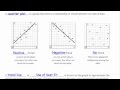
Analyzing Trends in Scatter Plots
Interactive Video
•
Mathematics
•
6th - 7th Grade
•
Practice Problem
•
Hard

Patricia Brown
FREE Resource
Read more
10 questions
Show all answers
1.
MULTIPLE CHOICE QUESTION
30 sec • 1 pt
What does a scatter plot with a positive trend indicate?
As one variable increases, the other decreases.
There is no apparent relationship between the variables.
As one variable increases, the other also increases.
The variables are unrelated.
2.
MULTIPLE CHOICE QUESTION
30 sec • 1 pt
In the context of scatter plots, what is a trend line?
A line that shows the maximum value of data points.
A line that divides the graph into two equal parts.
A line that approximates the relationship between data sets.
A line that connects all data points.
3.
MULTIPLE CHOICE QUESTION
30 sec • 1 pt
How does an increase in gasoline prices affect bus ridership according to the scatter plot?
Bus ridership fluctuates randomly.
Bus ridership increases.
Bus ridership remains constant.
Bus ridership decreases.
4.
MULTIPLE CHOICE QUESTION
30 sec • 1 pt
If gas prices are $2.75 per gallon, approximately how many bus passengers are expected?
7,000 passengers
12,000 passengers
5,000 passengers
10,000 passengers
5.
MULTIPLE CHOICE QUESTION
30 sec • 1 pt
Which graph shows a negative trend where one value increases and the other decreases?
Graph C
Graph A
Graph D
Graph B
6.
MULTIPLE CHOICE QUESTION
30 sec • 1 pt
What trend is generally observed between age and weight in children?
No trend
Positive trend
Negative trend
Random trend
7.
MULTIPLE CHOICE QUESTION
30 sec • 1 pt
What happens to temperature as latitude increases according to the scatter plot?
Temperature increases.
Temperature decreases.
Temperature fluctuates randomly.
Temperature remains constant.
Access all questions and much more by creating a free account
Create resources
Host any resource
Get auto-graded reports
Continue with Google

Continue with Email
Continue with Classlink
Continue with Clever
or continue with
Microsoft
%20(1).png)
Apple
Others
Already have an account?
