Data Visualization Concepts and Techniques
Interactive Video
•
Science
•
9th - 10th Grade
•
Practice Problem
•
Hard

Patricia Brown
FREE Resource
Read more
10 questions
Show all answers
1.
MULTIPLE CHOICE QUESTION
30 sec • 1 pt
What is the primary focus of the video tutorial?
Creating pie charts for data analysis
Analyzing financial data trends
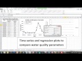
Comparing water quality parameters using time series and regression plots
Visualizing data with bar charts
2.
MULTIPLE CHOICE QUESTION
30 sec • 1 pt
In a time series plot, what is typically placed on the x-axis?
Time
Turbidity
Water quality parameters
Total phosphorus
3.
MULTIPLE CHOICE QUESTION
30 sec • 1 pt
Why is a secondary axis used for total phosphorus in the time series plot?
To highlight the importance of total phosphorus
Because total phosphorus values are much higher than turbidity
To make the plot more colorful
To separate the data visually due to differing value ranges
4.
MULTIPLE CHOICE QUESTION
30 sec • 1 pt
Why is it important to label axes in a plot?
To make the plot look professional
To ensure the plot is colorful
To add more text to the plot
To provide clarity on what the data represents
5.
MULTIPLE CHOICE QUESTION
30 sec • 1 pt
What is the role of a legend in a plot?
To explain the symbols and lines used
To display the data values
To provide a title for the plot
To add color to the plot
6.
MULTIPLE CHOICE QUESTION
30 sec • 1 pt
What should be considered when adding lines between scatter points?
Lines can imply a false sense of continuity
Lines are unnecessary in data visualization
Lines always represent accurate data trends
Lines should be avoided in all plots
7.
MULTIPLE CHOICE QUESTION
30 sec • 1 pt
What is the purpose of adding a trendline in a regression plot?
To highlight outliers in the data
To separate different data series
To provide a quantitative assessment of the relationship
To make the plot more visually appealing
Access all questions and much more by creating a free account
Create resources
Host any resource
Get auto-graded reports
Continue with Google

Continue with Email
Continue with Classlink
Continue with Clever
or continue with
Microsoft
%20(1).png)
Apple
Others
Already have an account?
