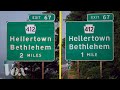
Highway Sign Typeface Comparison
Interactive Video
•
Design
•
9th - 10th Grade
•
Practice Problem
•
Hard

Amelia Wright
FREE Resource
Read more
10 questions
Show all answers
1.
MULTIPLE CHOICE QUESTION
30 sec • 1 pt
What is the primary purpose of the typeface used on highway signs?
To guide drivers to their destination without distraction
To make the signs look aesthetically pleasing
To provide historical information about the area
To advertise local businesses
2.
MULTIPLE CHOICE QUESTION
30 sec • 1 pt
When was Highway Gothic created?
1978
1968
1948
1958
3.
MULTIPLE CHOICE QUESTION
30 sec • 1 pt
What problem did Highway Gothic face with new reflective materials?
It became too expensive to produce
It caused signs to fade quickly
It led to a halo effect making signs hard to read
It was difficult to print on metal
4.
MULTIPLE CHOICE QUESTION
30 sec • 1 pt
What was the main design improvement of Clearview over Highway Gothic?
It had larger internal spaces in letters
It was more compact
It used brighter colors
It included more decorative elements
5.
MULTIPLE CHOICE QUESTION
30 sec • 1 pt
How much improvement in recognition did Clearview show over Highway Gothic during testing?
20%
25%
16%
10%
6.
MULTIPLE CHOICE QUESTION
30 sec • 1 pt
In what year did the Federal Highway Administration grant interim approval for Clearview?
2000
2004
2002
2006
7.
MULTIPLE CHOICE QUESTION
30 sec • 1 pt
What was a major concern about Clearview's legibility according to studies?
It was less legible on lighter colored signs
It was not compatible with digital displays
It was too similar to Highway Gothic
It was more expensive to produce
Access all questions and much more by creating a free account
Create resources
Host any resource
Get auto-graded reports
Continue with Google

Continue with Email
Continue with Classlink
Continue with Clever
or continue with
Microsoft
%20(1).png)
Apple
Others
Already have an account?
