Understanding Box Plots and Quartiles
Interactive Video
•
Mathematics
•
9th - 10th Grade
•
Practice Problem
•
Hard

Olivia Brooks
FREE Resource
Read more
5 questions
Show all answers
1.
MULTIPLE CHOICE QUESTION
30 sec • 1 pt
What percentage of the data set does each quartile in a box plot represent?
50%
25%
75%
10%
2.
MULTIPLE CHOICE QUESTION
30 sec • 1 pt
In a box plot, what percentage of the data is represented by the box in the middle?
100%
75%
50%
25%
3.
MULTIPLE CHOICE QUESTION
30 sec • 1 pt
What is the range of the first quartile in the given data set?
58 to 70
70 to 86
50 to 58
86 to 96
4.
MULTIPLE CHOICE QUESTION
30 sec • 1 pt
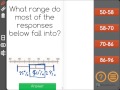
Which range contains 50% of the responses in the data set?
70 to 86
86 to 96
58 to 70
50 to 58
5.
MULTIPLE CHOICE QUESTION
30 sec • 1 pt
Where do most of the responses fall in the given data set?
70 to 86
86 to 96
58 to 70
50 to 58
Access all questions and much more by creating a free account
Create resources
Host any resource
Get auto-graded reports
Continue with Google

Continue with Email
Continue with Classlink
Continue with Clever
or continue with
Microsoft
%20(1).png)
Apple
Others
Already have an account?
Similar Resources on Wayground

11 questions
Factoring Quadratics and GCF Concepts
Interactive video
•
8th - 10th Grade
6 questions
Using Graphs to Persuade: Measures of Center and Variability
Interactive video
•
9th - 10th Grade
8 questions
CLEAN : Sade exhibit showcases writers fascination with human body
Interactive video
•
9th - 10th Grade
9 questions
Boyle's Law Experiment Concepts
Interactive video
•
8th - 10th Grade
11 questions
Sample Proportions and Expected Values
Interactive video
•
9th - 10th Grade
11 questions
Sampling Methods and Data Types
Interactive video
•
9th - 10th Grade
6 questions
Understanding Personal Genomics and Its Implications
Interactive video
•
10th - 12th Grade
6 questions
Working With Data: Introduction
Interactive video
•
10th - 12th Grade
Popular Resources on Wayground
8 questions
Spartan Way - Classroom Responsible
Quiz
•
9th - 12th Grade
15 questions
Fractions on a Number Line
Quiz
•
3rd Grade
14 questions
Boundaries & Healthy Relationships
Lesson
•
6th - 8th Grade
20 questions
Equivalent Fractions
Quiz
•
3rd Grade
3 questions
Integrity and Your Health
Lesson
•
6th - 8th Grade
25 questions
Multiplication Facts
Quiz
•
5th Grade
9 questions
FOREST Perception
Lesson
•
KG
20 questions
Main Idea and Details
Quiz
•
5th Grade
Discover more resources for Mathematics
20 questions
Graphing Inequalities on a Number Line
Quiz
•
6th - 9th Grade
11 questions
Adding and Subtracting Polynomials
Quiz
•
9th Grade
20 questions
Box and Whisker Plots
Quiz
•
9th Grade
18 questions
Exponential Growth and Decay
Quiz
•
9th Grade
12 questions
Equation of a Circle
Lesson
•
10th Grade
12 questions
Exponential Growth and Decay
Quiz
•
9th Grade
14 questions
Making Inferences From Samples
Quiz
•
7th - 12th Grade
24 questions
Solving Linear Equations with Variables on Both Sides
Quiz
•
9th Grade