Drawing and Measuring Pie Chart Sectors
Interactive Video
•
Mathematics
•
6th - 8th Grade
•
Practice Problem
•
Hard

Thomas White
FREE Resource
Read more
38 questions
Show all answers
1.
MULTIPLE CHOICE QUESTION
30 sec • 1 pt
What is the first step in creating a pie chart from survey data?
Drawing the circle
Calculating total frequency
Labeling the sectors
Choosing colors for each sector
2.
MULTIPLE CHOICE QUESTION
30 sec • 1 pt
How many degrees are there in a full circle?
90 degrees
360 degrees
270 degrees
180 degrees
3.
MULTIPLE CHOICE QUESTION
30 sec • 1 pt
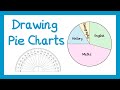
What is the total frequency of students in the first example?
20
22
24
26
4.
MULTIPLE CHOICE QUESTION
30 sec • 1 pt
If a pie chart represents 24 people, how many degrees does each person represent?
20 degrees
15 degrees
10 degrees
25 degrees
5.
MULTIPLE CHOICE QUESTION
30 sec • 1 pt
How many degrees is the sector for English in the first example?
135 degrees
120 degrees
90 degrees
105 degrees
6.
MULTIPLE CHOICE QUESTION
30 sec • 1 pt
What is the degree measure for the Maths sector in the first example?
150 degrees
165 degrees
180 degrees
195 degrees
7.
MULTIPLE CHOICE QUESTION
30 sec • 1 pt
What is the degree measure for the History sector in the first example?
50 degrees
60 degrees
70 degrees
80 degrees
Access all questions and much more by creating a free account
Create resources
Host any resource
Get auto-graded reports
Continue with Google

Continue with Email
Continue with Classlink
Continue with Clever
or continue with
Microsoft
%20(1).png)
Apple
Others
Already have an account?
Popular Resources on Wayground

15 questions
Fractions on a Number Line
Quiz
•
3rd Grade
10 questions
Probability Practice
Quiz
•
4th Grade
15 questions
Probability on Number LIne
Quiz
•
4th Grade
20 questions
Equivalent Fractions
Quiz
•
3rd Grade
25 questions
Multiplication Facts
Quiz
•
5th Grade
22 questions
fractions
Quiz
•
3rd Grade
6 questions
Appropriate Chromebook Usage
Lesson
•
7th Grade
10 questions
Greek Bases tele and phon
Quiz
•
6th - 8th Grade
Discover more resources for Mathematics
20 questions
Writing Algebraic Expressions
Quiz
•
6th Grade
20 questions
Ratios/Rates and Unit Rates
Quiz
•
6th Grade
14 questions
Volume of rectangular prisms
Quiz
•
7th Grade
15 questions
Graphing Inequalities
Quiz
•
7th - 9th Grade
20 questions
Graphing Inequalities on a Number Line
Quiz
•
6th - 9th Grade
20 questions
One Step Equations
Quiz
•
6th Grade
12 questions
One-Step Equations
Quiz
•
6th Grade
6 questions
Equations from models
Quiz
•
6th Grade