Box Plots and Data Analysis
Interactive Video
•
Mathematics
•
6th - 8th Grade
•
Practice Problem
•
Hard

Thomas White
FREE Resource
Read more
8 questions
Show all answers
1.
MULTIPLE CHOICE QUESTION
30 sec • 1 pt
What is another name for a box plot?
Histogram
Pie Chart
Scatter Plot
Box and Whisker Plot
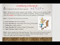
2.
MULTIPLE CHOICE QUESTION
30 sec • 1 pt
What does the rectangle in a box plot represent?
The lowest data point
The entire data set
The middle half of the data
The highest data point
3.
MULTIPLE CHOICE QUESTION
30 sec • 1 pt
How many sections is the data divided into in a box plot?
Four
Five
Three
Two
4.
MULTIPLE CHOICE QUESTION
30 sec • 1 pt
What percentage of data does each quartile in a box plot represent?
25%
50%
10%
75%
5.
MULTIPLE CHOICE QUESTION
30 sec • 1 pt
What is the first step in creating a box plot?
Calculate the median
Find the maximum value
Organize data from least to greatest
Draw the number line
6.
MULTIPLE CHOICE QUESTION
30 sec • 1 pt
In the Detroit Lions example, what is the median number of games won?
7
6
8
5
7.
MULTIPLE CHOICE QUESTION
30 sec • 1 pt
What is the range of resting heart rates in the example provided?
42
50
92
66
Access all questions and much more by creating a free account
Create resources
Host any resource
Get auto-graded reports
Continue with Google

Continue with Email
Continue with Classlink
Continue with Clever
or continue with
Microsoft
%20(1).png)
Apple
Others
Already have an account?
Popular Resources on Wayground

15 questions
Fractions on a Number Line
Quiz
•
3rd Grade
20 questions
Equivalent Fractions
Quiz
•
3rd Grade
25 questions
Multiplication Facts
Quiz
•
5th Grade
22 questions
fractions
Quiz
•
3rd Grade
20 questions
Main Idea and Details
Quiz
•
5th Grade
20 questions
Context Clues
Quiz
•
6th Grade
15 questions
Equivalent Fractions
Quiz
•
4th Grade
20 questions
Figurative Language Review
Quiz
•
6th Grade
Discover more resources for Mathematics
20 questions
Exponents
Quiz
•
6th Grade
22 questions
distributive property
Quiz
•
7th Grade
15 questions
Distributive Property & Review
Quiz
•
6th Grade
20 questions
Writing Algebraic Expressions
Quiz
•
6th Grade
20 questions
Ratios/Rates and Unit Rates
Quiz
•
6th Grade
20 questions
Writing and Graphing Inequalities
Quiz
•
6th Grade
15 questions
Product of Powers Property A1 U7
Quiz
•
8th Grade
20 questions
Laws of Exponents
Quiz
•
8th Grade