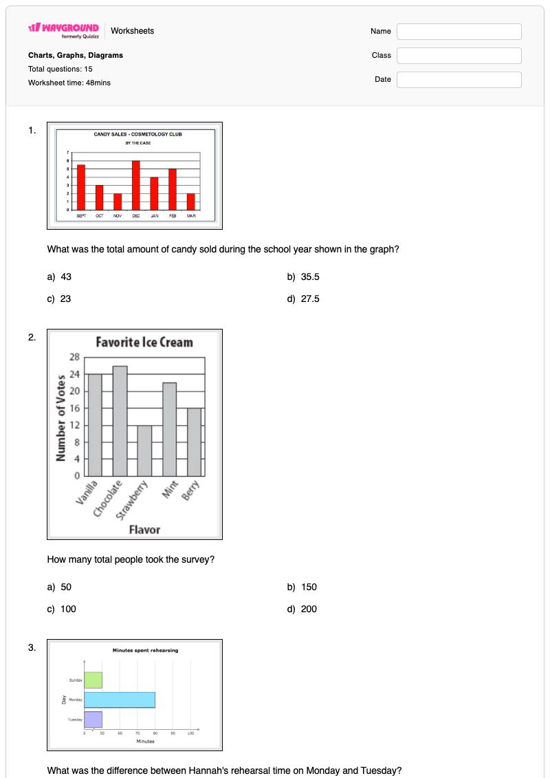
Charts, Graphs, Diagrams is a Grade 7 Geography worksheet that builds data-interpretation skills through 15 multiple-choice questions. Students read charts, graphs, and diagrams to identify totals, differences, values, trends, survey results, ranges, means, and category comparisons. The questions also ask students to extract information from a classification diagram and interpret geographic data about Oregon’s electrical energy sources.
This free printable worksheet helps students move beyond reading individual values by selecting evidence that supports a conclusion from a visual display. It is useful for guided practice, independent review, or a quick assessment of how accurately students interpret data presented in different formats. The worksheet includes a complete answer key, making it practical for Grade 7 Geography lessons focused on visual data literacy and evidence-based reasoning.
Worksheet settings
Font size
S
M
L
XL
Worksheets
Charts, Graphs, Diagrams
Total questions: 15
Name
Class
Date
1.
What was the total amount of candy sold during the school year shown in the graph?
a)
43
b)
35.5
c)
23
d)
27.5
2.
How many total people took the survey?
a)
50
b)
150
c)
100
d)
200
3.
What was the difference between Hannah's rehearsal time on Monday and Tuesday?
a)
0
b)
50
c)
30
d)
80
4.
In which year did exactly 60 students have scholarships?
a)
2010
b)
2011
c)
2012
d)
2013
5.
How many students are between 56 and 59 inches tall?
a)
5
b)
4
c)
10
d)
8
6.
How many students take the bus to school?
a)
35
b)
20
c)
10
d)
15
7.
How many students spent 7 hours doing homework that week?
a)
1
b)
3
c)
5
d)
6
8.
What is the annual salary of a person with a associates degree?
a)
$1012
b)
$9084
c)
$39364
d)
$757
9.
In which year was the per-student arts education budget $20?
a)
2005
b)
2009
c)
2013
d)
2014
10.
How many people added hot sauce to their food on Monday?
a)
40
b)
20
c)
70
d)
80
11.
In August, how many metric tons did Clark's Paper Mill and Tyler Paper Mill produce all together?
a)
10
b)
70
c)
80
d)
90
12.
How many more students played soccer than football?
a)
3
b)
30
c)
6
d)
60
13.
According to the diagram, the cheetah belong to the same GENUS as the....
a)
Lion
b)
Skunk
c)
Cat
d)
Human
14.
Where does the majority of electrical energy come from in Oregon?
a)
Hydroelectric
b)
Natural Gas
c)
Wood
d)
Wind
15.
Choose the best option.
a)
To make this graph 22 studentes were interviewed.
b)
The mean of the data is 5.
c)
More than 50% preferred soccer.
d)
The range of the data is 7.
Answer Key
Charts, Graphs, Diagrams
Total questions: 15
1.
d) 27.5
2.
c) 100
3.
c) 30
4.
a) 2010
5.
a)
5
6.
a) 35
7.
d) 6
8.
c) $39364
9.
d) 2014
10.
a) 40
11.
d) 90
12.
b) 30
13.
a) Lion
14.
a) Hydroelectric
15.
a) To make this graph 22 studentes were interviewed.
140 %
Browse by subjects
Browse by grades
Browse by format
FAQs
What does the Charts, Graphs, Diagrams worksheet cover?
This Grade 7 Geography worksheet uses 15 multiple-choice questions to assess how students read charts, graphs, and diagrams. Students determine totals and differences, locate values by year or category, interpret survey and measurement data, identify mean and range statements, and use a classification diagram to compare organisms.
How can I use this worksheet to teach students to interpret charts, graphs, and diagrams?
Model one item by having students identify the display type, locate the relevant label or scale, and explain which values support the answer. Then have pairs solve selected questions involving totals, differences, years, and categories before completing the remaining multiple-choice items independently. Ask students to justify one answer from the data display rather than choosing an option by estimation.
What mistakes should I watch for when students complete this charts and graphs worksheet?
Students may confuse a total with a difference, read the wrong year or category, or select a nearby value because they overlook the graph’s labels or scale. They may also confuse mean and range in the final data question or misread the classification diagram when identifying a shared genus. Ask students to point to the exact values or relationship in the display before they select an answer.
How do I assign and grade this Charts, Graphs, Diagrams worksheet?
On Wayground, assign it as a printable PDF or as a digital quiz, and use the complete answer key to check the 15 multiple-choice responses. For printable submissions, you can scan student work with the Wayground for Teachers app to support grading. The PDF option also lets students practise interpreting visual data without requiring a device.
How can I differentiate this worksheet for my students?
Use the worksheet’s Advanced Settings to adjust font spacing or increase the font size so graph labels, answer choices, and diagram text are easier to follow. You can also apply a dyslexia-friendly font or translate the charts-and-diagrams worksheet into another language when appropriate for your learners.
Where can I find more worksheets like this on Wayground?
Wayground offers a comprehensive collection of free printable worksheets and practice problems across all subjects, with downloadable PDFs and answer keys to help students master essential skills and concepts. Browse more resources at https://wayground.com/en-us/worksheets.

 Worksheets


