Histograms and Dot Plots is a Grade 8 mathematics worksheet that builds students’ ability to read data displays and calculate measures of center and spread. Across 21 questions, students interpret intervals and frequencies in histograms and dot plots, identify values such as the mean, median, and mode, and find the range of a data set. Items include math-response questions, multiple-choice questions, dropdowns, a drag-and-drop item, and fill-in-the-blank responses.
Use this worksheet to check whether students can extract quantities from visual data representations, compare values within intervals, determine totals, and apply procedures for mean, median, mode, and range. The varied response formats provide practice with both selecting an interpretation and producing a numerical answer. This free printable worksheet is designed for Grade 8 math instruction, independent practice, or review and includes an answer key for efficient checking.
Worksheet settings
Font size
S
M
L
XL
Worksheets
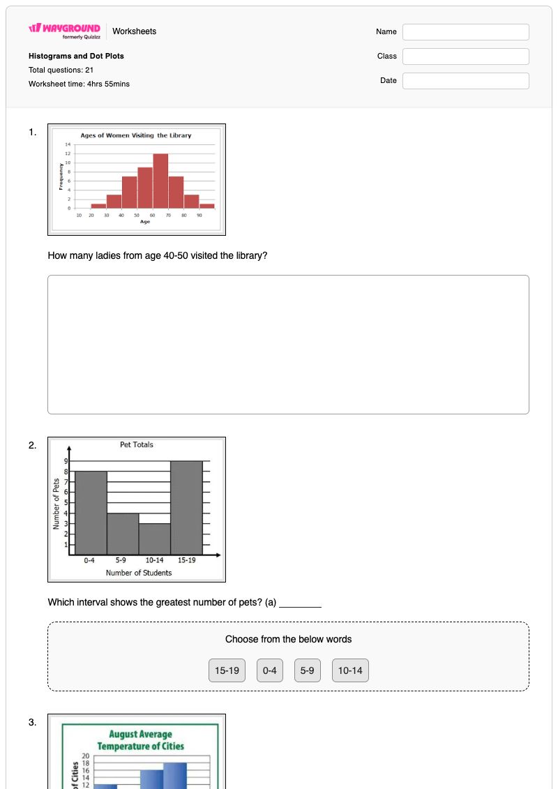
Histograms and Dot Plots
Total questions: 21
Name
Class
Date
1.
How many ladies from age 40-50 visited the library?
2.
Which interval shows the greatest number of pets? (a)
Choose from the below words
15-19
0-4
5-9
10-14
3.
How many cities have temperatures between 70 degrees and 99 degrees?
4.
21. How many students are represented by the histogram?
5.
How many people watched more than 25 hours of TV last week?
6.
What was the day with the least amount of cars sold? (a)
Choose from the below words
Monday
Tuesday
Wednesday
Thursday
7.
What is the mode? (a)
Choose from the below words
88%
89%
97%
91%
8.
What is the median of the data?
a)
105
b)
106
c)
104
d)
110
9.
How many students were greater than 55 inches tall but less than 70 inches tall?
a)
13
b)
15
c)
16
d)
17
10.
What is the MEAN for this data?
a)
80
b)
1040
c)
13
d)
81
11.
Find the mean of the data in version A. Round to the tenth.
(a)
12.
What is the MEDIAN of this data?
a)
65
b)
40
c)
915
d)
13
13.
How many giraffes were less than 16 feet tall?
a)
5
b)
7
c)
2
d)
14
14.
What is the RANGE of these numbers? 3, 7, 9, 10
(a)
15.
What is the RANGE of these numbers:
22, 20, 23, 21, 23, 25, 22, 29
a)
5
b)
9
c)
2
d)
6
16.
The range is found by finding the _______________ number and subtracting the ________________ number.
a)
smallest, biggest
b)
even, odd
c)
biggest, smallest
d)
middle, first
17.
Find the median: 3, 5, 7, 4, 3, 1
a)
3 and 4
b)
There isn't one
c)
3.5
d)
3
18.
Find the median of these numbers: 99, 32, 61, 82, 58, 41, 73, 24, 18
a)
58
b)
41
c)
32
d)
73
19.
What is the mean of these numbers? 4,5,5,2,3,3,2,8
a)
40
b)
24
c)
4
d)
256
20.
Calculate the mean.
2, 9, 10, 6, 8
a)
8
b)
4
c)
7
d)
22
21.
Calculate the mean.
10, 4, 5, 9
a)
7
b)
5
c)
8
d)
4
Answer Key
Histograms and Dot Plots
Total questions: 21
1.
7
2.
15-19
3.
44
4.
31
5.
10
6.
Thursday
7.
89%
8.
a) 105
9.
a) 13
10.
a) 80
11.
24.4
12.
a) 65
13.
a)
5
14.
7
15.
b)
9
16.
c)
biggest, smallest
17.
c) 3.5
18.
a) 58
19.
c) 4
20.
c)
7
21.
a)
7
140 %
Browse by subjects
Browse by grades
Browse by format
FAQs
What does the Histograms and Dot Plots worksheet cover?
This Grade 8 math worksheet asks students to read histograms and dot plots to determine frequencies, totals, interval counts, and comparisons such as which interval has the greatest or least value. It also includes multiple-choice, math-response, dropdown, drag-and-drop, and fill-in-the-blank questions on calculating or identifying the mean, median, mode, and range.
How can I use this worksheet to teach students to interpret histograms and dot plots?
Begin by modeling how to read the scale and frequency represented by each bar, dot, or interval, then work through one count or comparison item together. Have students explain how they located values such as an interval total or the day with the least amount, and follow with the worksheet’s mean, median, mode, and range items to connect visual interpretation with numerical analysis.
What mistakes should I watch for when students complete this worksheet?
Watch for students misreading interval boundaries, counting the wrong bar or dot, or treating a category label as a frequency when answering the chart questions. In the data-measure items, students may confuse mean, median, and mode, subtract the wrong values when finding range, or use the wrong number of data values when calculating a mean.
How do I assign and grade the Histograms and Dot Plots worksheet?
Wayground provides this worksheet as a printable PDF and as a digital quiz, and it includes a complete answer key for checking the 21 responses. For printable submissions, you can scan student work with the Wayground for Teachers app to grade it efficiently. The printable format also offers an option for schools reducing screen time.
How can I differentiate this histograms and dot plots worksheet for my students?
Use the worksheet’s Advanced Settings to adjust font spacing or choose a larger font size so the chart-reading prompts and response options are easier to follow. You can also apply a dyslexia-friendly font or translate the worksheet into another language, helping students access the histogram, dot plot, and data-measure questions.
Where can I find more worksheets like this on Wayground?
Wayground offers a broad collection of free printable worksheets and practice problems across subjects, with downloadable PDFs and answer keys to support essential skills and concepts. Browse more resources at https://wayground.com/en-us/worksheets.

 Worksheets


