
NEW
Font size
S
M
L
XL
 Worksheets
Graphing
Total questions: 10
Worksheet time: 8mins
Name
Class
Date
1.
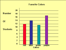
How many more people have purple for a favorite color than red?
a)
3
b)
5
c)
7
d)
9
2.
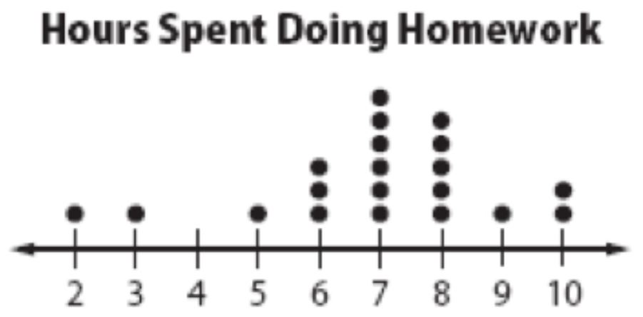
How many students spent 7 hours doing homework that week?
a)
1
b)
3
c)
5
d)
6
3.
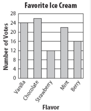
How many total people took the survey?
a)
50
b)
150
c)
100
d)
200
4.

What is the difference between the highest score and the lowest score on the test?
a)
15
b)
100
c)
6
d)
10
5.

What type of association does this graph have?
a)
positive
b)
negative
c)
none
d)
all of the above
6.

How many sophomores like burritos and pizza?
a)
6
b)
5
c)
11
d)
50
7.

A survey explored the relationship between gender and band class. Which is a reasonable conclusion?
a)
There are more band members than non-band members
b)
There are more boys in the class than girls
c)
There are more boys in band than not in band
d)
More than half of the bands members in the class are girls
8.

What type of association does this scatter plot show?
a)
positive linear association
b)
negative linear association
c)
no association
d)
nonlinear association
9.

What is the range of the data shown in the stem and leaf plot?
a)
40
b)
56
c)
136
d)
96
10.

In how many games did the team score more than 20 points?
a)
8
b)
7
c)
10
d)
9
Reset

