wayground logo

Free Printable Worksheets

Font size

S
M
L
XL
Worksheets

GRAPHS

Total questions: 49

Worksheet time: 1hrs 3mins

Name
Class
Date
1.

How many votes did reading receive?

a)

2

b)

4

c)

6

d)

8

2.

How many votes did reading and social studies receive together?

a)

9

b)

11

c)

13

d)

15

3.

How many total votes were collected?

a)

5

b)

10

c)

15

d)

20

4.
How many more students played soccer than football?
a)
3
b)
30
c)
6
d)
60
5.

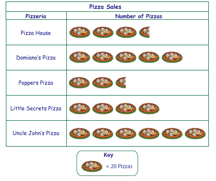
Which pizzeria has the second largest sales?

a)

Pizza House

b)

Domiano's Pizza

c)

Little Secrets Pizza

d)

Uncle John's Pizza

6.
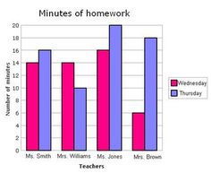
Which day had more minutes of homework?
a)
Wednesday
b)
Thursday
c)
Friday
d)
Ms. Jones
7.
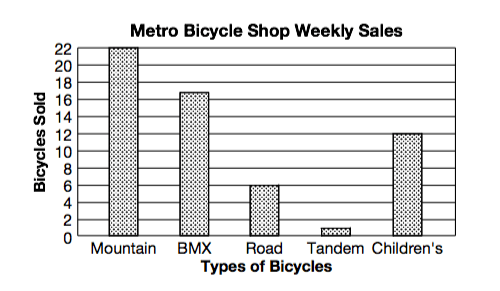
How many mountain bikes were sold?
a)
22
b)
28
c)
16
d)
6
8.
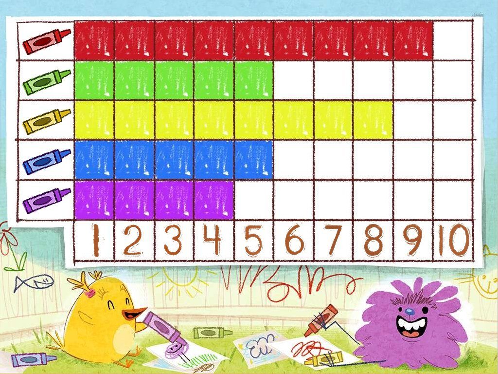
How many more people like red than purple?
a)
100
b)
10
c)
2
d)
5
9.
How many total people took the survey?
a)
50
b)
150
c)
100
d)
200
10.
How many pizzas were sold by Domiano’s Pizza and Little Secrets Pizza?
a)
160
b)
200
c)
20
d)
180
11.
Which pizzeria sold fewer pizzas; Pizza House or Poppers Pizza?
a)
Pizza House
b)
Poppers Pizza
12.
How many more pizzas did Little Secrets Pizza and Uncle John's Pizza sell than Pizza House and Domiano's Pizza?
a)
10
b)
30
c)
50
d)
100
13.
How many more pizzas did Little Secrets Pizza and Uncle John's Pizza sell than Pizza House and Domiano's Pizza?
a)
10
b)
30
c)
50
d)
100
14.
How many students take the bus to school?
a)
35
b)
20
c)
10
d)
15
15.

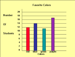
How many students' favorite color is blue?

a)

11

b)

12

c)

14

d)

17

16.

How many more people like purple than red?

a)

3

b)

5

c)

7

d)

9

17.
The graph below shows the number of sunny days and rainy days in a city during four months.

Based on the graph,how many more sunny days than rainy days did this city have during the months of April, May, and June?
a)
21
b)
56
c)
26
d)
20
18.
Which subject received the most votes?
a)
science
b)
reading
c)
social studies
d)
math
19.
How many more people like red than purple?
a)
100
b)
10
c)
2
d)
5
20.

What type of graph is this?

a)

Bar Graph

b)

Line Plot

c)

Pictograph

d)

Tally Chart

21.

How many students have blue for a favorite color?

a)

11

b)

12

c)

14

d)

17

22.

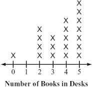
How many people have four books in their desks?

a)

2

b)

3

c)

4

d)

5

23.
How many people have two or less books in their desk?
a)
4
b)
5
c)
6
d)
7
24.

How many students voted Diary of a Wimpy Kid as their favorite book series?

a)

55

b)

60

c)

50

d)

25

25.

What is the X-axis labeled as?

a)

Number of Students

b)

Titles of Book Series

c)

Books, Books, and More Books!!!

d)

5th Grade Survey over Favorite Book Seriwes

26.
Which book series has the most votes for girls?
a)
Twilight
b)
Diary of a Wimpy Kid
c)
Harry Potter
d)
The Dork Diaries
27.
How many students voted all together?
a)
230
b)
100
c)
210
d)
300
28.

Which book series had the lowest amount of votes? How many students voted for that series?

a)

Diary of a Wimpy Kid, 60

b)

Percy Jackson, 15

c)

Percy Jackson, 25

d)

The Dork Diaries, 55

29.

How many boys voted for Harry Potter as their favorite book series?

a)

50

b)

25

c)

30

d)

20

30.
Which book has the most votes for boys?
a)
Harry Potter
b)
The Dork Diaries
c)
Diary of a Wimpy Kid
d)
Percy Jackson Series
31.
What type of graph is this called?
a)
Double Bar Graph
b)
Pie Chart
c)
Coordinate Grid
d)
Bar Graph
32.

What was the least amount of money that a customer paid for a gallon of gas?

a)

$2.00

b)

$1.82

c)

$1.99

d)

$1.55

33.
What was the most a customer paid for a gallon of gas?
a)
$1.83
b)
$2.07
c)
$2.25
d)
$2.35
34.
How many customers paid over $2.00 for a gallon of gas?
a)
10
b)
5
c)
12
d)
15
35.
What is the label for the x-axis?
a)
Sprint
b)
# of people
c)
name of providers
d)
Cell-phone Providers
36.
What is the label of the y-axis?
a)
Verizon 
b)
# of people
c)
name of providers
d)
Sprint
37.

How many tickets were sold to students?

a)

55 tickets

b)

120 tickets

c)

225 tickets

d)

275 tickets

38.

Which graphs shows nickels at 13, dimes at 9, and quarters at 17.

a)

Graph 1

b)

Graph 2

c)

Graph 3

d)

Graph 4

39.

Which graph matches the data?

a)

Graph 1

b)

Graph 2

c)

Graph 3

d)

Graph 4

40.
Which graph matches the data?
a)
Graph 1
b)
Graph 2
c)
Graph 3
d)
Graph 4
41.
Which graph shows vanilla at 3 people?
a)
Graph 1
b)
Graph 2
c)
Graph 3
d)
Graph 4
42.
Which graph shows nickels at 8 coins?
a)
Graph 1
b)
Graph 2
c)
Graph 3
d)
Graph 4
43.
How many students received a score of 94%? 
a)
94
b)
4
c)
1
d)
2
44.

This is a picture of a

a)

Bar chart

b)

Pie chart

c)

Line graph

d)

Column chart

45.
This is a picture of a 
a)
Bar chart
b)
Pie chart
c)
Line chart
d)
Column chart
46.
A chart that has a series of data points connected by horizontal lines, each representing a series of data is a ___________ chart.
a)
Pie
b)
Column
c)
Line
d)
Stacked Bar
47.
What are graphs used for?
a)
To show data
b)
To keep track of things so you don't forget
c)
To catch the eye and look colorful 
d)
To draw pictures on
48.
What is the title of the graph?
a)
Number of people
b)
Character
c)
Favorite Cartoon Characters
d)
Sponge Bob
49.
What is the title of the graph?
a)
Number of people
b)
Character
c)
Favorite Cartoon Characters
d)
Sponge Bob