
 Worksheets
Algebra I - Practice Test - Dealing with Data
Total questions: 75
Worksheet time: 8hrs 52mins
Name
Class
Date
1.

What is the range of the set of data?
a)
70
b)
65
c)
80
d)
55
2.

What percentage of SUV's are driven by women?
a)
56.25%
b)
75%
c)
83.25%
d)
86.5%
3.

What is the MEDIAN of this data
a)
95
b)
90
c)
100
d)
40
4.

Describe the shape of the graph.
a)
Skewed right
b)
Skewed left
c)
Uniform
d)
Symmetrical
5.

How many people have two or less books in their desk?
a)
4
b)
5
c)
6
d)
7
6.

What is incorrect about the following histogram?
a)
The intervals are too small
b)
The intervals overlap
c)
The graph does not start at 0
d)
The axes are not labeled.
7.

Is the Cars dot plot skewed left or right?
a)
left
b)
right
8.

a)
spread
b)
mean
c)
outlier
d)
median
9.
Roger bowled 7 games last weekend. His scores are: 155, 165, 138, 172, 127, 193, 142. What is Roger's median score?
a)
127
b)
155
c)
156
d)
193
10.

What is the median of the data?
a)
200
b)
100
c)
90
d)
140
11.

Which city has a minimum value that is lower?
a)
Millersburg
b)
Arcandia
12.
Which of the following best describes the process of finding the interquartile range for a set of data?
a)
ADD the biggest and smallest numbers
b)
Place the number in order from least to greatest then find the middle.
c)
Find the difference between the Maximum and the Minimum.
d)
Subtract Q3 from Q1
13.
You must find the 5 number summary in order to make a box and whisker plot.
a)
True
b)
False
14.
Which of the following lists all parts of the five number summary?
a)
Mean, Median, Mode, Range, and Total
b)
Minimum, Quartile 1, Median, Quartile 3, and Maximum
c)
Smallest, Q1, Q2, Q3, and Q4
d)
Minimum, Maximum, Range, Mean, and Median
15.

What percentage of the data is between 90 and 140?
a)
25 %
b)
50%
c)
75%
d)
100%
16.

What percentage of the data is between 90 and 140?
a)
25 %
b)
50%
c)
75%
d)
100%
17.

What percentage of the data is between 40 and 90?
a)
25 %
b)
50%
c)
75%
d)
100%
18.

What percent does each of the 4 sections contain on a box and whisker plot?
a)
100%
b)
75%
c)
50%
d)
25%
19.

What is the term for the median of the lower half of the data?
a)
Lower Quartile
b)
Upper Quartile
c)
Median
d)
Maximum
20.

What is the term for the median of the upper half of the data?
a)
Upper Quartile
b)
Lower Quartile
c)
Median
d)
Minimum
21.

What is the term that means the middle data value?
a)
Mean
b)
Median
c)
Mode
d)
Range
22.

Which car club has the higher median?
a)
Cruisers
b)
Car Hops
23.

What is the IQR of the Cruisers?
a)
4
b)
6
24.

What is the IQR of the Car Hops?
a)
4
b)
6
25.

What is the range of the Cruisers?
a)
9
b)
13
26.

50% of the Cruisers attended between 7 and 16 car shows. True or False?
a)
True
b)
False
27.

What is the minimum number of shows attended by a car club?
a)
0
b)
3
c)
7
28.
The mean of 6 numbers is 5.5. The first five numbers are 2, 5, 6 , 7, 8. Find the sixth number.
a)
33
b)
28
c)
5.5
d)
5
29.
The mean of five numbers is 26. The first four numbers are 10, 20, 30, and 20. Find the 5th number.
a)
130
b)
80
c)
50
d)
20
30.
Categorical or Quantitative?
Years of schooling completed
Years of schooling completed
a)
Categorical
b)
Quantitative
31.

50% of the Car Hops went to 11 or fewer car shows. True or False?
a)
True
b)
False
32.
Categorical or Quantitative?
College Major
College Major
a)
Categorical
b)
Quantitative
33.
Which of the following is an example of categorical data?
a)
High School Graduate or Not
b)
Annual Income
c)
Years of Schooling Completed
d)
Years of playing an instrument
34.

Is the information collected during the survey numerical or categorical data?
a)
Numerical data. I know this because the y-axis is labeled with numbers.
b)
Numerical data. I know this because the surveyor counted how many people that they surveyed.
c)
Categorical data. I know this because the responses to the survey are names.
d)
Categorical data. I know this because each column is a different color.
35.
Class Types (Math, SS, ELA, Science)
a)
Categorical
b)
Quantitative
36.
Age
a)
Categorical
b)
Quantitative
37.
Distance from School
a)
Categorical
b)
Quantitative
38.
Hair Color
a)
Categorical
b)
Quantitative
39.
Time
a)
Categorical
b)
Quantitative
40.
Days of the week
a)
Categorical
b)
Quantitative
41.
What does "mode" mean?
a)
average
b)
middle
c)
repeats the most
d)
variation
42.
What is a the meaning for "median"?
a)
fair share
b)
middle
c)
repeats the most
d)
variation
43.
How do you find the range?
a)
order least to greatest, then slash from each side until you reach the middle
b)
add the numbers in your data set, then divide by the amount you added
c)
look for the number that repeats the most
d)
highest number minus the lowest number
44.

How would you describe this distribution?
a)
Left skewed
b)
Uniform
c)
Right Skewed
d)
Symmetrical
45.

What is the RANGE of this data?
a)
40
b)
100
c)
60
d)
45
46.

What is the MODE of this data?
a)
100
b)
20
c)
80, 85, and 90
d)
none
47.
What is the mean of a data set?
a)
highest - lowest
b)
what number occurs the most
c)
average
d)
minimum
48.

What type of graph is this?
a)
Bar Graph
b)
Pictograph
c)
Line Plot
d)
Tally Chart
49.

How many people purchased no food and no drink?
a)
60
b)
10
c)
20
d)
200
50.

According to the two-way table, a person who plays an instrument is most likely to:
a)
Not play an instrument
b)
Not play a team sport
c)
Play a team sport
d)
All of the above
51.

According to the table, what is the relative frequency of students ages 10 - 13 who eat breakfast?
a)
About 33%
b)
About 50%
c)
About 40%
d)
About 44%
52.

What percentage of the students were boys?
a)
20%
b)
25%
c)
40%
d)
50%
53.

How are the mean and the median likely to be related in this histogram?
a)
Mean > Median
b)
Mean = Median
c)
Mean < Median
54.

How many employees are there that make between $33,000 and $43,000
a)
250
b)
500
c)
550
d)
750
55.
A method of showing how data are distributed by using the median, quartiles, and minimum and maximum values; also called a box plot
a)
box and whisker plot
b)
line plot
c)
dot plot
d)
histogram
56.

Which class did better on the Algebra test?
a)
Class 1
b)
Class 2
c)
Not enough information
d)
Can't tell
57.

Choose the correct data set for this box and whisker plot
a)
1, 2, 2, 3, 5, 5, 8
b)
1, 2, 3, 5, 8
c)
1, 3, 8
d)
2, 5, 8, 1, 3
58.
Which measure of central tendency is MOST EASILY affected by outliers?
a)
mean
b)
median
c)
mode
d)
IQR
59.

Which box and whisker plot shows more "spread out" data?
a)
Top plot
b)
Bottom plot
60.
In order to find the median, the data must be sorted from least to greatest first.
a)
True
b)
False
61.

This is a histogram
a)
true
b)
false
62.

A florist recorded the number and cost of flower bouquets that were sold daily and recorded the data below. What is the frequency of a bouquet that cost at least $40?
a)
2
b)
15
c)
22
d)
37
63.

How many cities have temperatures between 70 degrees and 99 degrees?
a)
44
b)
34
c)
26
d)
62
64.
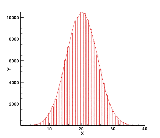
How would you describe this distribution?
a)
Left skewed
b)
Uniform
c)
Right Skewed
d)
Symmetrical
65.

What was the exact price most people payed for a gallon of gas?
a)
$2.10
b)
$1.95
c)
$2.03
d)
We can not tell using the histogram
66.
Is a histogram the same as a bar graph?
a)
Yes, because they both use intervals.
b)
No, because a histogram displays numerical data while a bar graph displays categorical data.
c)
Yes, because they both use bars to display data.
d)
No, because a histogram displays categorical data while a bar graph displays numerical data.
67.
What is incorrect about the following histogram?
a)
The intervals are too small
b)
The intervals overlap
c)
The graph does not start at 0
d)
The axes are not labeled.
68.

Why is this a bar chart and not a histogram?
a)
It's based on quantitative data
b)
It's based on categorical data
69.

24. How many of the students had an ACT composite score of at least 20?
a)
12
b)
15
c)
20
d)
Cannot be determined
70.
21. How many students are represented by the histogram?
a)
Cannot be determined
b)
9
c)
31
d)
35
71.

How many employees are there that make between $33,000 and $43,000
a)
250
b)
500
c)
550
d)
750
72.

How many scores are listed in this Stem and Leaf Plot?
a)
3
b)
6
c)
9
d)
18
73.

What type of graph is this?
a)
Bar Graph
b)
Line Plot
c)
Pictograph
d)
Tally Chart
74.

Each dot represents 1 day. How many days were recorded?
a)
9
b)
21
c)
20
d)
105
75.

How many trouts weighed MORE THAN 450 grams?
a)
8
b)
14
c)
11
d)
10
100 %

