
 Worksheets
Data analysis
Total questions: 45
Worksheet time: 3hrs 45mins





What height did most students jump?


How many more students are signed up than parents?

Which type of muffin was sold twice as many times as apple muffins?


What is the percent by mass of peanuts in Brand A?
45.6%

Based on this graph, which of the following statements is true?
The anole weighs 2.5 grams after 3 days of observation
The mass of the anole increased by 2.5 grams in 3 days
The anole weighs 2.3 grams after 3 days
The mass of the anole increased by 2.7 grams during the experiment

The reaction occurred FASTER with the enzyme
The reaction occurred SLOWER with the enzyme
Energy is absorbed and stored
Energy absorbed increases, then decreases

Graph A best illustrates the relationship between the heat released by the foods listed in Table 1 and the change in water temperature.
Graph B best illustrates the relationship between the heat released by the foods listed in Table 1 and the change in water temperature.
Graph C best illustrates the relationship between the heat released by the foods listed in Table 1 and the change in water temperature.
Graph D best illustrates the relationship between the heat released by the foods listed in Table 1 and the change in water temperature.

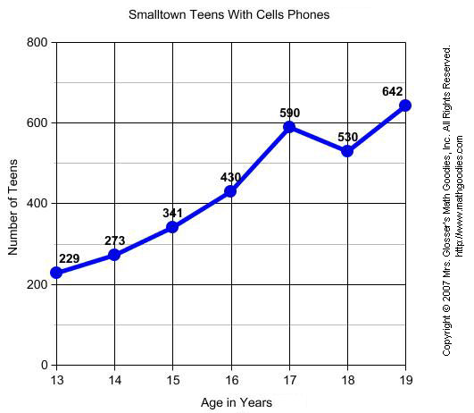
The overall trend in the data would be best described as increasing
The overall trend in the data would be best described as decreasing
The overall trend in the data would be best described as unchanging
The overall trend in the data would be best described as unrelated
The concentration of CO2 in the atmosphere is increasing
The concentration of CO2 in the atmosphere is decreasing
The concentration of CO2 fluctuates too much to form a valid conclusion
There is more CO2 in Hawaii than anywhere else

This data set shows that global temperatures are increasing over time
This data set shows that global temperatures are decreasing over time
This data set shows that carbon dioxide is increasing over time
This data set shows that carbon dioxide is increasing over time

The graph shows CO2 is increasing but temperature is decreasing
The graph shows both temperature and CO2 are increasing
The graph shows both CO2 and temperature are decreasing
The graph shows CO2 is decreasing but temperature is increasing

