
 Worksheets
box plot
Total questions: 58
Worksheet time: 2hrs 25mins

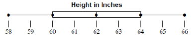
4. Which of the following lists all the five numbers needed to make a box plot?
Mean, Median, Mode, Range, and Total
Minimum, Quartile 1, Median, Quartile 3, and Maximum
Smallest, Q1, Q2, Q3, and Q4
Minimum, Maximum, Range, Mean, and Median
Find the median of these numbers:
2, 5, 4, 3, 7, 5, 5,
4
5
3
6
In order to find the median, the very first thing you must do is to..
find the difference between biggest and the smallest number.
find the middle number
list the numbers in order
find the most repeated number


Which of the following statements is NOT true?
The lower quartile is also known as Quartile 1.
The median is also known as Quartile 2.
The interquartile range is the difference between quartile 1 and quartile 2.
The upper quartile is also known as quartile 3.
What is the upper quartile of the set of data; 2, 4, 6, 6, 7, 8, 10
4
6
8
2

The median test score is 80.
The lower quartile is 65.
The upper quartile is 90.
The IQR is 30.
What does a quartile mean?
One fourth of the data.
One half of the data.
Some data only.
All of the data.

Which has a higher median?
Florida
Texas

Which has a lower median?
Florida
Texas
Which has a lower IQR? (Interquartile Range)
Florida
Texas
What is Florida's median?
10
15
12
18

Which has the higher median?
Thanksgiving
New Years Eve
What is Thanksgivings maximum?
30
15
22
24

Which has a greater median?
Week 1
Week 2
Which has a lower IQR? (Interquartile Range)
Week 1
Week 2
True or False: Week 2 median is the same as Week 1 Q3
False
True

Which has a higher median?
6th graders
4th graders
Which has a greater IQR? (Interquartile Range)
6th graders
4th graders
Which has a lower IQR? (Interquartile Range)
6th graders
4th graders


Which box and whisker plot has the lowest minimum?
Top plot
Bottom plot
The "box" contains ALL of the following EXCEPT...
Maximum
Quartile 1
Quartile 3
Median


Science: _________ Math: __________


JoBeth draws a scatter plot that shows as the outside temperature increases, sales at her lemonade stand increase. Which best describes the scatter plot?
The points show that as x-values increase, y-values increase.
The points show that as x-values increase, y-values decrease.
The points show that as x-values decrease, y-values stay the same.
The points show that as x-values decrease, y-values increase.
Which of the following best describes a scatter plot that shows no relationship between the x-values and the y-values?
As x-values increase, the points are higher on the graph.
As x-values decrease, the points are higher on the graph.
The points are scattered around the graph.
The points form a horizontal line.

Which relationship could be represented by this scatter plot?
As the number of muffins in a box increases, the price increases.
As the speed of a car increases, the distance the car travels increases.
As the population of a city increases, the number of schools in the
city increases.
As the number of daylight hours increases, the number of night hours decreases.
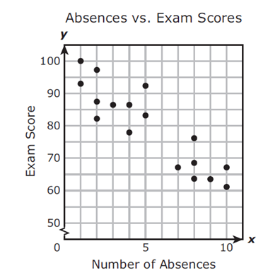
Mrs. Collins made a scatterplot to show the relationship between the number of absences and a student’s final exam score. Based on this scatterplot, a student with 12 absences should get approximately what score on the final exam?
60
92
70
76

Which sentence describes the relationship shown on this scatter plot?
As the temperature decreases, the visitors increase.
As the temperature increases, the number of visitors increases.
As the visitors increase, the temperature decreases.
No correlation

What type of correlation does this scatter plot show?
positive
negative
no correlation
nonlinear association

Mrs. Collins made a scatterplot to show the relationship between the number of absences and a student’s final exam score. Based on this scatterplot, a student with 6 absences should get approximately what score on the final exam?
85
92
70
76

The scatter plot shows the relationship between the number of chapters and the total number of pages for several books. Use the trend line to predict how many pages would be in a book with 19 chapters.
150 pages
170 pages
190 pages
210 pages

Mrs. Collins made a scatterplot to show the relationship between the number of absences and a student’s final exam score. Based on this scatterplot, a student with 6 absences should get approximately what score on the final exam?
65
92
70
76

Based on the graph, if Joe earned $400, how many hours did he work?
25 hours
35 hours
45 hours
15 hours


Which scatter plot show a positive relationship?
Graph A
Graph B
Graph C
Graph D

Based on the scatterplot, which of the following conclusions about the relationship between her height and weight is true?
There is a negative relationship between height and weight
There is a positive relationship between height and weight
There is a constant relationship between height and weight
There is no relationship between height and weight



