NEW
Font size
 Worksheets
Math in Focus - Grade 4 - Chapter 4
Total questions: 37
Worksheet time: 9hrs 15mins
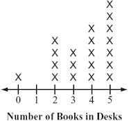
How many people have four books in their desks?
2
3
4
5

How many people have two or less books in their desk?
4
5
6
7
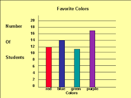
What type of graph is this?
Bar Graph
Line Plot
Pictograph
Tally Chart
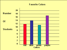
How many more people have purple for a favorite color than red?
3
5
7
9

How many students have blue for a favorite color?
11
12
14
17
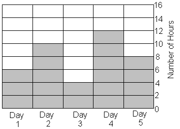
Jamie practiced for her piano recital for 5 days in a row.
She found the sum of hours she practiced on day 1 and day 3. What is the difference of that sum and the number of hours she practiced on day 4?
5
2
10
1
Lou wants to make a bar graph to show how many types of birds he has observed. Which type of bird would have the shortest bar?
38 bluejays
23 hawks
41 hummingbirds
45 cardinals

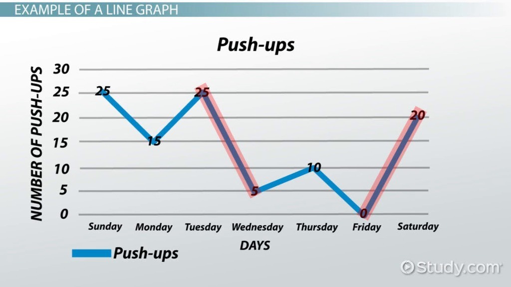
What is the name of this graph?
line plot
line graph
bar graph
frequency table

What is the main purpose of a line graph?
to compare two things
to show trends over time
to have an independent variable
so you don't have to read words
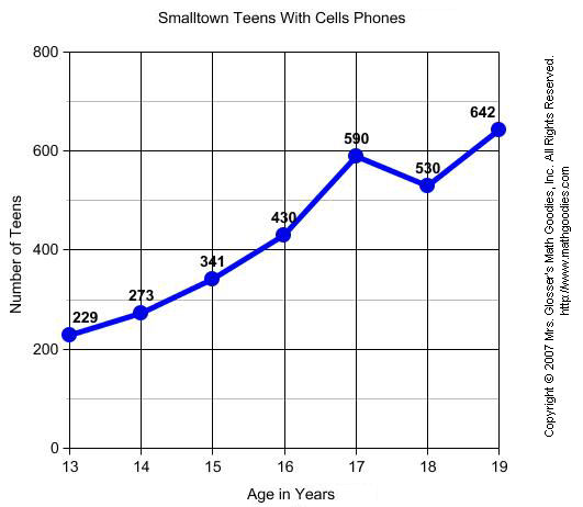
What label is along the y-axis in this graph?
Copyright 2007
Lines
Age in Years
Number of Teens
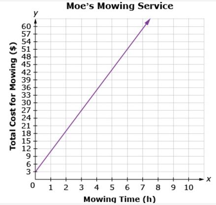
How much does it cost to have your lawn mowed for 2 hours?
$16
$17
$18
$19
At which age do the least amount of teens have a cell phone?
18
14
13
15
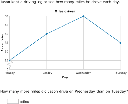
How many more miles did Jason drive on Wednesday than on Tuesday?
40 miles
10 miles
5 miles
50 miles

What is the difference between Jill's 12th grade math score and her 7th grade math score?
72
91
21
19

How many more students chose soccer than basketball?
9
6
3
15

How many students were surveyed in all?
22
23
3
9

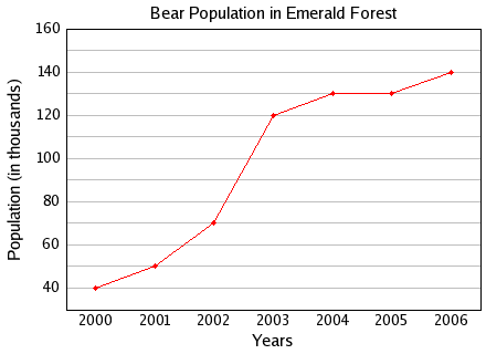
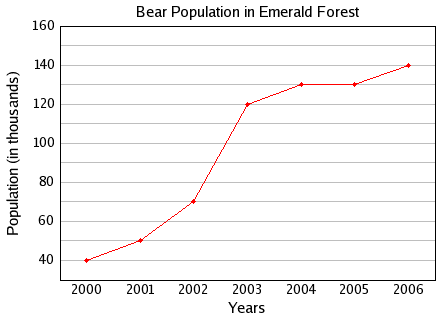
Based on the data in this graph, between which 2 years did the bear population stay the same?
2002-2003
2003-2004
2004-2005
2005-2006

Based on the data from this graph, what is true about the bear population in Emerald Forest?
The population is decreasing.
The population is staying the same.
The population is going down.
The population is increasing.

Which type of graph would best show the data in the table?
Bar graph
Line Graph
Pictograph
Pie Chart
What is true about line graphs?
They show categorical data.
They are a circle.
They show change over time.
They must be colorful.

How many cookies did they sell this week?
200
180
250
150
What is not true about bar graphs?
They show categorical data.
The data is graphed with bars.
They show change over time.
They must have a title.

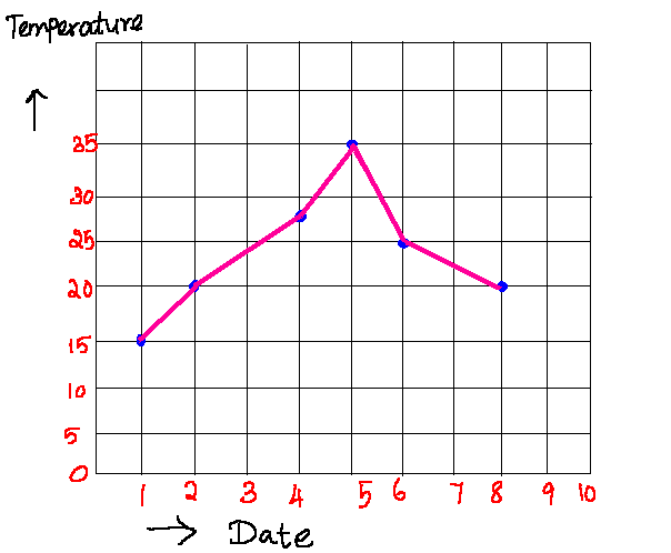
If the trend continues, what is the temperature likely to be on Day 7?
50
55
60
70

How much did the temperature increase from day 5 to day 6?
6 degrees
7 degrees
8 degrees
5 degrees

Which type of movie appears to be 5 times the favorite as drama?
romance
scifi
comedy
action

Which of the following is closest to the number of miles Mrs. Simmons drove in 5 hours?
200 miles
300 miles
250 miles
350 miles