
 Worksheets
Types of graphs
Total questions: 96
Worksheet time: 3hrs 50mins









To display data which compares favorite movie types, you should use a...
Circle Graph
Bar Graph
Line Graph
To display data showing your heights over the first ten years of your life, use a...
Circle Graph
Bar Graph
Line Graph
To display data comparing the colors of skittles in a bag compared to the total number of skittles in the bag, use a...
Circle Graph
Bar Graph
Line Graph

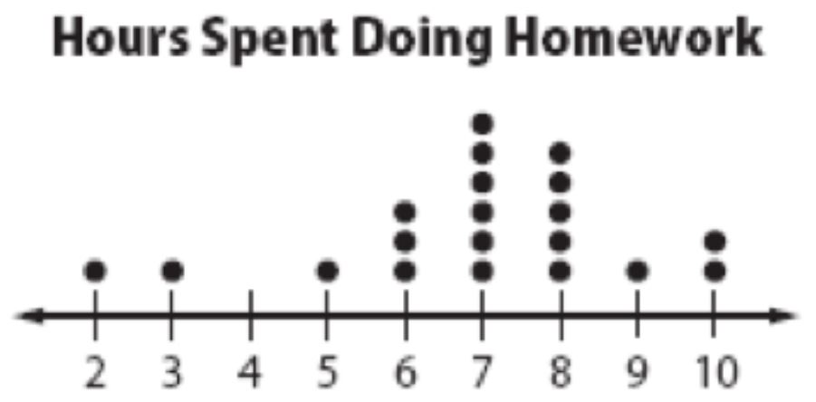
Name the type of graph.
pie chart
tally chart
pictograph
bar graph

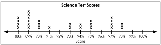
Name the type of graph.
pie chart
tally chart
pictograph
bar graph

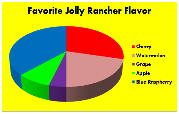
Name the type of graph.
pie chart
tally chart
pictograph
bar graph
The vertical axis of a line graph is called the __________.
slope
line of best fit
x-axis
y-axis
A ____________ shows the overall trend of all the data taken in an experiment.
line of best fit
slope
position
direction
A line graph shows how changes in a responding variable correspond to changes in a manipulated variable.
true
false
A _________ is a pair of numbers used to determine the position of a point on a graph.
coordinate
line of best fit
straight
x-axis
You can use a _______to show how the responding variable changes in response to the manipulated variable.
table
bar graph
line graph
circle graph
The slope of the graph tells you how much y changes for every change in x.
true
false
To calculate the slope of a graph, you need the coordinates of one point on a linear graph.
true
false
In a linear graph , the data points yield a curved line.
true
false
What is an independent variable?
the variable that changes because another variable changes
independent variables are only found on pie charts.
a variable most often found on the y-axis
the variable the experimenter changes or manipulates.
You have been asked to make a graph which represents everyone's favorite video game system in your class. Which type of graph would work best?
line
bar
circle
table
Which type of graph best represents data over a set period of time?
line
bar
table
circle
What is a dependent variable?
the variable the experimenter changes or manipulates.
the variable that changes because another variable changes
independent variables are only found on pie charts
a variable most often found on the x-axis
What is a data table?
Is a visual tool that uses that uses bars to compare data among categories
Used to compare the parts of a whole
Any display of information in tabular form, with rows and or columns named
Is a visual tool that uses that uses lines to compare data among categories
Which best describes a bar graph?
Any factor, trait, or condition that can exist in differing amounts or types
Useful for displaying data or information that changes continuously over time
Is a visual tool that uses that uses bars to compare data among categories
Any display of information in tabular form, with rows and or columns named
What is a variable?
something used to compare the parts of a whole
Something that is useful for displaying data or information that changes over time
Any display of information in tabular form, with rows and or columns named
Any factor, trait, or condition that can exist in differing amounts or types

How the mass of the dog changed
How much food the dog consumed
what kinds of food the dog consumed
When the dog was measured each month

The cooler the temperature, the louder the crickets chirp.
The crickets cannot chirp at temperatures lower than 10 degrees C.
The warmer the temperature, the more often crickets chirp.
The temperature and the chirping of crickets are not related.

What type of graph is this?
Linear
Quadratic
Cubic
Reciprocal

What type of graph is this?
Linear
Quadratic
Cubic
Reciprocal

What type of graph is this?
Linear
Quadratic
Cubic
Reciprocal

What type of graph is this?
Linear
Quadratic
Cubic
Reciprocal

What type of graph is this?
Linear
Quadratic
Cubic
Reciprocal

What type of graph is this?
Linear
Quadratic
Cubic
Reciprocal

What type of graph is this?
Linear
Quadratic
Cubic
Reciprocal

What type of graph is this?
Linear
Quadratic
Cubic
Reciprocal

What type of graph is this?
Linear
Quadratic
Cubic
Reciprocal

What type of graph is this?
Linear
Quadratic
Cubic
Reciprocal

What type of graph is this?
Linear
Quadratic
Cubic
Reciprocal

What type of graph is this?
Exponential
Quadratic
Cubic
Reciprocal
You use this type of graph when percentages are involved
pie or circle graph
bar graph
line graph
You use this type of graph when you are comparing part to another part.
pie or circle graph
bar graph
line graph
You use this type of graph when comparing a change over the course of time
pie or circle graph
bar graph
line graph
Lionel wants to measure the growth of his tomato plant over the course of 6 weeks. What type of graph would be best for him to use?
pie or circle graph
bar graph
line graph
Nancy wants to see how her shadow changes over the course of a year. She measures her shadow each month. What type of graph should she use?
pie or circle graph
bar graph
line graph
Nancy wants to see how her shadow changes over the course of a year. She measures her shadow each month. What type of graph should she use?
pie or circle graph
bar graph
line graph
Kyle wants to see how many jolly ranchers of each color are in a bag. What kind of graph should he use?
pie or circle graph
bar graph
line graph
Lucas puts two cups of water by the window and records how much water is in each cup at the end of each day. What kind of graph should Lucas use?
pie or circle graph
bar graph
line graph
Kathy records how many cars of each color are in the parking lot. What kind of graph should she use?
pie or circle graph
bar graph
line graph
Kathy records how many cars of each color are in the parking lot and then turns those into percentages. What kind of graph should she use?
pie or circle graph
bar graph
line graph
Natasha is coaching the school track team. She records the mile times for each of her three runners each week for the entire 2-month season. What kind of graph should Natasha make to show her data and why?
bar graph - she's comparing the times of the runners
line graph - she's comparing the times of the runners
line graph - she's showing change over time
pie or circle graph - she's showing a percentage

