wayground logo

Free Printable Worksheets

NEW

Font size

S
M
L
XL
Worksheets

Data Displays

Total questions: 20

Worksheet time: 27mins

Name
Class
Date
1.

What is the mode for this data set? Remember the mode is the most common or most frequent data.

a)

55

b)

60

c)

70

d)

75

2.

What is the range for this data set? Remember to subtract the minimum value from the maximum value.

a)

10

b)

15

c)

25

d)

30

3.

What is the median for this data set? Remember to rank the data in order from least to greatest, then find the median, which is the middle number in the ranked set of data.

a)

55

b)

60

c)

70

d)

75

4.

How many baseball teams scored 0 runs per inning?

a)

4

b)

3

c)

2

d)

1

5.

For how many weeks was the data collected?

a)

48

b)

50

c)

52

d)

54

6.

How many people were surveyed to collect this data?

a)

18

b)

20

c)

22

d)

24

7.
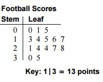
What is the range of the data shown in the stem and leaf plot?
a)
40
b)
56
c)
136
d)
96
8.
How many scores are listed in this Stem and Leaf Plot?
a)
3
b)
6
c)
9
d)
18
9.
In how many games did the team score more than 20 points?
a)
8
b)
7
c)
10
d)
9
10.

Look at the bar graph, "Nicest Fruit". What does the x-axis show?

a)

Types of fruit

b)

The number of people.

11.

Look at the bar graph, "Nicest Fruit". What does the y-axis show?

a)

Types of fruit

b)

Number of people.

12.

Look at the bar graph, "Nicest Fruit". What scale does the bar graph use?

a)

1

b)

2

c)

5

d)

10

13.
What type of graph is this?
a)
Bar Graph
b)
Histogram
c)
Line Plot
14.
Which interval has 400 employees?
a)
33-43
b)
0-10
c)
77-87
d)
66-76
15.
Which interval has the greatest number of employees?
a)
11-21
b)
33-43
c)
77-87
d)
44-54
16.
A PIE Chart is created using
a)
Cherries
b)
Apples
c)
Data
d)
Cars
17.
Which Continent is home to 36% of the wild cats?
a)
Asia
b)
Africa
c)
North America
d)
South America
18.
Which Continent is home to 13% of wild cats?
a)
Asia
b)
Africa
c)
North America
d)
South America
19.

The double dot plots show the average wait times, in minutes, for two popular rides at an amusement park. Which ride typically has a longer wait time?

a)

No inference can be made from the graph.

b)

Topsy Turvy

c)

The wait times are the same for both rides.

d)

Rocket Blast

20.
The box-and-whisker plots show the test scores of two different classes. Which class had a greater range of test scores?
a)
There is no range.
b)
2nd period
c)
the ranges are the same
d)
1st period