
 Worksheets
One try Unit 7 Lessons 1-5
Total questions: 45
Worksheet time: 11hrs 15mins

Which runner won the race? (Click image to enlarge.)
HINT: You are interpreting which line shows the most distance covered over the same time period.
A
B
C
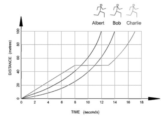
Which runner stopped for a rest? (Click on image to enlarge.)
Albert
Bob
Charlie

Which statement below accurately represents the graph? (Click to enlarge.)
$100 is earned for each hour worked
$100 is earned for every 2 hours worked
$500 is earned for every 8 hours worked
$200 is earned for every 3 hours worked

How many cars were sold on Saturday and Sunday? (Click on image to enlarge.)
5
3
8
10

If you surveyed 100 students and this was your results, how many liked comedy? (Click to enlarge image.)
10
20
40
50

The graph shows the results of a survey to determine student's favorite pets. Why is this graph misleading? (Click on image to enlarge.)
The slices are the wrong color
The slices are not the correct size
The percents do not add up to 100
Not misleading
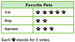
How many total votes were collected? (Click on image to enlarge.)
5
10
15
20

The pie chart shows the colours of 32 beads. How many green beads are there? (Click to enlarge image.)
HINT: The right angle is a clue. The 32 beads is 100% of the pie chart.
90
8
11
9
In mathematics, what is a table?
a picture
a group of columns and rows of data
the place where you eat
tells us what a graph is about
Why are graphs and charts important to analyze data?
Because we would never be able to know what is going on with the data.
Because teachers say they are important.
Because they are nice to look at.
Because they allow a person to visualize data and find patterns and trends in the data.

Name this type of graph. (Click to enlarge image.)
HINT: Though some answers may be similar, there is only ONE correct answer. Look carefully at the graph.
bar graph
line graph
pie graph
double bar graph

What is the title of the graph? (Click to enlarge image.)
Metro Bicycle Shop Weekly Sales
Bicycles Sold
Types of Bicycles
What is a database?
A piece of software to do calculations
A device to load information onto the computer.
An organized collection of data.
A calculator
What can you do if the list of answers you provided for your survey question does not have the answer people want to choose?
provide as many answer choices as you can
force them to select only from the options you’ve provided
add an "other" answer option or comment box
ask them to leave it blank

You're scheduled to interview a small town mayor. Choose the best source for the background research.
Wikipedia
Local Newspaper
Encyclopedia
Mayor's husband
Which of these questions is open-ended?
HINT: Open-ended questions cannot be answered with a yes or no answer.
What is the garbage collection schedule like in your town?
Do you think the garbage collection schedule is adequate?
Is Tuesday a convenient day for garbage collection?
Has garbage always been collected on Tuesdays and Thursdays?
Which of the following would probably be the best place to conduct an interview with one of your teachers?
The school lunchroom, during lunch time
In the stands during a school football game
The principal's office with the principal listening in
In her classroom after school

What type of survey question is this? (Click on image to enlarge.)
Multiple-Choice
Scale
Open-Ended
Yes/No

What type of survey question is this? (Click on image to enlarge,)
Multiple-Choice
Scale
Open-Ended
Yes/No
You would like to compare eye colors to the number of students in your classroom. Which graph would you choose to best display this data?
Bar Graph
Line Graph
Pie Chart
Pictograph
You are trying to prove that your family spends way too much money on entertainment.
Your family monthly spending looks like this:
Food = $450
Entertainment = $800
Home Mortgage = $1,250
Maintenance = $200
Meals Outside Home = $150
Which two graphs could you use to best display this data?
Line Graph and Pictogram
Pictogram and Pie Chart
Pie Chart and Bar Graph
Bar Graph and Line Graph

Choose an appropriate data display for the given situation.
(Click on image to enlarge.)
Bar Graph
Line Graph
Pie Chart
Double Bar Graph

Which graph is best appropriate to display the data?
(Click on image to enlarge.)
Pie Chart
Bar Graph
Line Graph
Pictograph

Choose an appropriate data display for the given situation.
(Click on image to enlarge.)
HINT: Which graph shows 100% of data?
Line Graph
Pie Chart
Bar Graph
Pictograph

Which graph best shows the number of students who got B as a final grade? (Click on image to enlarge.)
HINT: What is the question asking you? In which graph can you easily see the answer?
Bar Graph
Pie Chart

Which graph is more appropriate to display the data?
(Click on image to enlarge.)
Graph 1
Graph 2

The data display above is misleading. It would best be replaced with a:
(Click image to enlarge.) HINT: Look at the title.
Bar Graph
Line Graph
Pie Chart
Double Bar Graph

How many people ordered the cheese topping?
(Click to enlarge image.)
5 orders
25 orders
20 orders
30 orders

How many pictures did Earl draw? (Click image to enlarge.)
5 pictures
20 pictures
16 pictures
18 pictures
An example of a print database:
TV
dictionary
radio
internet
We can use electronic media to collect data. An example of electronic media is:
telephone book
internet
dictionary
newspaper
A fair question is a question should not influence a person's answer.
True
False
Do you like to eat disgusting broccoli or delicious watermelon?
This is an example of a:
fair question
biased question
Statistics Canada stores data in electronic databases.
True
False
Electronic media can be a way to collect data.
True
False
You want to find out who are the leading point scorers in the NHL today.
You would____________________to gather your data.
Choose the best answer to fill in the blank.
use the newspaper
use electronic media
go to the library
ask your neighbor
You need to use a jagged line to show a break on your graph when you are not showing all the numbers.
True
False
It is not important to draw your graphs using a consistent, appropriate scale.
True
False

Based on the bar graph, how many more students take the bus than car? (Click on image to enlarge.)
25
35
10
15

The graph below shows the number of sunny days and rainy days in a city during four months.
(Click on image to enlarge,)
Based on the information in the graph, which inference about the general weather days is valid (correct)?
There are more rainy days in April than sunny days in March.
There are more sunny days in May than any other month.
There are more rainy days in March than sunny days in May.
There are more sunny days in June than all the other months combined.

