
 Worksheets
statistical analysis
Total questions: 51
Worksheet time: 2hrs 40mins
A consumer confidence researcher asks several retailers to report the number of LCD televisions sold during a particular month. These numbers most likely represent what level of measurement?
Ordinal
Ratio
Interval
Nominal
A consumer confidence researcher asks several retailers to report the number of LCD televisions sold during a particular month. These numbers most likely represent what level of measurement?
Ordinal
Ratio
Interval
Nominal
A consumer confidence researcher asks several retailers to report the number of LCD televisions sold during a particular month. These numbers most likely represent what level of measurement?
Ordinal
Ratio
Interval
Nominal


Select all the statements that describe the data
shown
Every student took at least 5 vacation days
More than half the students took 0 to
8 vacation days.
There are 31 students in the class
Two more students went on vacation
for 5 to 8 days than did 0 to 4 days.
Ten students took more than 8 vacation days
How many customers enjoyed their shopping experience with us last year?
Quantitative
Qualitative
How many customers from Europe prefer to purchase online or in-store?
Quantitative
Qualitative
How do our customers feel about our new store lay-out?
Quantitative
Qualitative

Find the cumulative frequencies.
28, 56, 84, 100
28, 58, 70, 72, 74, 76
33%, 37%, 20%, 7%, 7%, 7%
28, 30, 12, 2, 2, 2

Calculate relative frequency of right handed people to the whole group
90/270
90/100
180/300
270/300
Calculate relative frequency of left handed people who prefer pie to the whole group
20/30
30/300
20/200
20/300
Looking at the two-way table, what does the following mean? 10010=0.10=10%
10% of people prefer cake
10% of people are left handed
10% of people who prefer cake are left-handed
10% of people prefer cake & are left-handed
Looking at the two-way table, what does the following mean? 30090=0.3=30%
30% of people prefer cake
30% of right-handed people prefer cake
30% of people are right-handed and prefer cake
30% of people are left-handed and prefer cake

Identify the class with the least relative frequency.
115 - 125
125 - 135
135 - 145
145 - 155
Approximate the greatest relative frequency.
0.03
0.15
0.25
0.35

Use the frequency histogram to determine the number of classes.
5
6
7
8

Use the frequency polygon to identify the class with the greatest frequency.
20.5 - 23.5
29.5 - 32.5
35.5 - 38.5


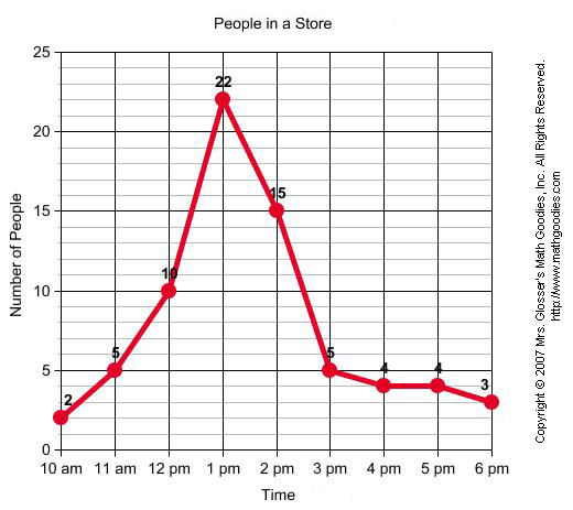
When was the greatest amount of shoppers at the store?
10am
1pm
6pm
2pm

Which Continent has the smallest % of wild cats?
Asia
Europe
North America
South America

How many MORE people like Owls than Dogs?
10
6
1
3

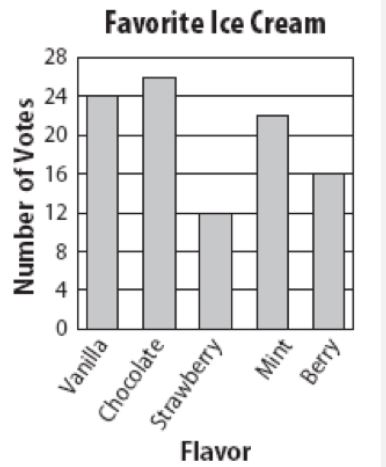
How many fewer people prefer Vanilla to Mint?
7
5
2
10


Part/total= %/100

The bar graph shows pizza toppings students enjoy. Which circle graph displays the same data?


If 200 people were surveyed, approximately how many people like pepperoni and cheese as their topping?
100 people
150 people
50 people
75%

25
15
5
10

32
33
44
38

72
28
87
13


Which is correct?
Sales of food and drink... from Monday to Friday.

From Tuesday to Wednesday there is ....

Look at the line graph. Which is the best description for the line representing country A?
The population increased steadily then declined.
The population remained steady then increased slightly.
The population remained steady then increased dramatically.
Look at the line graph. What was the population of country B in 2000?
3.8 million
500, 000
2.5 million
Look at the line graph. What will the population of country A be in 2050?
2%
2 million
2.8 million
Look at the line graph. Which country does the following statement best describe?
"The population aged over 65 is expected to reach 20 million by the year 2100."
A
B
C
Look at the line graph. Which country does the following statement best describe?
"The population is expected to almost double from 2000 to 2050."
A
B
C

