wayground logo

Free Printable Worksheets

Font size

S
M
L
XL
Worksheets

Chapter 7-Collecting, Displaying & Analyzing Data

Total questions: 97

Worksheet time: 4hrs 24mins

Name
Class
Date
1.
What is the median of the data set?
9, 7, 2, 4, 3, 5, 9, 6, 8, 0, 3, 8
a)
6
b)
7
c)
5.5
d)
9
2.
Another name for the "mean"
a)
Middle number
b)
Average
c)
Number that repeats the most
d)
Rude
3.
What is the mean of the data set:
8.9, 9.4, 8.6, 9.1
a)
8.5
b)
8.9
c)
9
d)
9.1
4.
What is the first thing you should do before finding the median or the mode?
a)
Start crossing numbers off
b)
Put numbers in order from least to greatest
c)
List the numbers how they are
d)
Look for repeats
5.
How do you find the average of a data set?
a)
Add them all up and divide by how many numbers there are
b)
List in order from least to greatest
c)
Add the numbers and subtract the largest number
d)
Find the repeated numbers
6.
Identify the outlier of the data set:
22, 32, 26, 31, 2, 33, 27
a)
32
b)
31
c)
2
d)
22
7.
If my data set had an outlier that was quite a bit more than the other numbers in my data set, what would it do to my average
a)
leave it the same
b)
increase the average
c)
decrease the average
8.

What is the definition of the mean?

a)

Add all the numbers together and divide by the number in the set.

b)

The middle number after the numbers have been put in order from least to greatest.

c)

The difference between the highest and lowest numbers

d)

The number that occurs the most often.

9.

What is the definition of median?

a)

Add the numbers together and then divide by the number in the set.

b)

The difference between the largest and smallest number.

c)

The number in the middle when the numbers are in order from least to greatest.

d)

The number that appears most often.

10.

What is the definition of mode?

a)

The average

b)

The number that appears most often.

c)

The largest number - the smallest number

d)

The number in the middle.

11.
When finding the median, what do you do if there are two middle numbers?
a)
Add them together and divide by 2
b)
Write them both as the answer
c)
Give up
d)
Pick one
12.

For the data set below, which of the following measures is the greatest?

(20, 25, 30, 31, 32, 45, 45, 80)

Mean = _________, Median = _________ Mode = __________

a)

Mean

b)

Median

c)

Mode

d)

None of the above

13.
The mode score on the 6th grade math test was 94! Which of these interpretations must be correct?
a)
99 was the highest score on the test.
b)
More students received a 94 than any other score
c)
No student scored below a 50
d)
A score of 91 was slightly below average.
14.

Find the mean of the following data set:

45 , 10 , 15 , 20 , 30 , 35 , 40 , 25

(a)  

15.
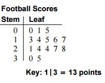
What is the range of the data shown in the stem and leaf plot?
a)
40
b)
56
c)
136
d)
96
16.
1. Which of the following best describes the process of finding the range for a set of data?
a)
ADD the biggest and smallest numbers
b)
Place the number in order from least to greatest then find the middle.
c)
Find the difference between the Maximum and the Minimum.
d)
Find the average.
17.
How many scores are listed in this Stem and Leaf Plot?
a)
3
b)
6
c)
9
d)
18
18.
What is the minimum in this data set?
a)
0
b)
4
c)
9
d)
40
19.
In how many games did the team score more than 20 points?
a)
8
b)
7
c)
10
d)
9
20.
What is the mode of the scores?
a)
24
b)
14
c)
34
d)
30
21.

What is the range of the data set? Remember to subtract the minimum value from the maximum value.

a)

4

b)

3

c)

2

d)

1

22.

For how many weeks was the data collected?

a)

48

b)

50

c)

52

d)

54

23.

How many people were surveyed to collect this data?

a)

18

b)

20

c)

22

d)

24

24.

For how many weeks did it rain 5 days?

a)

1

b)

5

c)

6

d)

4

25.
How do you group tally marks together?
a)
by ones
b)
by twos
c)
by threes
d)
by fives
26.
What type of association does this graph have?
a)
positive
b)
negative
c)
none
d)
all of the above
27.
What type of association does this graph show?
a)
Positive
b)
negative
c)
none
d)
all of the above
28.
About how many male math teachers were there in 2006?
a)
15
b)
30
c)
35
d)
45
29.
The number of siblings you have and your weight. 
a)
Positive correlation
b)
Negative correlation
c)
No correlation
30.

What percentage does the entire circle graph represent?

a)

100%

b)

50%

c)

25%

d)

15%

31.

The pie chart shows the percent of students with different footwear. Estimate the percent of students who wear sneakers.

a)

22%

b)

11%

c)

32%

d)

30%

32.

If this survey included 2,500 people, how many people said they like sausage on their pizza?

a)

625 people

b)

375 people

c)

167 people

d)

16,600 people

33.

If this survey included 2,500 people, how many people said they like supreme pizza?

a)

250 people

b)

25,000 people

c)

625 people

d)

375 people

34.

If this survey included 2,500 people, how many people said they like to have pepperoni pizza?

a)

1,250 people

b)

625 people

c)

250 people

d)

375 people

35.
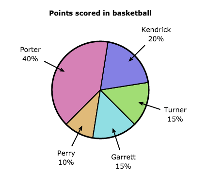
The team scored 50 points. How many points did Kendrick score?
a)
12 points
b)
20 points
c)
10 points
d)
72 points
36.
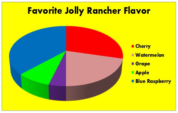
According to this circle graph, what is the least popular flavor of Jolly Rancher?
a)
Blue Rasberry
b)
Watermelon
c)
Grape
d)
Apple
37.

Look at the bar graph, "Nicest Fruit". What does the x-axis show?

a)

Types of fruit

b)

The number of people.

38.

Look at the bar graph, "Nicest Fruit". What does the y-axis show?

a)

Types of fruit

b)

Number of people.

39.

Look at the bar graph, "Nicest Fruit". What scale does the bar graph use?

a)

1

b)

2

c)

5

d)

10

40.
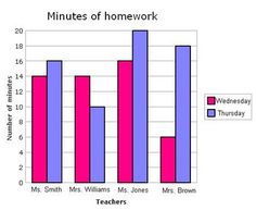
Which day had more minutes of homework?
a)
Wednesday
b)
Thursday
c)
Friday
d)
Ms. Jones
41.
How many votes did reading and social studies receive together?
a)
9
b)
11
c)
13
d)
15
42.

The histogram above shows the total number of books read by students in the Principal's Reading Club during the school year. How many books were read from January through April.

a)

85

b)

80

c)

95

d)

87

43.

Students at Center Jr. High were surveyed and asked about their favorite school after work snack. The bar graph shows the results of the survey.

Based on the graph, which statement is true?

a)

Twice as many students chose ice cream as chose fruit for their favorite snack.

b)

Twice as many students chose chips/ dips as chose ice cream for their favorite snack.

c)

The same number of students chose chips/ dips as chose cheese & crackers as their favorite snack.
d)

Fifteen more students chose ice cream as chose cheese & crackers as their favorite snack.
44.
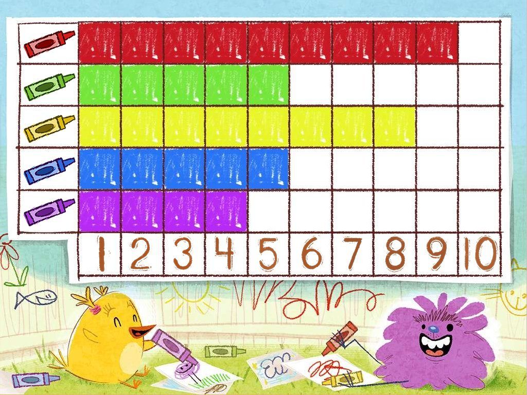
How many more people like red than purple?
a)
100
b)
10
c)
2
d)
5
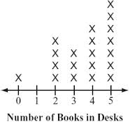
45.
How many people have two or less books in their desk?
a)
4
b)
5
c)
6
d)
7
46.
What is the difference between the highest score and the lowest score on the test?
a)
15
b)
100
c)
6
d)
10
47.
What is the name of this graph?
a)
line plot
b)
line graph
c)
bar graph
d)
frequency table
48.
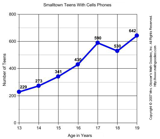
What is the main purpose of a line graph?
a)
to compare two things
b)
to show trends over time
c)
to have an independent variable
d)
so you don't have to read words
49.
What label is along the y-axis in this graph?
a)
Copyright 2007
b)
Lines
c)
Age in Years
d)
Number of Teens
50.
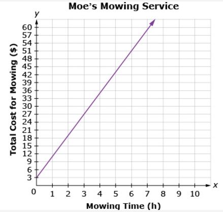
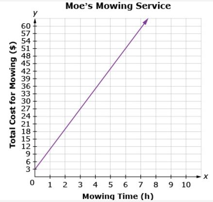
What is the general trend of this line graph?
a)
The more you mow, the less money you make.
b)
You make the same amount of money regardless of how long you mow.
c)
The more you mow, the more money you make.
d)
Mowing is dangerous.
51.
How much does it cost to have your lawn mowed for 2 hours?
a)
$16
b)
$17
c)
$18
d)
$19
52.
The X axis is _______?
a)
vertical
b)
diagonal
c)
criss-cross
d)
horizontal
53.
The Y axis is _______?
a)
Vertical
b)
Horizontal
c)
criss-cross
d)
diagonal
54.
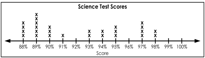
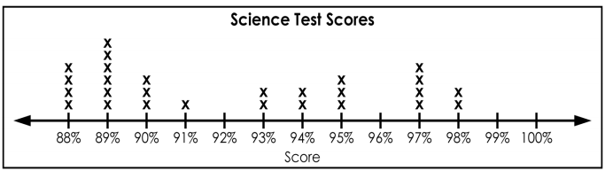
How many students received a score of 94%? 
a)
94
b)
4
c)
1
d)
2
55.
What is the highest score in the class?
a)
88%
b)
100%
c)
13
d)
98%
56.
How many total students are in the science class?
a)
13
b)
6
c)
27
d)
25
57.
What is the median?
a)
62
b)
58
c)
66
d)
60
58.
What is the minimum value?
a)
64
b)
58
c)
66
d)
61
59.
What is the maximum value?
a)
58
b)
66
c)
64
d)
60
60.
What value is the lower quartile (Q1)?
a)
66
b)
58
c)
60
d)
64
61.
What data value is the upper quartile (Q3)?
a)
64
b)
62
c)
66
d)
58
62.
What is the term that means the middle data value?
Hint: Look at your notes!
a)
Median
b)
Mode
c)
Mean 
d)
Range
63.
What is the term for the median of the upper half of the data?
Hint: Look at your notes!
a)
Upper Quartile
b)
Lower Quartile
c)
Median
d)
Minimum
64.
What is the term for the median of the lower half of the data?
Hint: Look at your notes!
a)
Lower Quartile
b)
Upper Quartile
c)
Median
d)
Maximum
65.
What two values do the "whiskers" stand for on a box and whisker plot?
a)
Minimum and Maximum
b)
Lower and Upper Quartile
66.
Which city has a higher median?
a)
Millersburg
b)
Arcadia
67.
Which best represents the Interquartile Range
a)
15
b)
93
c)
85
d)
78
68.
What is the range of the set of data?
a)
70
b)
65
c)
80
d)
55
69.
_______ is a part of a group being surveyed.
a)
Sample
b)
Population
c)
Random Sample
d)
Quartile
70.

_________ is a sample in which each individual or object in the entire population has an equal chance of being selected.

a)
Sample
b)
Population
c)
Random Sample
d)
Quartile
71.
_______ is the entire group of objects or individuals considered for a survey.
a)
Sample
b)
Population
c)
Random Sample
d)
Quartile
72.
The manager of a book store surveys people who buy mystery novels to see if the store should expand its hours.  What is the population?
a)
People who visit the bookstore.
b)
People who buy mystery novels.
c)
Residents of the town
d)
People who like to read.
73.
A student surveys mathematics teachers to get their opinion on teaching.  What is the sample?
a)
All teachers in the world.
b)
All teachers within the school.
c)
All mathematics  teachers in the school.
d)
All teachers except mathematics teachers.
74.
A new cable TV station wants to study the viewing habits of households.  The station surveys every household that purchased a new TV within the last 2 years in New York.  Is this random sampling?
a)
Yes
b)
No
75.
A U.S. senator from Maine wants to find out the opinion of the voters in his state on issues concerning education.  The office of the senator sends out a survey to a random sample of registered voters in Maine.  Is this random sampling?
a)
Yes
b)
No
76.
Kim surveys 100 moviegoers that entered the movie theater in the first hour.  What type of sampling method is this?
a)
Random
b)
Convenience
c)
Biased
77.
Tom surveys 40 moviegoers by randomly choosing their names.  What type of sampling method is this?
a)
Random
b)
Convenience
c)
Biased
78.
The Candlelit-Dinner Candle Store surveys its Monday customers to find out their opinion on a new scented candle.  Is this biased or unbiased?
a)
Biased
b)
Unbiased
79.
A teacher decides to survey the students in her classes to find out their opinion on the new menu in the cafeteria.  Is this biased or unbiased?
a)
Biased
b)
Unbiased
80.
The TV station wants to get the opinion of viewers on the look of a new game-show set.  The station's staff calls random people in the phone book.  Is this biased or unbiased?
a)
Biased
b)
Unbiased
81.

You would like to compare the number of votes that 6 candidates received in the latest student election.

a)

Bar Graph

b)

Line Graph

c)

Pie Chart

d)

Histogram

82.

You are trying to prove that your family spends way too much money on entertainment. Your family monthly spending looks like this:

$450 food $800 entertainment $1,250 home mortgage

$200 maintenance $150 meals outside home

a)

Line Graph

b)

Histogram

c)

Pie Chart

d)

Bar Graph

83.

You would like to track the total amount of monthly sales over the period of a year for three sale people.

a)

Line Graph

b)

Bar Graph

c)

Pie Chart

d)

Histogram

84.

Choose an appropriate data display for the given situation.

a)

Bar Graph

b)

Line Graph

c)

Pie Chart

d)

Histogram

85.

Which graph is best appropriate to display the data?

a)

Pie Chart

b)

Bar Graph

c)

Line Graph

d)

Histogram

86.

Which graph is best display of data?

a)

Bar Graph

b)

Line Graph

c)

Histogram

d)

Pie Chart

87.

Which graph best shows the number of students who got B as a final grade?

a)

Bar Graph

b)

Pie Chart

88.

Which graph would you choose in each case?

i. You want to show how the times changed over time.

ii. You want to show the differences between the times for each year.

a)

both using line graph

b)

i. line graph

ii. bar graph

c)

both using bar graph

d)

i. bar graph

ii. line graph

89.

Which statement below is the correct answer for the difference between bar graph and histogram?

a)

Bar graph and Histogram is actually same

b)

Histogram is better than bar graph to show discrete data

c)

Histogram groups numbers into ranges, but bar graph doesn't

d)

all statements above are true

90.
Explain why this graph may be misleading?
a)
the x-axis does not have equal intervals
b)
San Fransisco is not a real city
c)
you cannot have percents in a line graph
d)
the y-axis does not have equal intervals
91.
The graph shows the results of a survey to determine student's favorite pets. Why is this graph misleading?
a)
The slices are the wrong color
b)
The slices are not the correct size
c)
The percents do not add up to 100
d)
Not misleading
92.

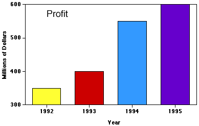
Why is this graph misleading?

a)

x axis intervals are different

b)

y axis intervals are different

c)

y axis doesn't start at 0

d)

you can't use different colors

93.

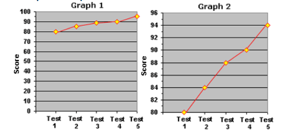
Alden wanted to impress his parents by showing the rapid increase in his score on 5 tests. Which graph should he use to impress them?

a)

Graph 1

b)

Graph 2

c)

Neither

d)

Both

94.

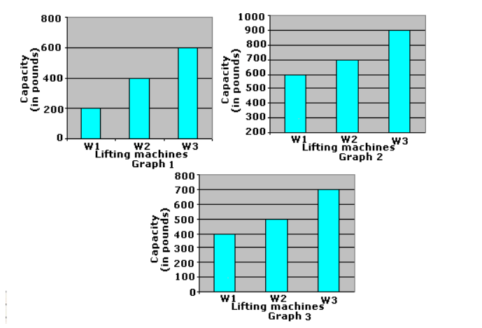
Which graph is misleading?

a)

graph 1

b)

graph 2

c)

graph 3

d)

graph 2 and 3

95.

What is wrong with this graph?

a)

Not enough information.

b)

The basketball ticket prices in 2001 were approximately 2 times as much as 1991, yet the size of the basketballs are about 4 times as big.

c)

y axis scale is not uniform

96.

What is the best way to protect yourself against misleading graphs?

a)

A.) Look at the visual representation only.

b)

B.) Never trust graphed data again.

c)

C.) Read the labels, the scale, the numbers, and the context.

d)

D.) Look only at the curves and the trend of the data.

97.

What makes this graph bad?

a)

The graph is blue.

b)

The y axis has numbers on it.

c)

There isn't any data on it.

d)

The x axis is empty.