
 Worksheets
ACT Graph Prep 5
Total questions: 35
Worksheet time: 1hrs 8mins

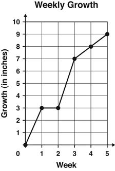
The graph shows the number of inches a plant grew each week.
Between which 2 weeks did the plant grow the MOST?
Week 1 and Week 2
Week 2 and Week 3
Week 3 and Week 4
Week 4 and Week 5
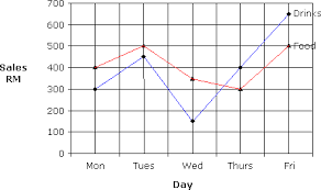
People buy more drinks on (a) than any other day.

Which month had the biggest difference between the high and low temperatures?
(a)


Here distance stands for Bill's distance from Ridgewood. When was Bill furthest from Ridgewood?
(a)

In this graph, what are the units for of the dependent to the independent or the slope?

The graph shows the relationship between pressure and the depth in the earth's layers as rock is formed. Which statement summarizes the cause-and-effect relationship that the graph shows?
As the amount of pressure increases, the depth decreases
As the amount of pressure decreases, the deph increases
As the amount of pressure increases, the depth increases
As the amount of pressure decreases, the depth remains the same


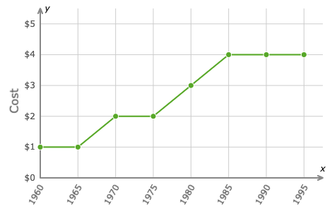
What year did a ticket cost $3.00?
(a)
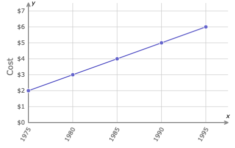
What year did a book cost $4.00?
(a)

What do the two axes of this bar graph represent?
The x-axis represents temperature, and the y-axis represents wind speed of tornadoes.
The x-axis represents cities, and the y-axis represents average number of people injured.
The x-axis represents cities, and the y-axis represents average numbers of tornadoes.
Which provides the best explanation for the different types of graphs: bar, line, and circle.?
Bar graphs are best for comparing values. Line graphs are best for showing changes over time. Circle graphs are best for showing percentages of a population.
Bar graphs are best for showing changes over time. Line graphs are best for showing percentages of a population. Circle graphs are best for showing comparisons.
Bar graphs are best for showing percentages of a population. Line graphs are best for showing changes over time. Circle graphs are best for showing comparisons.

Which type of graph is best to display the data shown?
bar graph
line graph
circle graph
scatter plot

Which type of graph would be best to display the data in the table shown?
bar graph
line graph
circle graph
scatter plot

Which type of graph would be best to display the data in the table shown?
bar graph
line graph
circle graph
scatter plot

The graph below shows the rainfall over a period of 12 months. Find the month after it started increasing for the first time.
Februrary
April
November
June

The graph below shows the average hours of sun per day over a period of one year. What was the month in which there were the least number of average hours of sun per day?
January
May
March
December

The graph shows the number of visitors at a museum over six days. Find the weekday when there were the second least number of visitors in a day?
Wednesday
Friday
Thursday
Sunday

The graph below shows noon temperatures for five days. What weekday had the second least noon temperature for the five days?
Tuesday
Wednesday
Thursday
Monday

The graph below shows the average hours of sun per day over a period of one year. Which other month had the same number of average hours of sun per day as February?
July
January
December
November
The graph below shows the average hours of sun per day over a period of one year. What was the month in which there were the most number of average hours of sun per day?
July
January
February
August

The graph below shows the rainfall over a period of 12 months. Find the month in which there was the second least rainfall.
(a)


