
 Worksheets
Organizing data and Graphing
Total questions: 30
Worksheet time: 30mins
What type of graph would be best to show the relationship between the number of endangered species over time.
bar graph
line graph
circle graph
data table
There are 15 kids in Tim’s class, if you wanted to use a graph to plot how tall each one of them is, which would be the best graph to use.
line graph
bar graph
circle graph
data table
What’s another name for a circle graph?
pizza chart
cake chart
pie chart
box graph
A bar graph shows the number of calories in five different types of cookies. How can you tell which cookie has the highest number of calories using the bar graph?
its bar goes the highest
its bar is the widest
its bar is twice as long as the other bars
its bar is the shortest
Which graph would be best to help display the average snow fall for the winter months in Buffalo?
bar graph
line graph
circle graph
data table
Which graph would be best to show the relationship of the amount of each type of gases in total in the atmosphere?
line graph
circle graph
bar graph
data table

According to the data table, as the pressure of the gas increases, the volume of the gas...?
decreases
increases
remains the same
none of the above

What is the dependent variable in this experiment?
incubation temperature
number of bacteria
the effect of E.Coli bacteria
bacteria type


What type of graph is this?
line graph
circle graph
data table
bar graph

What type of graph is this?
bar graph
circle graph
line graph
data table
The ___________ graph shows the relationship between two variables over time.
line graph
bar graph
circle graph
data table
The ____________________ graph is best when one variable isn’t a number.
line graph
bar graph
circle graph
data table
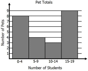


What is wrong with this graph?
The dependent variable is not labeled.
The data that is graphed is incorrect and a different graph should have been used.
The intervals on the x and y axis are written incorrectly.
The color of the graph is not appropriate or professional
What is something on a graph that you have control over and isn't changed by any other variable?
Independent variable
Dependent variable
Controlled variable
Extraneous variable
Time such as minutes, days, and months will always be a(n) ________________ variable when graphing.
Controlled
Independent
Dependent
Extraneous

What is the independent variable in this graph?
Tadpoles
Year
Frogs
Number of tadpoles in the pond

What type of variable is the "Price per Bushel (dollars)" in this graph?
Bar graph
Dependent variable
Independent variable
Controlled variable
What type of graph shows change over time?


Why are graphs and charts important to analyze data?
Graphs and charts are important to analyze data because we would never be able to know what is going on with the data.
Graphs and charts are important to analyze data because teachers say they are important.
Charts and graphs is something good to do because they are nice to look at.
Charts and graphs allow a person to visualize data and find patterns and trends in the data.
You want to create a graph that shows your height over a 12-month period. What type of graph will you use? Why?
A line graph because you can put the data points on the graph and see how much you grew over a 12-month period.
Both a line and bar graph would be appropriate because both graphs would be able to show your height over a 12-month period.
A circle graph because we will be able to easily see your height over a 12-month period.
A bar graph because the bars will make it very easy to see how you grow over the months.
What is a dependent variable?
A variable most often found on the x-axis
Dependent variables are only found on pie charts
The variable that changes because another variable changes
The variable the experimenter changes or manipulates
You have been asked to make a graph which represents everyone's favorite video game system in your class. Which type of graph would work best?
Circle
Table
Bar
Line

What part of this data table will be graphed on the Y-AXIS?
The food cooked
Type of barbecue
The time
The temperature
What type of graph would be BEST for showing plant growth? A line graph or a bar graph?
line graph
bar graph

