
 Worksheets
Graphing Review
Total questions: 41
Worksheet time: 1hrs 11mins
What must you have to make a graph?
data
facts
a hypothesis
variables
What kind of relationships do circle graphs show?
Parts of a whole
changes over time
Two Separate Sets of Data
The Independent Variable is represented on which Axis?
it can be represented on either axis
X
Y
What must be included at the top of the graph?
X axis
data table
title
scale/interval
What is the name of the vertical (up and down) axis of the graph?
X axis
Y axis
What should be used to pick the numbers (interval) for the scale of a graph?
you must always count by ones
you must always count by tens
use your data to pick the scale
you don't need a scale
What would be the best interval for this data?
Days Cm
1 1.0
2 3.5
3 5.0
4 8.5
count by fives up to 10
count by tens up to 100
count by ones up to 5
count by ones up to 10
it can be represented on either axis
Y
the thing we change or test in an experiment
the data before anything is tested
what we measure at the end of an experiment
the thing we keep the same in an experiment
What is the dependent variable in an experiment?
the thing we change or test in an experiment
the data before anything is tested
what we measure at the end of an experiment
the thing we keep the same in an experiment
Does the Y-Axis need to be labeled?

What is the dependent variable in this graph?
the specific diet of an animal

A line graph allows you to easily see:


information about parts related to the whole.
how data changes over time
comparisons at different times

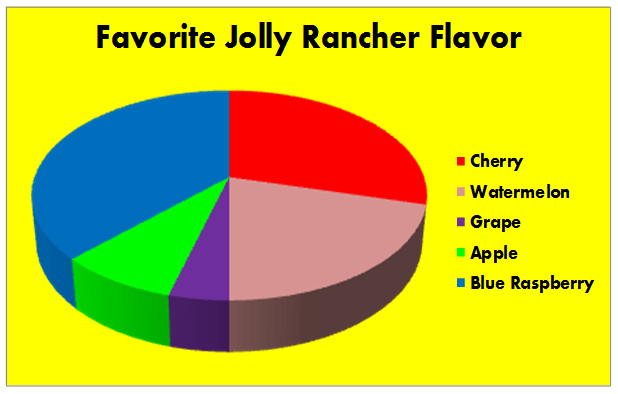

What graph is used to see the percentage in the groups? (hint: the percentage or part of the whole)
data table


You have been asked to make a graph which represents everyone's favorite video game system in your class. Which type of graph would work best?
line
bar
circle
table
What is a dependent variable?
the variable the experimenter changes or manipulates.
the variable that changes because another variable changes
the variable that remains constant in an experiment
a variable most often found on the x-axis
What is a variable?
something used to compare the parts of an experiment
Any display of information gathered from an experiment
Any factor, trait, or condition that can be changed in an experiment

What is being shown in this graph?
How the mass of the dog changed over time
How much food the dog consumed
what kinds of food the dog consumed over time
When the dog was measured each year

What can we conclude from reading this graph?
The cooler the temperature, the louder the crickets chirp.
The crickets cannot chirp at temperatures lower than 10 degrees C.
The warmer the temperature, the more often crickets chirp.
The temperature and the chirping of crickets are not related.

What is the independent variable?
population numbers of different species
years
bears
the orange line

What is the dependent variable?
wildlife population
years
bears
the orange line
What is the interval of the y-axis?
counting by 25 up to 175
counting by 25
there's no way to tell
counting by 1 year

