
NEW
Font size
 Worksheets
Graphing
Total questions: 15
Worksheet time: 32mins
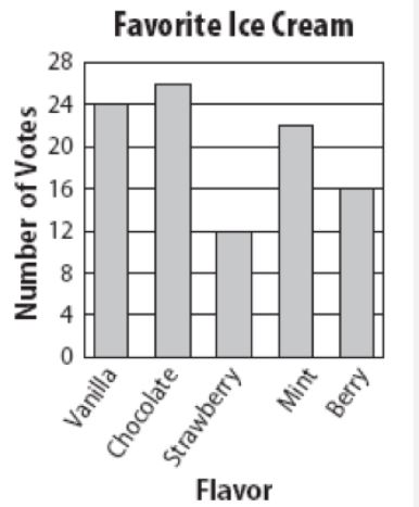
How many total people took part in the survey?
50
150
100
200
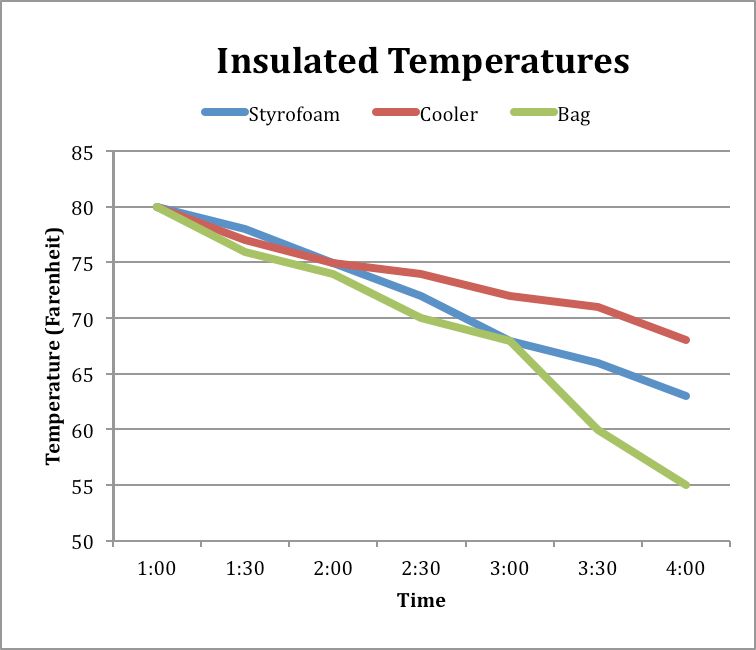
What was the temperature of the liquid in the Styrofoam container at 4:00?
55 degrees
68 degrees
73 degrees
63 degrees
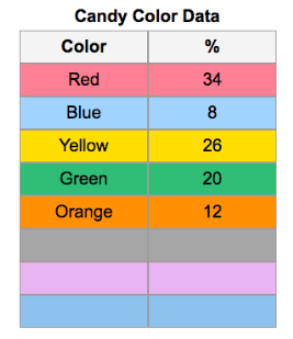
Based on the table provided, which type of graph would be best for the data?
Line graph
Bar Graph
Pie Chart
Scatter Plot
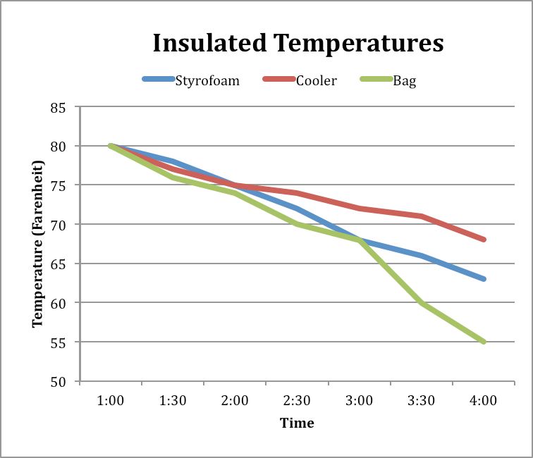
What data does this graph represent?
This graph represents the change in temperature of a liquid over time in 3 different containers.
This graph represents how temperature can change the molecules in a material.
This graph represents the phase changes of a material.
This graph represents what type of container people use the most to store hot liquids.
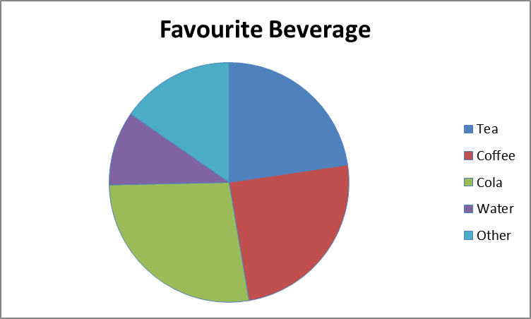
Approximately what percentage of people prefer Tea as their favorite beverage?
around 28%
around 18%
around 25%
around 23%


when you want to compare categories you use ________
Bar graph
Line graph
Pie chart
Example:
Daily temperatures over a 7 day period.
Bar graph
Line graph
Pie chart
Example:
What percent of 8th graders like hip hop, country, and pop music?
Bar graph
Line graph
Pie chart
Example:
Comparing student’s favorite type of candy
Bar graph
Line graph
Pie chart

