
 Worksheets
interpreting graphs
Total questions: 15
Worksheet time: 52mins

This graph shows the population of the town of Golden Hills, modeled as a function of time since the town's founding.
The population is increasing throughout the time period.
The population has a constant rate of change.

The minimum hippo population was recorded in the year (a) .
List one reason why the hippo population may have increased...

When was there the highest rainfall?
Day 8
Day 12
Day 3
Day 5


Which quarter had the highest engagement in social media?
quarter 1
quarter 2
quarter 3
quarter 4

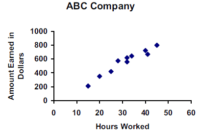
If Joe worked 30 hours, how much is he expected to earn?
$600
$200
$1000
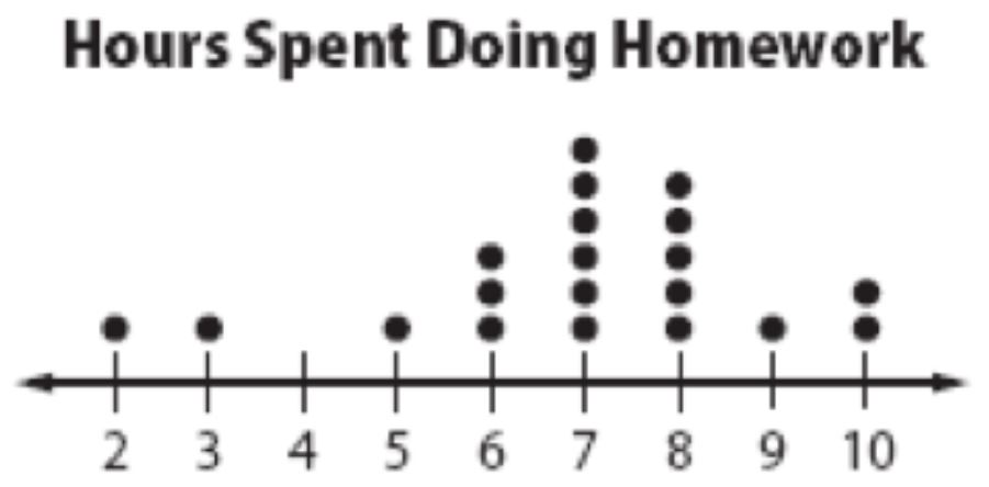
How many students spent 7 hours doing homework that week?
1
3
6

This is a. . .
line graph
flow chart
pie chart
bar graph

What is happening at E?
Stationary
Accelerating
Fast steady speed; moving away from the starting position
Steady speed; returning to start position


Which is the dependent variable?
The Number of Hippos
The Year

What is the explanation for the trends seen in this graph?
The more rabbits there are, the less likely they are to be caught so their numbers keep increasing
When prey levels are high, there is more food for the predators so more of those survive so their numbers increase, so they catch more prey so their numbers go down
The fox numbers are decreasing as they are being hunted more
It is the natural cycle of life

Examine the line graph below. If the population of Centerville continues to increase at the same rate, what will the population be in the year 2010?
16,000 people
6500 people
9500 people
8000 people

