
 Worksheets
Correlation vs Causation and Fitting lines to Scatterplots
Total questions: 11
Worksheet time: 7mins
Number of steps taken per day and number of kilometers walked per day. r=.92
Indicate the type of correlation and tell if it's an example of causation.
strong positive
strong negative
weak positive
weak negative
This is an example of causation
Average time spent listening to music per day and average time spent watching TV per day. r=−.17
Indicate the type of correlation and tell if it's an example of causation.
strong positive
strong negative
weak positive
weak negative
This is an example of causation
The distance traveled for a trip and the amount of gallons of gas in car r=−.86
Indicate the type of correlation and tell if it's an example of causation.
strong positive
strong negative
weak positive
weak negative
This is an example of causation
Sort each statement into one of three categories: Correlation, Causation, No Relationship.
The number of cold, snowy days and the amount of hot chocolate sold.
Correlation
The amount of time a phone is used and its battery percentage
Causation
Number of pets someone has and number of books a person has read.
No Relationship
Sort each statement into one of three categories: Correlation, Causation, No Relationship.
The number of cars travelling during a holiday weekend and the number of accidents reported.
Correlation
The number of miles driven and the amount of gas used on a trip to Disneyworld.
Causation
Test scores and shoe size.
No Relationship

The data given in the table below show some of the results of a study comparing the height of a certain breed of dog, based upon its mass.
What does the correlation coefficient suggest about this data set?
The correlation coefficient is approximately (a) , which suggests there is a (b) correlation
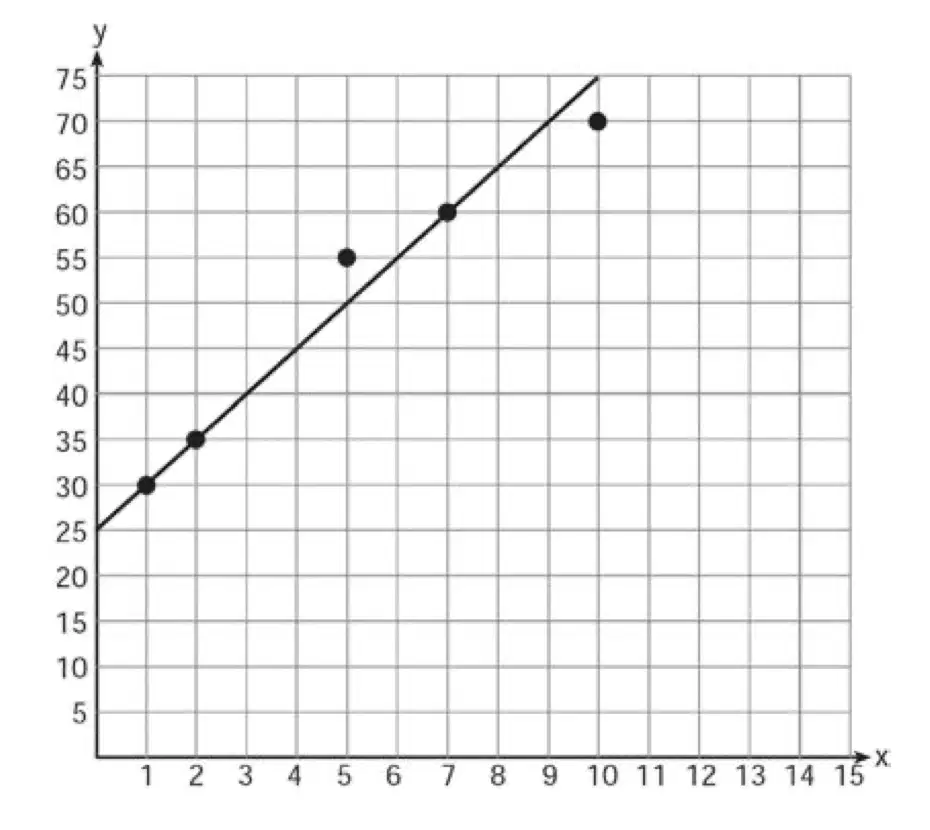
A scatter plot was constructed on the graph below and a line of best fit was drawn.
What is the equation of this line of best fit?
y = x + 5
y = 5x + 25
y = 5x + 5
y = x + 25
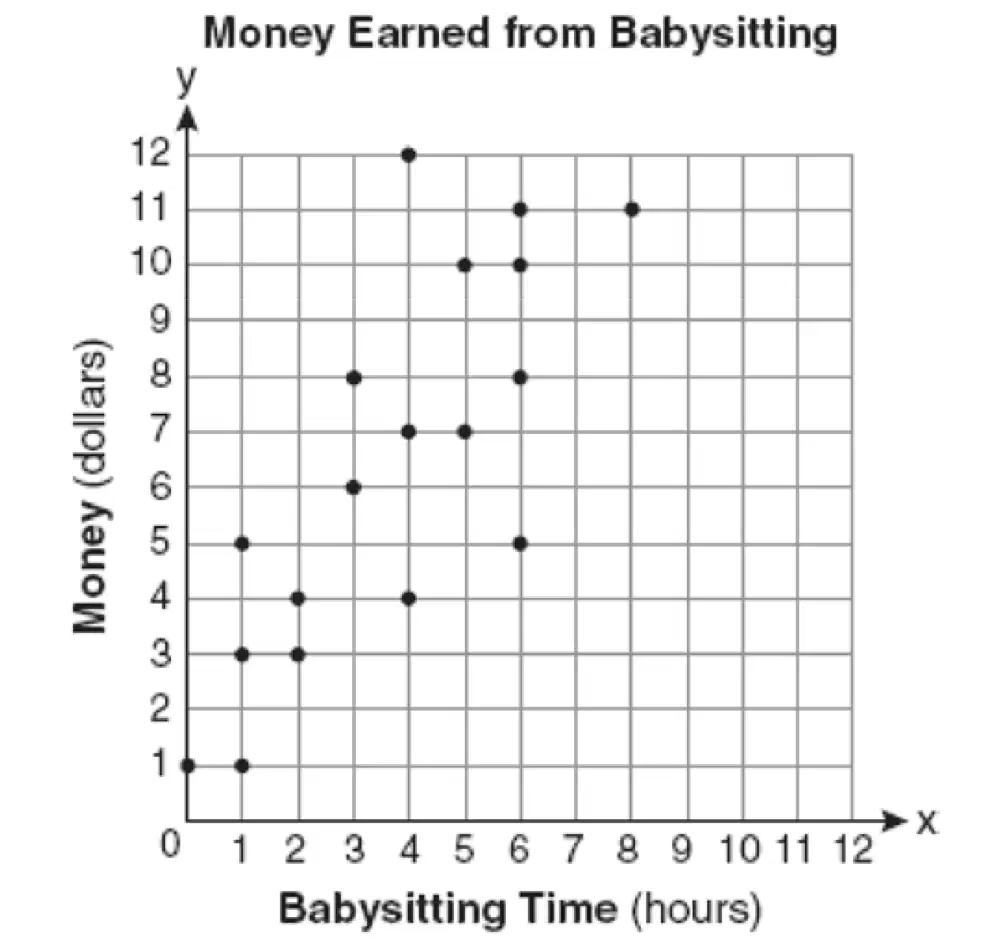
The scatterplot shows the relationship between the amount of money made while babysitting and the hours.
Which function best fits the data shown in the scatter plot?
f(x)=x
f(x)=32x+1
f(x)=23x+1
f(x)=23x+4
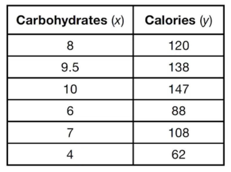
The table below shows the number of grams of carbohydrates, x, and the number of Calories, y, of six different foods.
Which equation best represents the line of best fit for this data set?
y=15x
y=0.07x
y=0.1x−0.4
y=14.1x+5.8
Sort each statement into one of three categories: Correlation, Causation, No Relationship.
The increase of warm sunny days and the number of ice cream trucks visible.
Correlation
The amount of cars a salesman sells and the amount of commission he makes.
Causation
Person's height and how fast they drive.
No Relationship
Which situation BEST represents causation?
When the number of bus stops increases, the number of car sales decreases
When fewer firefighters report to a house fire, the damage caused by the fire decreases
When ice cream sales increase, incidents of sun burn increase
When it rains several inches, the water level of a lake increases

