Wayground logo

Free Printable Worksheets

Font size

S
M
L
XL
Worksheets

HW #6.15

Total questions: 20

Worksheet time: 1hrs 26mins

Name
Class
Date
1.
What is a scatter plot?
a)
A graph that shows the relationship of two data sets.
b)
A graph drawn using rectangular bars to show how large each value is.
c)
A graph that shows information that is connected in some way.
d)
A graph that shows data changing over time.
2.

Which relationship could be represented by this scatter plot?

a)

As the number of muffins in a box increases, the price increases.

b)

As the speed of a car increases, the distance the car travels increases.

c)

As the population of a city increases, the number of schools in the

city increases.

d)

As the number of daylight hours increases, the number of night hours decreases.

3.

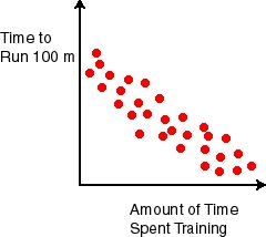
What type of correlation does this graph have?

a)

positive

b)

negative

c)

none

d)

all of the above

4.

What type of correlation does this graph have?

a)

Negative

b)

no association

c)

positive

5.
What type of correlation does this scatter plot show?
a)
positive linear association
b)
negative linear association
c)
no association
d)
nonlinear association
6.
If a scatterplot has no association then...
a)
...it has no ordered pairs
b)
...it has ordered pairs that have a negative pattern
c)
...its ordered pairs have no predictable pattern
d)
...if it makes a lion on a graph (roar!)
7.
In a scatterplot, an outlier...
a)
...is something we didn't learn 8th grade
b)
...is a puppet with a long nose named Pinocchio
c)
...is a point that is far outside the main cluster of points/ordered pairs
d)
...is a really naughty point who doesn't tell the truth when outside
8.

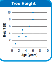
What is the age of the tree that is 8 feet tall?

a)

6 Years

b)

7 Years

c)

8 Years

d)

9 Years

9.

JoBeth draws a scatter plot that shows as the outside temperature increases, sales at her lemonade stand increase. Which best describes the scatter plot?

a)

The points show that as x-values increase, y-values increase.

b)

The points show that as x-values increase, y-values decrease.

c)

The points show that as x-values decrease, y-values stay the same.

d)

The points show that as x-values decrease, y-values increase.

10.

Which of the following best describes a scatter plot that shows no relationship between the x-values and the y-values?

a)

As x-values increase, the points are higher on the graph.

b)

As x-values decrease, the points are higher on the graph.

c)

The points are scattered around the graph.

d)

The points form a horizontal line.

11.
Which scatter plot shows a linear relationship between x and y?
a)
Graph A
b)
Graph B
c)
Graph C
d)
Graph D
12.
What type of association does this scatter plot represent?
a)
positive linear association
b)
negative association
c)
no association
d)
nonlinear association
13.

Label the type of association shown by the scatter plot as positive, negative or none.

a)

positive

b)

negative

c)

none

14.

What type of association does this scatter plot show?

a)

positive linear association

b)

negative linear association

c)

no association

d)

nonlinear association

15.
What type of association does this scatter plot represent?
a)
positive linear association
b)
negative linear association
c)
no association
d)
nonlinear association
16.
The following scatter plot shows Pam's training as she prepares to run a 6 mile race at the end of the month.  Which of the following would be a reasonable approximation for the length of time it would take for her to run 6 miles? 
a)
A. 50 min
b)
B. 80 min
c)
C. 45 min
d)
D. 60 min
17.
What type of correlation (association)?
The outside temperature and the amount of layers you wear. 
a)
Positive correlation
b)
Negative correlation
c)
No correlation
d)
All of the above
18.
What is the correlation between length of running start and distance of jump?
a)
positive:  the further you run the further you jump
b)
negative: the less you run the less distance of your jump
c)
positive: the further your running start the less your distance
19.

Hector surveyed 500 people and asked them how far they drive to work and what the last digit of their phone number is. He used the results to make a scatter plot. What type of association should he expect to see in the scatter plot?

a)

Positive Association

b)

Negative Association

c)

No Association

20.

Jules conducted a survey and asked 100 people how many years of education they have and what their annual income is. She used the results to make a scatter plot. What type of association should he expect to see in the scatter plot?

a)

Positive Association

b)

Negative Association

c)

No Association