
 Worksheets
Ch 9. Poster Basics
Total questions: 14
Worksheet time: 7mins
For text heavy content, you should. . .
Organize the content in an information hierarchy and assign appropriate text sizes.
Be sure to use different font style to express when the tone, or style changes in your content.
Use big graphics to catch the reader’s attention.
Write as Elegantly as possible! Using Big fancy words, and flowery language to impress your readers!

Which of the following is NOT good advice when making a poster series?
Make each poster stand out as their own work.
Establish a noticeable art style that stays consistent through each work
Keep the font style the same throughout the posters.
Using a similar layout for each poster.

Before posters became a visual communication staple what was used?
Broadside
Notes
Emails
Cellphones
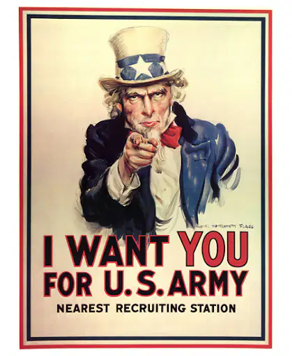
A poster can become a communication vehicle when you want to what?
For a medium to voice dissent, to incite, or to inform.
As decorations or for other luxury activities.
Use only for promotional ads.
If you are feeling a little quirky.
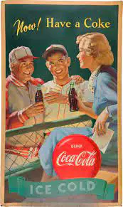
What are questions to ask when developing a poster?
Does my poster interest people enough to call them to action?
Does my poster have enough information?
Does my poster appeal to everyone?
Does my poster match most wallpapers, paint colors, and buildings?
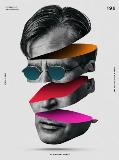
What is the purpose of posters?
To grab people's attention and to display information, data, schedules, or offerings.
To make people buy things they need
To make customers feel confused
To make things look cool as decoration
When starting with a poster you should always include the information you…
Need
Want
Made up
Think might be right
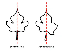
An asymmetrical distribution of elements in a composition would be better suited to the communication. What would be best to consider?
All of the above
The relevance of a logical graphic space versus an ambiguous space to your design concept.
An image to type relationship: big image versus small type, or vice versa.
An entry point into the graphic space established by type or image.
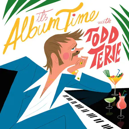
How should type be used with an image
You should consider how the text and image work together
You should consider adding type after making a image
You shouldn't care about the connection of image and text
Text doesn’t matter at any point
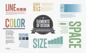
What is the FIRST thing to consider about poster basics?
To grab attention in order to persuade people.
Single surface one unit because a poster
Set it apart to stand out.
Communicate key messages.
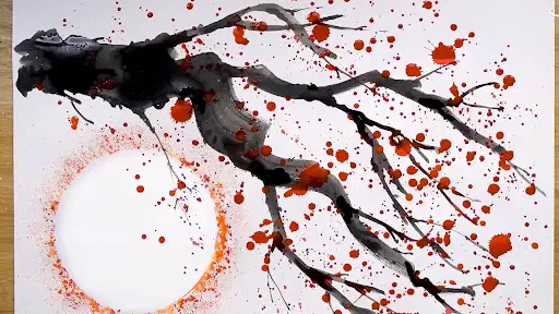
Toulouse-Lautrec's art was heavily influenced by 19th-century Japanese woodblock prints. This method was known as _______.
Both are correct.
Crachis method.
Neither are correct.
Spatter method.
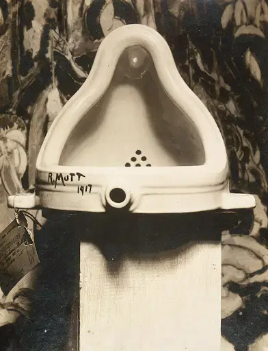
Why did Marcel Duchamp use a urinal in his “The Fountain” piece
To break the stereotype of art and grab people's attention
He was very fascinated by the design of the urinal
He worked at a plumbing factory and so he had easy access to it
All of the above
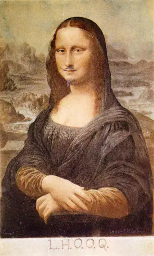
What famous painting did Marcel DuChamp Revise in his piece “L.H.O.O.Q.”?
“Mona Lisa” by Leonardo da Vinci
ona Lisa” by Vincent Van Gogh
“Girl With A Pearl Earring” by Johannes Vermeer
“Lee Simone” by Leonard da Vincent
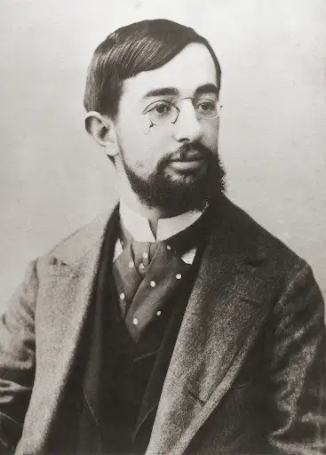
What disability did Toulouse suffer from?
Achondroplasia,
Blindness
Hard of hearing
Narcolepsy

