
 Worksheets
Data review - 4.20.23
Total questions: 42
Worksheet time: 2hrs 6mins
The mean is...
the middle
the average number (added together, then divided by the number of dots)
The most frequent number
The middle when in order
The spread/range is...
the greatest number - the lowest number
the average number (added together, then divided by the number of dots)
The most frequent number
The middle when in order

What is the outlier for this data?
90
96
102
108

What is the shape of the dot plot shown?
skewed left
skewed right
symmetrical
What is the spread of the data?
2
1
4
12


What shape is the dot plot for SUV's?
skewed right
skewed left
symmetrical
none of the above
What is the mode for CARS?
25
22
27
26

The dot plots show the number of siblings of students in two different classrooms.
Which statement is best supported by the data in the dot plots?
The mode of the data in Mrs. Blackfield's class is less than the mode of the data in Mr. Johnson's class.
The range of the data in Mr. Johnson's class is less than the range of the data in Mrs. Blackfield's class.
The median of the data in Mrs. Blackfield's class is greater than the range of the data in Mr. Johnson's class.
The minimum value of the data in Mr. Johnson's class is greater than the minimum value for the data in Mrs. Blackfield's class.

The dot plots show the ages of students at two different arcades.
Which statement is best supported by the information in the dot plots?
The range of the age of students at Arcade A is greater than the range of age of students at Arcade B.
The distribution of the data for Arcade A and Arcade B are approximately symmetrical.
The median age of students at Arcade A is greater than the median age of students at Arcade B.
The maximum age at Arcade B is less than the maximum age at Arcade A.

Based on the shape of the data distribution, what statement is true about the measure of the center?
The mean and median are equivalent
The mean is greater than the median
The mean is less than the median
None of these

The dot plots show the number of minutes it takes students in Mrs. Williams's and Mr. Escobedo's class to get to school.
Which statement is NOT supported by the information in the dot plots?
The data in Mr. Escobedo's class is approximately symmetrical.
The median number of minutes it takes Mrs. Williams's students to get to school is greater than the median number of minutes it takes Mr. Escobedo's students to get to school.
The number of minutes it takes Mrs. Williams's students to get to school has a greater range than the number of minutes it takes Mr. Escobedo's students to get to school.
The maximum value of the data for Mr. Escobedo's class is less than the maximum value of the data for Mrs. Williams's class.

The dot plots show the number of hours two boys played video games each day for 10 days.
Which statement is NOT supported by the information in the dot plots?
The mode of the number of hours played by Jayden is less than the mode number of hours played by Juan.
The mean of the number of hours played by Jayden is more than the mean number of hours played by Juan.
Jayden had a greater range of the number of hours played than Juan.
The maximum number of hours played by Juan is less than the maximum number of hours played by Jayden.

How do you find the IQR (Interquartile range)?
add the five number summary
subtract the median from the maximum
subtract the minimum from the maximum
subtract quartile 1 from quartile 3
4. Which of the following lists all the five numbers needed to make a box plot?
Mean, Median, Mode, Range, and Total
Minimum, Quartile 1, Median, Quartile 3, and Maximum
Smallest, Q1, Q2, Q3, and Q4
Minimum, Maximum, Range, Mean, and Median
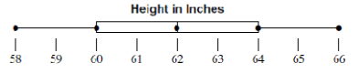

Kerron gathers the heights of a random sample of 6th graders and 7th graders and displays the data in box plots. Which statement below is true?
The median of the 7th grade sample is greater than the 6th grade sample.
The 7th grade sample has greater variability.
The ranges of both data samples are equivalent.
The median of the 6th grade sample is greater than the 7th grade sample.

Mykel surveyed 15 7th graders and 15 8th graders at his school to see how many hours they spend per day listening to music. He made two box plots to compare the data sets. What inference can he draw from the data sets?
The range is greater for the 8th graders, so there is greater variability for the 8th graders than the 7th graders.
The person who listens to music the least is a 7th grader.
The median is greater for the 7th graders, so they generally spend more time listening to music than 8th graders.
No inferences can be made from the box plots.

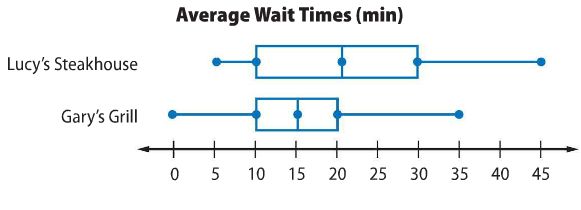
The range of the data for Fun Fit is less than the range of the data for Greg’s Gym.
The median for Greg’s Gym is less than the median for Fun Fit.
The minimum attendance for Fun Fit is less than the minimum attendance for Greg’s Gym.
The interquartile range for Greg’s Gym is greater than the interquartile range for Fun Fit.

Which statement is NOT true according to the box plots shown?
1st period Q1 is 75
The minimum for 2nd period is 70.
The median for 1st period is 85.
The maximum for 2nd period is 95.

12,10,10,10,13,12,11,13,10
The list below shows the most recent test scores for students in Mr. Garcia’s study group.
78, 90, 94, 72, 80, 68, 72, 88, 94, 98, 86, 96
Which box-and-whisker plot correctly represents the data in the list?


The total percent of a circle graph is?
Equivalent to the biggest section
10%
1000%
100%


The 7th grade class participated in the following fitness challenges. If there are 250 students total, how many participated in weight lifting?
20
8
80

Based on the graph,how many more sunny days than rainy days did this city have during the months of April, May, and June?

The graph shows the favorite colors chosen by some middle school students. Which statement is supported by the information in the graph?
Fewer than 30% of the students chose red, yellow, or orange as their favorite color.
More than 101 of the students chose pink as their favorite color.
Exactly 18% of the students chose blue as their favorite color.
Exactly 52 of the students chose green, black, or purple as their favorite. color.

Based on the graph, what percent of the books checked out was adventure or science fiction?
50%
62.5%
75%
80%

What percent of the tiles are green?
12
24
50
86
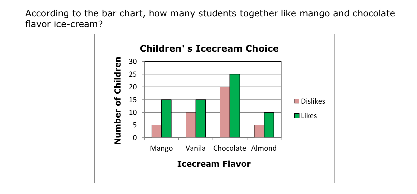
According to the double bar graph , how many students together like mango and chocolate ice - cream ?
2
1
90
40

According to the bar graph, what percent of the people choose Country or Rock as their favorite type of music??
20%
40%
45%
60%


The bar graph shows the approximate number of visitors at a state park. What percentage of visitors went to a state park in 2011? Hint: Percent proportion
20%
40%
60%
80%

