
 Worksheets
Grade_11_term3_22-23(Charts)_Revision
Total questions: 81
Worksheet time: 1hrs 21mins
In this complex formula 2/4 ^3-(5+2)*8 if we removed the parentheses which part will be calculated first
2/4
4 ^3
5+2
Which of the next cell references is true
A2
B0
7A
C4
A cell reference or cell address is a combination of a column letter and a row number that identifies a cell on a worksheet
True
False
Formulas in Excel always begin with the -------------
*
&
Nothing
=
/

If the parenthesis is removed, what will 9.5% be multiplied by?
D2 +D3+D4+D5
None
D2
D5
In MS Excel when applying a percentage view to (0.123) it will result as -----------.
12.3%
0.123%
12300%

To show your percentage as a whole number you can use
Increase decimal button
decrease decimal button
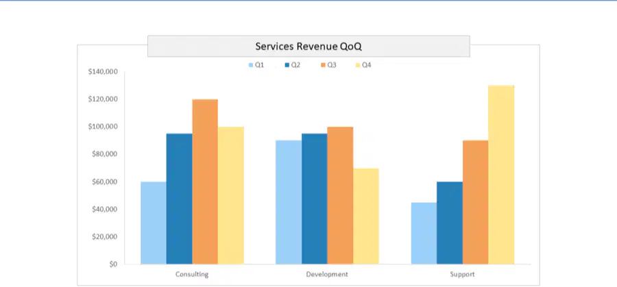
This is a ---chart
Clustered
Stacked

This is a ---chart
Clustered
Stacked

This is a ------------- chart
Column
Line
Pie
To insert a chart in MS Excel you go to ---------------menu
insert
home
design
You can't select data that are not connected (next to each other)
True
False
You------------------- Change the Chart Type after inserting it
can
Can't
You can switch the rows and columns of data in a chart so they appear in opposite positions.
True
False
To select two columns that are NOT next to each other to create a chart, hold down the --------key on your keyboard
Ctrl
Enter
You can update your chart data (Add or remove a data series to a chart)
True
False
All of these are complex formula Except---------.
2+3*4-1
3*4
(5+2)*8
In this complex formula:
=2*(8-6)/2^5
which part will be calculated first if the parentheses are removed?
(a)
Using the order of operations specify which part of this complex formula will be calculated first
(7+5)^2*3
(a)
Using the order of operations specify which part of this complex formula will be calculated first
6^2-2*(5+1+3)
(a)
Using the order of operations specify which part of this complex formula will be calculated first
80-7+85/5*3
(a)
A Chart Or Graph is a visual representation of information.
They make it easier to understand and analyze numbers.
True
False
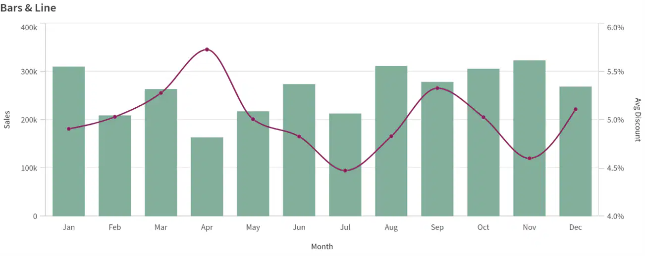
This chart is ----------
Column Chart
Line Chart
Pie Chart
Combination Chart
The first step to insert chart into Excel is ------------
Select the cells
Go to Insert tab
Change Chart Type
To easily change from one chart type to another. Just select the chart and click "---------------------" on the Design tab of the ribbon
change chart type
Switch Row/Column Data
select data

This button for select data is used to -----------------
Add or remove a data series to a chart
Switch Row/Column Data
Change the Chart Type
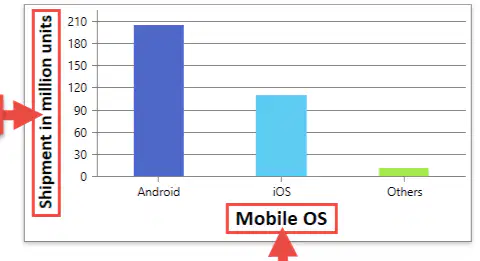
Mobile OS and Shipment in million units are represent -------------
Chart Title
Axis Titles
Chart Legend

Expenses by Month are represent ------------
Chart Title
Axis Titles

This chart title (Export Report) is position at -----------
Centered Overlay
Above chart

This chart is a ----------chart
Pie
Column
Line
Bar
Column charts use ----------- bars to represent data
Vertical
Horizontal

In this Column chart for each Quarte's the data are ---------------------
Clustered
Stacked

This is an example of line chart
True
False
Bar charts use ----------- bars to represent data
Vertical
Horizontal

This chart is a ----------chart
Pie
Combination
Line
Bar
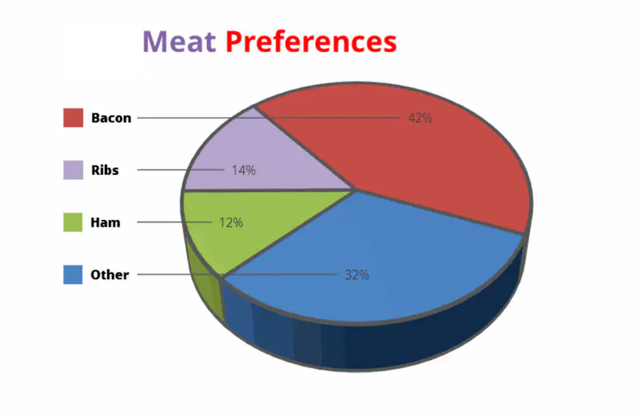
According to this chart, which type do people prefer most?
Bacon
Other
Ham
Ribs

According to this chart, in which month are produce sales the highest?
June
May
November
March

According to this chart, which band sold the most albums?
Marva and the Larva
Sherm and the Worms
Gails and the Snails
Doug and the Slugs

In the next --------- chart ------ is the highest expenses in all the months
Stacked , Rent
Clustered, Rent
Stacked , food
Clustered, Gasoline

On a small island, scientists kept track of the number of wolves and moose over time. Which trend did they record?
An increase in wolf population and a drop in moose population
An increase in wolf population and an increase in moose population
A drop in wolf population and an increase in moose population
A drop in wolf population and a drop in moose population

According to this chart, which country spent the least money on books in 2004?
Germany
Australia
Italy
France

This chart shows the composition of lunar soil. Which element is third most abundant?
Silicon
Impossible to tell
Iron
Magensium

Which ice cream is least liked by both grades?
Vanilla
Peach
Chocolate
Lemon
Strawberry

According to this chart, which appliance is used 8 hours per day on weekdays?
TV
Heater
Fridge
Computer

Which ice cream is most liked by second grade?
Vanilla
Strawberry
Lemon
Chocolate
Peach
Which ice cream is second most liked by first grade?
Vanilla
Strawberry
Lemon
Chocolate
Peach

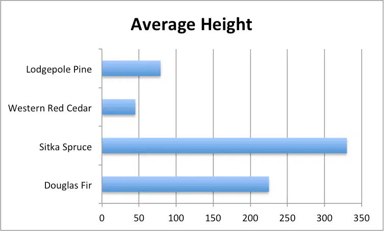
What is the approximate average height of the Douglas Fir trees sampled in this chart?
100 feet
150 feet
200 feet
225 feet
250 feet

Which type of milk is the favorite of respondents to this survey?
Plain skim milk
Plain 1% milk
Plain 2% milk
Plain whole milk

Which day of the week has the most traffic accidents for New York City?
Tuesday
Thursday
Saturday
Sunday
Which day of the week has roughly 125 accidents on average?
Tuesday
Wednesday
Thursday
Friday

This chart includes----------- (all that apply)
Chart title
Axis titles
Legends
Data labels

Which Axis title is mentioned in the chart
Primary horizontal
Primary Vertical

Chart legend are arranged to-------------
•Top
•Right
•Left
•Bottom

Chart Data labels are arranged to-------------
•Top Center
Data callout
Inside end
•Bottom

adding a a Data Table to this chart will result in --------


This data table is --------------
•No legend keys
•With legend keys

•Once you create a chart of axes type(Column ,Line , Area , XY Scatter ) the ------------------- is displayed by default in the chart background.
Primary major horizontal
Primary major Vertical

Which chart element(s) are used in the attached chart (all that apply)
Trendline
Gridlines
Chart Title
Axis Titles
Data Labels

Moose and Wolves are represent -------------
Chart Title
Axis Titles
Chart Legend
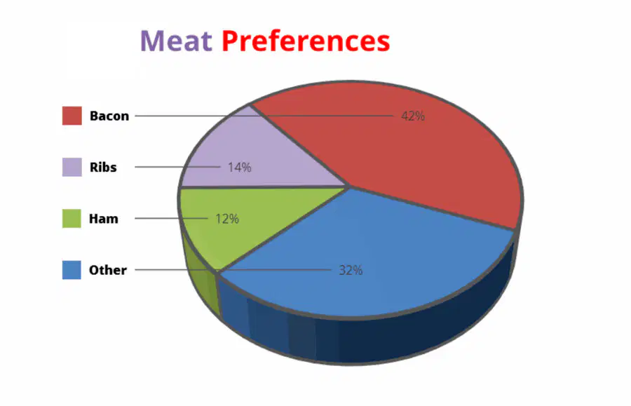
Legends in these chart ------------
Meat Preferences
Bacon , Ribs,Ham,Other

This chart title (Expenses by Month) is position at -----------
Centered Overlay
Above chart

This chart includes both of Legends & Data labels
True
False
Select all the elements you can see
Chart Title
Legends
Axis title
Data labels
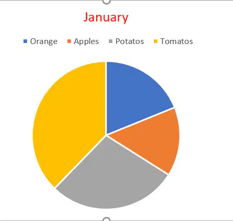
The chart Title is --------------
(a)
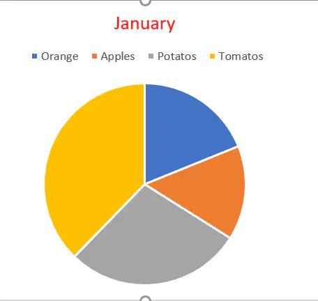
The position of the legend is----------------
(a)
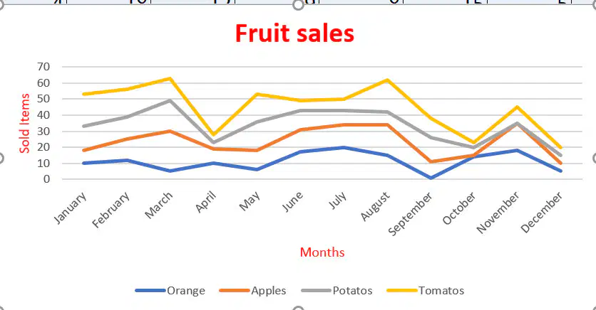
There is Axis title shown in the chart---------------.
(a)
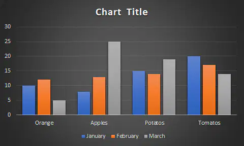
There is Axis title shown in the chart---------------.
(a)
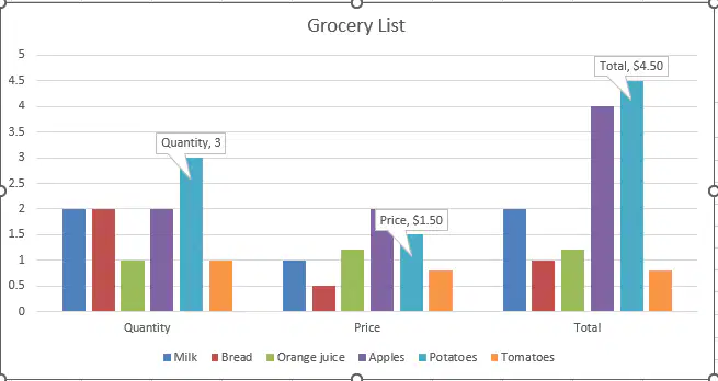
The data labels are shown for series --------------
(a)

The data labels are shown for series --------------
(a)
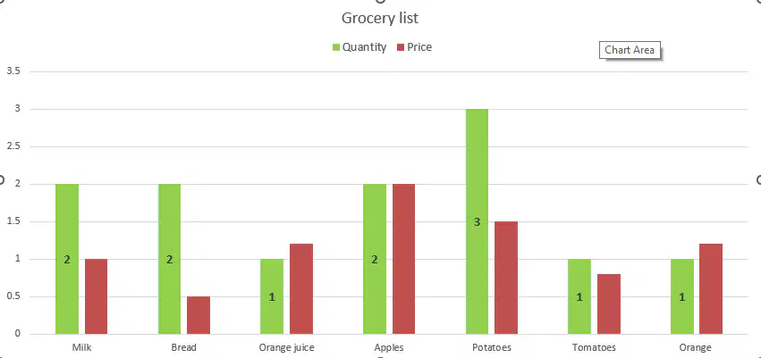
The data labels are shown for series --------------
(a)
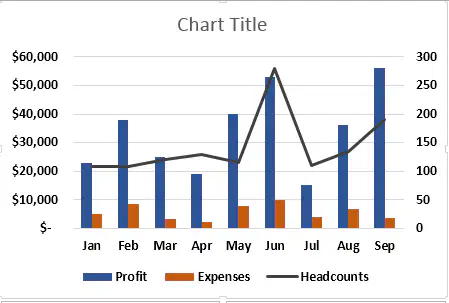
In this combination chart the line chart is representing ---------------.
Expenses
Headcounts
Profit
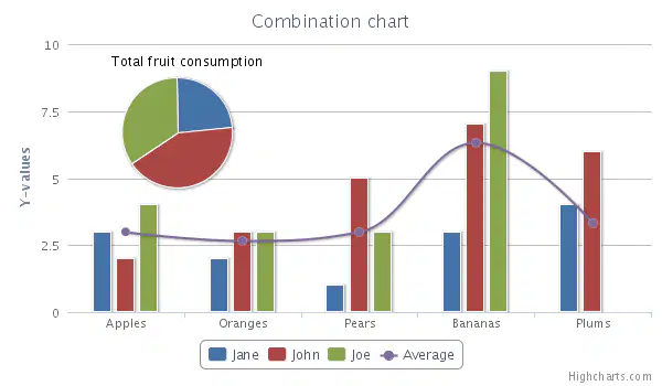
In this combination chart the line chart is representing ---------------.
Jane
Average
John
Joe
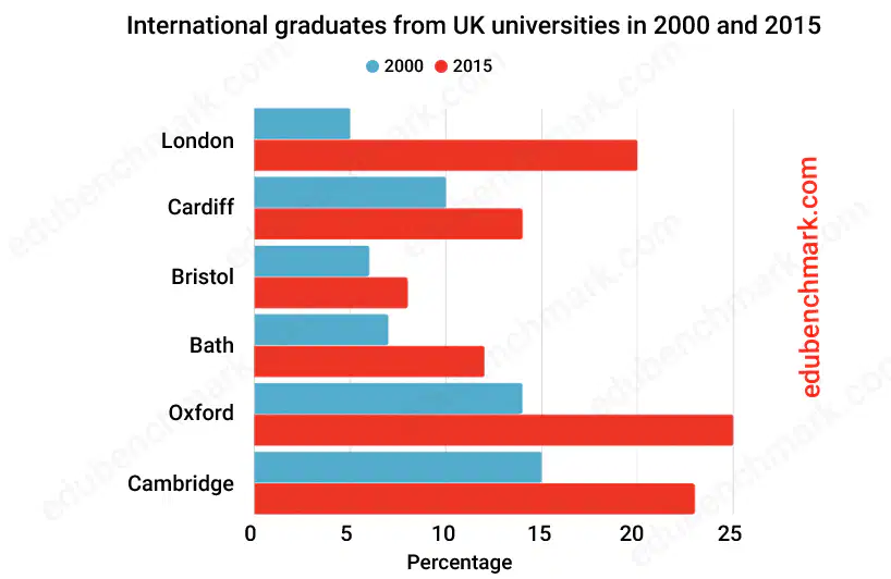
This chart is a ----------chart
Pie
Column
Line
Bar

Which Gridelin is appearing in this chart-------------.
Primary Major Vertical
None
Primary Major Horizontal
Both

Which Gridelin is appearing in this chart-------------.
Primary Major Vertical
None
Primary Major Horizontal
Both
Which Gridelin is appearing in this chart-------------.
Primary Major Vertical
None
Primary Major Horizontal
Both
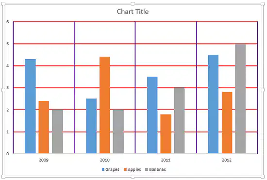
Which Gridelin is appearing in this chart-------------.
Primary Major Vertical
None
Primary Major Horizontal
Both Vertical
and Horizontal
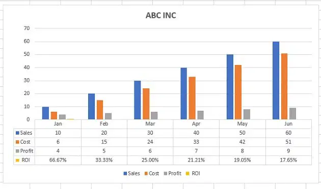
This data table is --------------
•No legend keys
•With legend keys
In MS Excel when applying a percentage view to (46) it will result as -----------.
46%
4600%
4.6%
A Chart Or Graph : is a visual representation of information.
They make it easier to understand and analyze numbers.
True
False
A chart in Excel is a tool you can use in Excel to -----------------.
communicate data graphically.
allow audience to
•see the meaning behind the numbers,
allow audience to
•Make and showing comparisons and trends much easier.
All that mentioned.

