
 Worksheets
The Categorical Journey
Total questions: 87
Worksheet time: 44mins


A ________ is a type of graph that show the frequency distribution of data within equal intervals (thus, there are no spaces between the bars).
Dot Plot
Line Graph
Histogram
Box Plot
A _______ shows the number of values within an interval and not the actual values.
Dot Plot
Histogram
Bar Graph
Box Plot

What is the the first quartile for the data on the 6TH Grade Math Test?
68
78
85
93

What does point C on the box plot represent?
First Quartile
Median
Third Quartile
Mean

What is the least and greatest value of this data set?
6 and 8
6 and 19
8 and 15
15 and 19
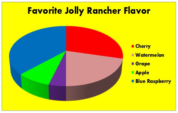
According to this circle graph, what is the least popular flavor of Jolly Rancher?
Blue Rasberry
Watermelon
Grape
Apple
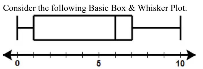
What is the Inner Quartile Range of the Box & Whisker Plot?
0
1
6
10
Consider the following Ordered Data Set.
2, 3, 5, 7, 7, 9, 10
Which is a correct box and whisker plot of the data above?



Consider the two dot plots. Which statement is true?
Data Set A has more variation than Data Set B
Data Set A has less variation than Data Set B
Data Set A has the same amount of variation than Data Set B
They are all true
None of the choices are true
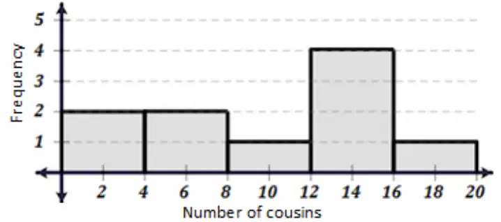
A student created a histogram of his classmates. The histogram shows the number of cousins each classmate has.
Which ordered data set below could this histogram represent?
{0, 2, 6, 7, 8, 13, 14, 14, 15, 19}
{0, 1, 2, 6, 8, 13, 14, 15, 15, 18}
{0, 4, 6, 7, 9, 13, 14, 14, 16, 17}
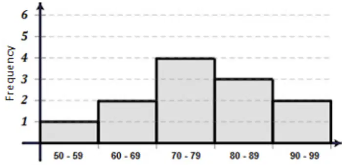
Consider the following histogram that shows the scores on the Unit 2 test for Ms. Carter.
How many students did not pass the test (their grade was below 70)?
0
1
2
3
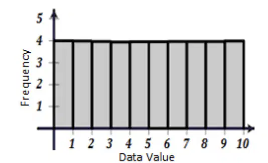
What type of distribution type would best describe the data displayed in the histogram?
Skewed Right
Bimodal
Uniform
Skewed Left
Which histogram below shows a data set that is skewed right?


Which histogram has the most amount of variation?



What is the mean of the following data set shown in the dot plot:
7.6
8.5
9.5
9
What is the mode of the following data set shown in the dot plot:
7.6
8.5
9.5
9

Describe the shape of the dot plat
skewed left
skewed right
symmetric
uniform
Consider the data set represented by the dot plot.
What does the red dot represent?
third quartile
outlier
mean absolute diviation
maximum value

Which type of distribution is given?
Right Skewed
Left Skewed
Normal

Which type of distribution is given?
Right Skewed
Left Skewed
Normal

What type of distribution is given?
Right Skewed
Left Skewed
Normal
The list below shows the most recent test scores for students in Mr. Garcia’s study group.
78, 90, 94, 72, 80, 68, 72, 88, 94, 98, 86, 96
Which box-and-whisker plot correctly represents the data in the list?


What conclusion can be made?
The 2nd quartile is 600.
The mean is 400.
The range is 300-600.
25% is between 300 and 400

Which of the following best describes the distribution of data?
bimodal
skewed
uniform
bell shaped

Which bookstore has the lower median price?
Bookstore A
Bookstore B
Both bookstores have the same median value.
It is not possible to determine this answer on a box plot.

The graph shows how employees at Disney World travel to work. How many employees ride bikes, ride the bus, or walk to work?
300
450
325
375


Which bar graph is the same as the data in the circle graph if 20 people were surveyed?


Alberto’s monthly income is $3,200. Part of Alberto’s monthly budget is shown in the table.
What percentage of Alberto’s income is used to pay for his rent and groceries?
40%
28%
64%
12%
What percent do circle graphs always add up to?
1
3.14
100
360

If you are given a graph that is missinng a percent, what do you do to find it?
Add up the given percentages and subtract from 100
Set up a proportion

0.2% of the 2017 Philippines Population is what age group
under 15
60-74
85+
not stated in the graph

What percentage of time did Gian spend on his Math and English homework?
30%
32%
33%
34%

Name the type of graph.
circle graph
line graph
histogram
bar graph
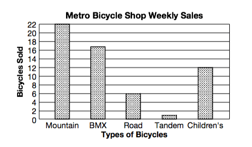

What type of graph is this?
Step graph
Line graph
column graph
picture graph
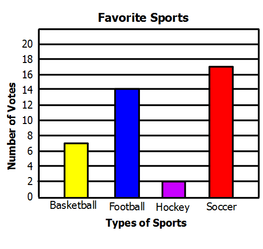

What was the population of whales in 2019?
100
10
99
32

Tina earns $2600 a month. How much does she spend on RENT each month?
$2600
$260
$1300
$1000

A class of students were asked their favourite sport. How many students were in the class?
30
12
80
16

Katie is reading a 200-page book that is divided into 5 chapters. The bar graph shows the number of pages in each chapter.
What percent of the pages is in even-numbered chapters?
50%
15%
35%
70%

Paul randomly surveyed people in the mall and asked them what genre of movie they prefer. The
results are shown in the survey below.
By what percent did action movies exceed drama movies as the genre of choice?
1.5%
3%
21%
19.5%

On Thursday, how much longer did it take to finish Ms. Jones homework that Mrs. Williams?
2 Minutes
10 Minutes
30 Minutes
4 Minutes
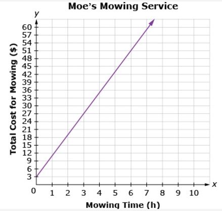
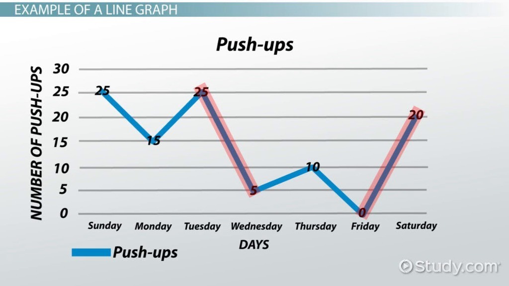
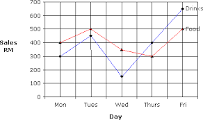
What kind of graph shows change over time?
bar graph
line graph
line plot
pie graph
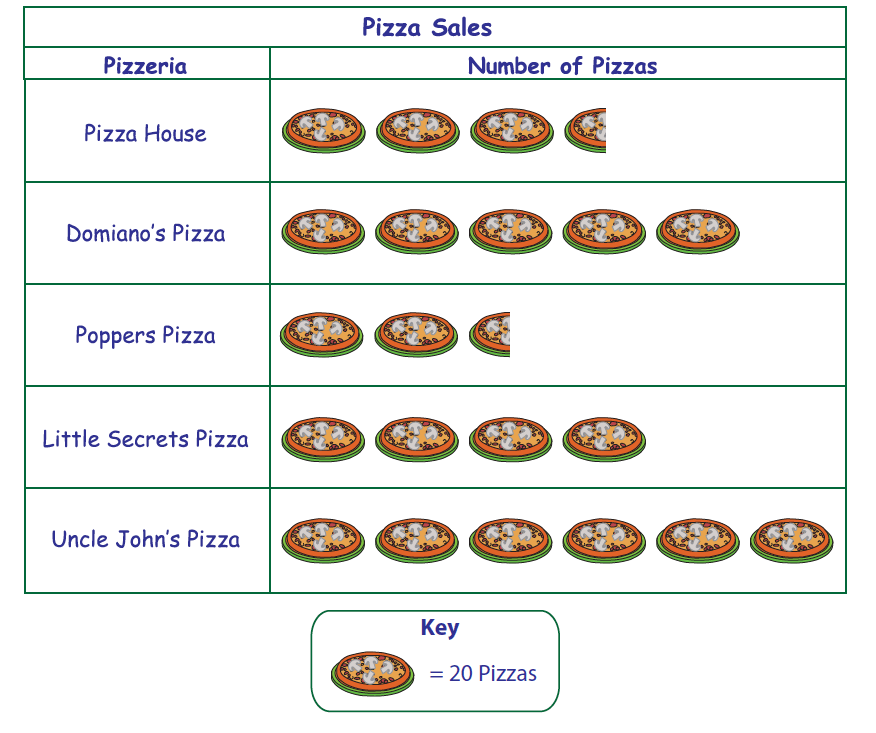
How many more pizzas did Uncle John's Pizza sell than Popper's Pizza?
70
85
9
45

Which statement best describes the data shown in the dot plot?
The peak of the data is at 35
The data are clustered from 30 to 32
The data distribution has gaps
The data distribution is symmetrical

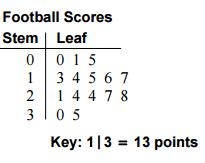
7, 1, 1, 7, 1, 4, 1


How does the median number of miles driven for Driver A compare to the median number of miles driven for Driver B?
Driver B drives much less than Driver A when comparing medians.
The medians are the same
Driver A drives much less than Driver B when comparing medians.
Driver A and Driver B make the same amount of money.
What place value is listed on the LEAF side of a stem-and-leaf plot?
Ones
Tens
Hundreds
Tenths

Out of 400 people, how many would you expect to say their favorite topping is sausage?
53%
50 people would pick sausage
53 people would pick sausage
50%

What do you call the given chart?
histogram
bar graph
frequency polygon
hisograph

Which calculation is possible with this information?
Mean
Median
Mode
None of these
What is the peak?
95-100
90-105
85-90
80-85
What is the cluster?
95-100
90-105
85-90
80-85
What would be a good title for this chart?
How long are people's favorite movies?
Frequency
How long is ELA (minutes)?
Length (minutes)
How long was the shortest film in the data?
1
Impossible to know for sure
80
85
Where might there be an outlier?
95-100
90-105
85-90
80-85

Which of the statements below is true?
Exactly half of the homes were sold between Jan - Jun
There were more two story than one story homes sold
14.5 homes were sold in Apr - Jun
More homes were sold in the first half of the year than the second.

Which of the statements is true?
The same number of senators are 40-49 as are 80-89
There are the more senators over the age of 70 than under.
There are exactly 100 US senators.
Over half of the senators are between the ages of 60-69.


The height of the students in Mrs. Abel's class were recorded. Which line plot represents the same data shown in the histogram?


Sam's team has scored the following numbers of goals in recent games
2, 3, 1, 2, 1, 3, 2, 3, 4, 5, 4, 2, 2, 3
What type of distribution for the above data?
Raw data
Ungrouped frequency distribution table
Grouped frequency distribution table
Cummulative frequency

Sam had 15 soccer games this season. His team scored the following goals for each game:
1,2,0,3,1,1,0,2,1,3,0,2,1,1,3
What is the frequency of Sam's team scoring 0 goals?
15
6
3
4

The graph shows the top selling food items from a local restaurant. The managers are comparing the type of food sold during different years. What conclusion could the managers make about the type of food sold?
Fish and chips were the most popular food sold over time
Pizza increased the most over time
In 1980, hamburgers sold the most while pizza sold the least
In 1990, pizza was sold the most while hamburgers were sold the least

