
 Worksheets
The Principles of Design
Total questions: 24
Worksheet time: 1hrs 12mins
Simplicity is....
adding details, designs and borders
eliminating unnecessary elements and keeping the design simple to help deliver the message to the targeted audience.
keeping things simple by eliminating all pictures and titles.
In design, repetition is used to ….
reinforce an idea, unify a design and bring everything together by using repeated font/type, colors and shapes
create a focal point for the viewer by repeating the same shapes.
give the design form and stability by repeating the same text over and over again.
Balance in design covers how elements are...
used to create variety, visual interest and drama in the work.
weighted against each other on different sides of a design to create cohesiveness, completion, and satisfaction.
used to attract the viewers eye to important areas of the design.
Contrast creates….
balance throughout the design so that the weight is evenly divided.
leads the viewer’s eye around the design.
a focal point for the viewer and drawers the viewer into the design by using different colors or sizes to make elements stand out.
Movement is when....
the image incorporated in a design represents someone or something that is in motion.
the viewers eye travels around the design, wanting to look at each part.
the designer needs a break and either walks or begins exercising to take their mind off of the design.
Hierarchy is so important in design because it...
helps to incorporate something that attracts, something that intrigues and something delivers the message to the targeted audience.
creates patterns and designs for the designer.
helps the designer to choose royalty free images that are no copyrighted.
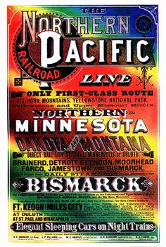
Which principle of design can we use to make the message in this advertisement clearer and more precise?
Simplicity
Movement
Contrast
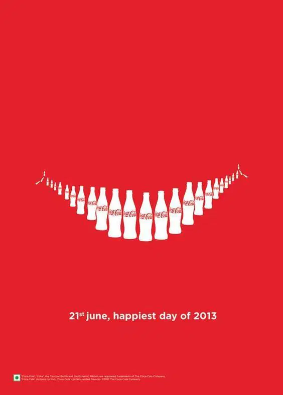
Which principle of design is most responsible for the success of this advertisement image?
Hierarchy in the Coca Cola bottles
Contrast in the Coca Cola bottles
Repetition of shape in the Coca Cola bottles

The Principle of design that is missing most from this advertisement is...
Balance
Movement
Hierarchy

Which principle of design is NOT used in this graphic?
Balance
Repetition
Contrast

In this advertisement, what did the designer do to lead the viewers eyes from one side of the design to the other (movement)?
Strategically place the images and text from the left side to the right side
Include a picture of an athlete in motion
Created an advertisement with the theme of basketball because there is so much movement in that sport

In this advertisement, how was Hierarchy created?
Attract = McDonald's Logo
Intrigue = French Fries Image & Claw
Message = "EYES ON YOUR FRIES!"
Attract = French Fries Image & Claw
Intrigue = "EYES ON YOUR FRIES!
Message = "WORLD FAMOUS FRIES" & McDelivery
Attract = "86236"
Intrigue = McDonald's Logo
Message = "McDelivery"

What principle of design would be most helpful in clarifying this advertisement’s purpose to the viewer?
Contrast
Movement
Simplicity
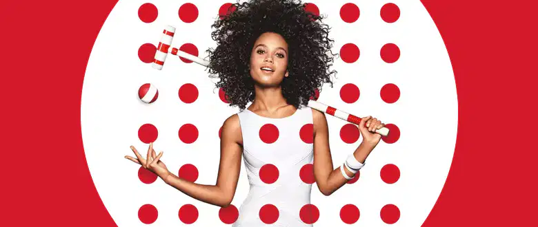
Which principal of design is most evident in this advertisement image?
Hierarchy
Repetition
Simplicity

What type of balance is demonstrated in this advertisement poster?
Symmetrical Balance
Central Balance
Asymmetrical Balance
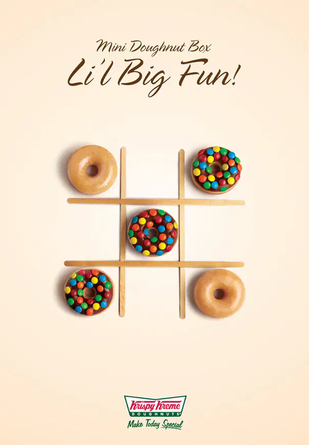
Where was contrast used in this advertisement?
In the Title: Making some text larger in size than the other text
In the Image: Including plain doughnuts and sprinkled donuts
Both A & B

A strong sense of movement is created in the image by using
a green color palette
a white background
repeated lines and imagery

This image best represents the effectiveness of which principle of design?
Simplicity
Hierarchy
Balance
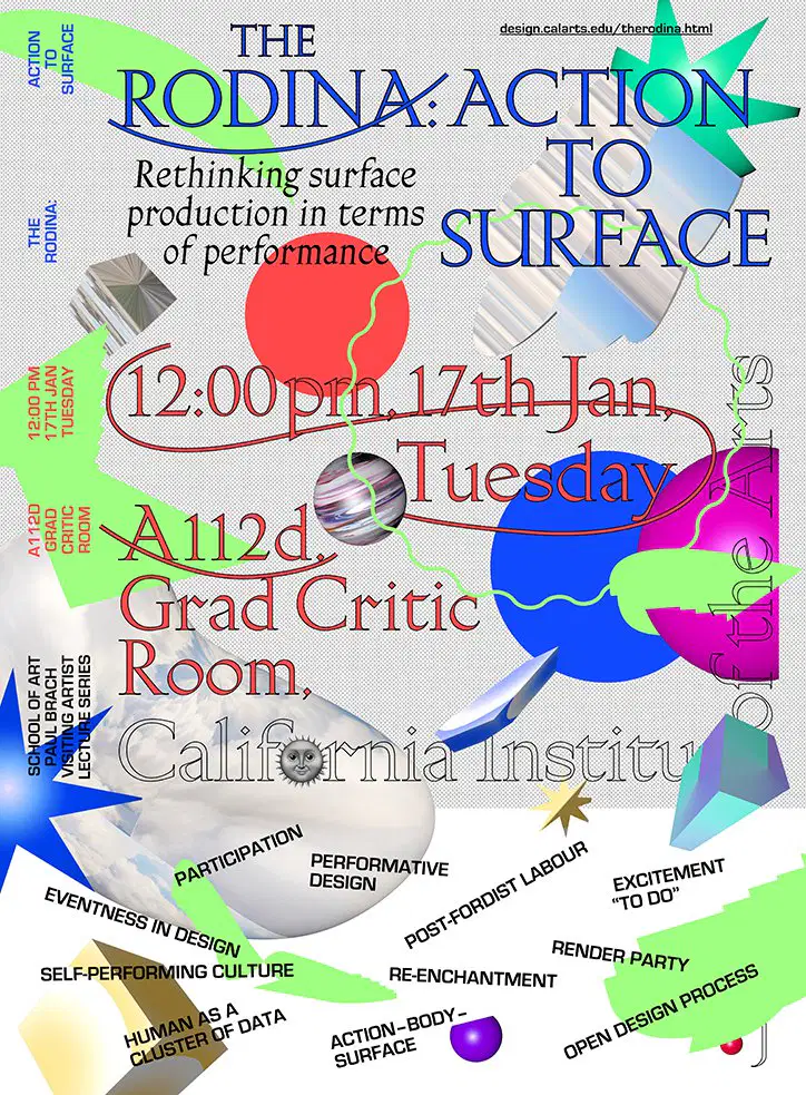
What element of design would best help to reduce confusion for the viewer in this image?
Movement
Repetition
Simplicity

Which principle of design did the designer use way too much of in this advertisement?
Repetiton
Simplicity
Balance
The two different types of balance are...
Central Balance and Negative Balance
Side Balance and Positive Balance
Symmetrical Balance and Assymetrical Balance
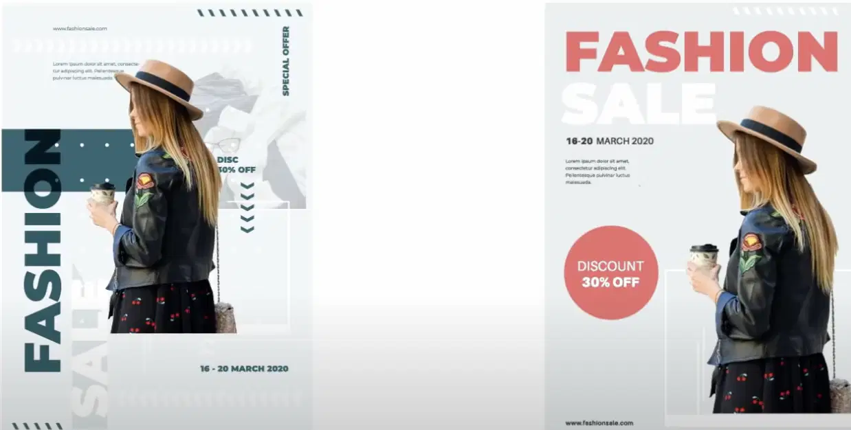
The principle of design that is most evident in the image redesign is...
Contrast of Color
Movement
Repetition
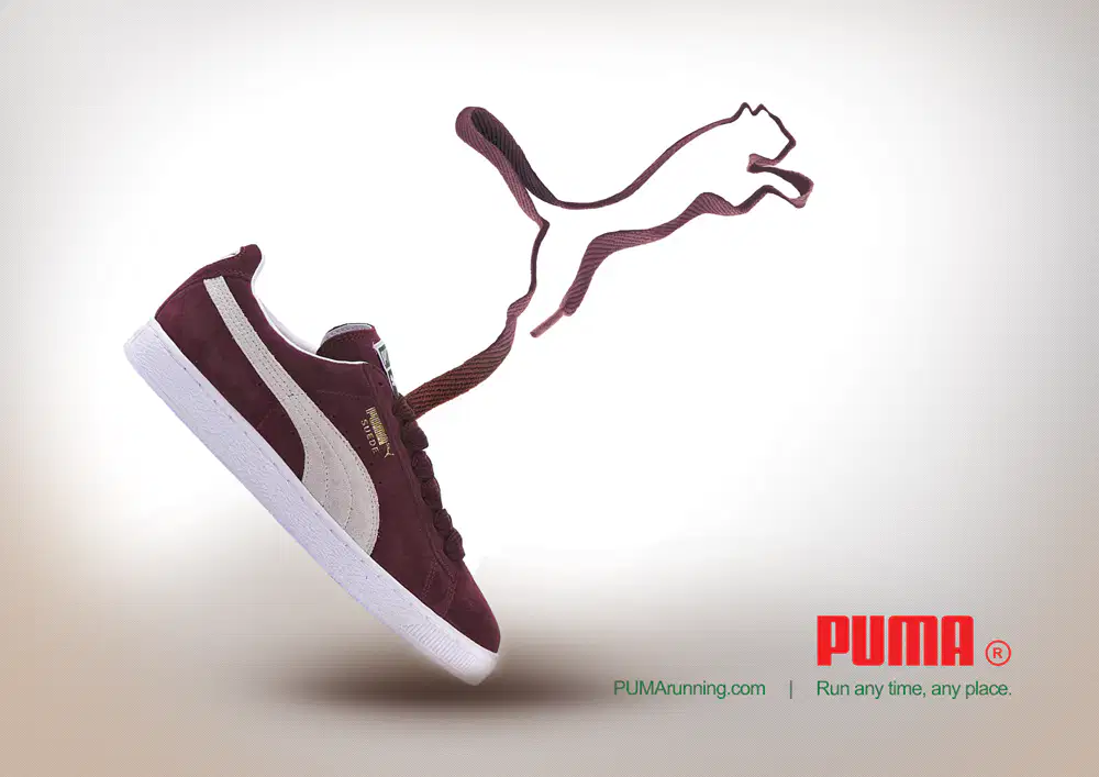
The tilt of the sneaker and the shoelace in the shape of a cat creates a sense of ________ in the image.
Simplicity
Contrast
Movement

First the image catches our attention, then we read the title "Mobile Ordering is here" and lastly we look at the McDonald's logo. What principle of design does this best represent?
Simplicity
Contrast
Hierarchy

